
Picking porch paint colors sounds simple, but the porch has a lot going on. It has sun, rain, dirt, and heavy foot traffic, plus it sits right next to your front door color and trim.
This guide walks through 10 porch color looks, from soft sage green and warm terracotta to chalky white, sea-glass blue, and moody charcoal trim. Each one is based on a realistic porch setup, so you can picture it on your own home.
You will get color pairing ideas, styling tips (mats, lights, planters, benches), and small updates that make the entry feel welcoming. Each section also includes a Pro Design Tip and a Budget Consideration to keep decisions easy.
Use the ideas to narrow your choices, take notes, and pick a paint color that fits your house style, your schedule, and how you really use the porch every day.
1 Classic Front Porch Refresh
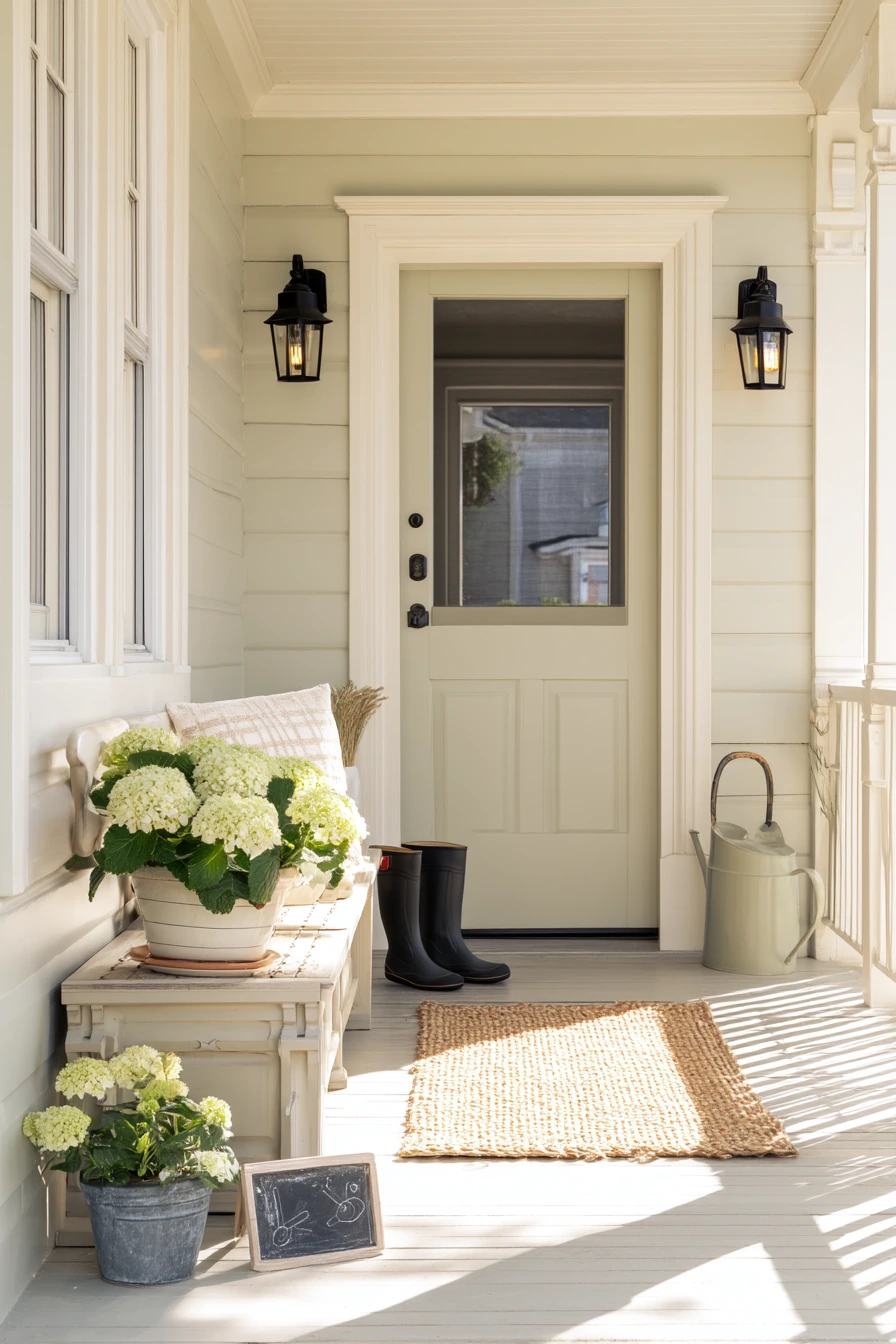
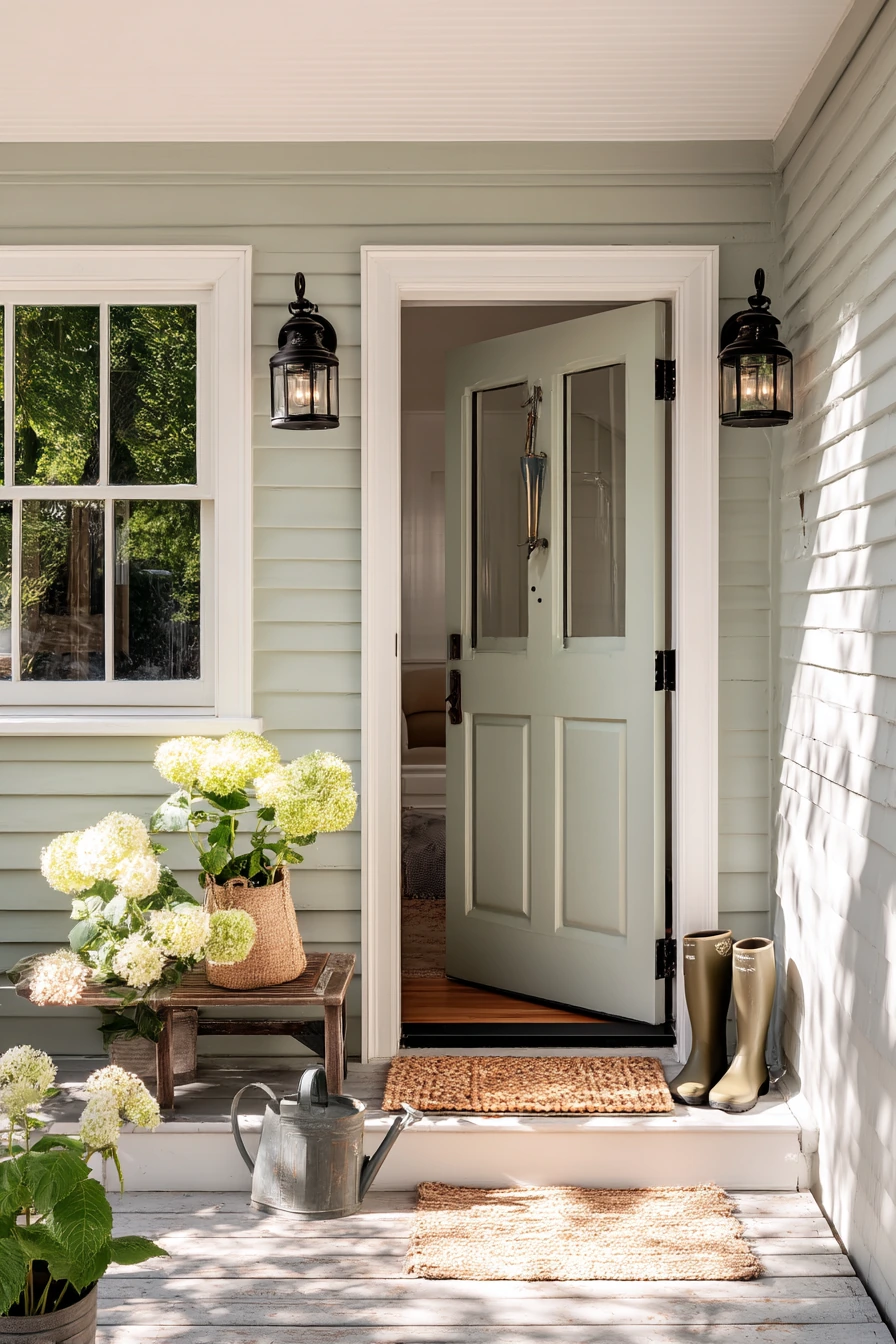
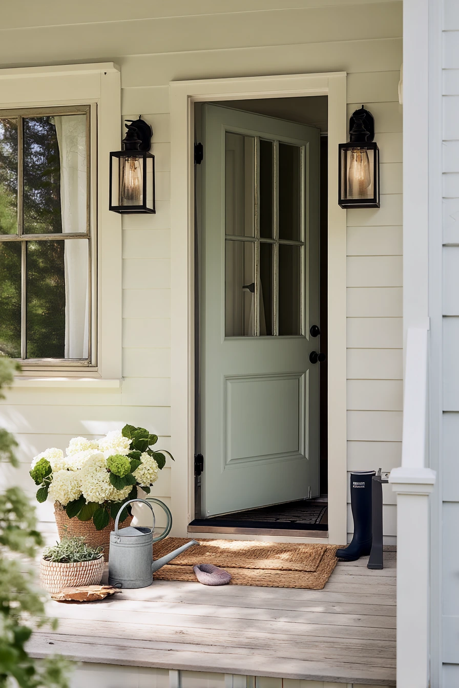
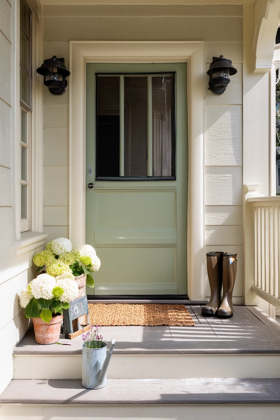
Soft sage green is a calm porch paint color that works well in suburban neighborhoods. It feels friendly without being too bright, and it pairs well with creamy trim for a clean, finished edge. If you have black lantern sconces, sage helps them stand out without looking harsh. This kind of color also hides light dust and pollen better than pure white.
To keep it lived-in and still neat, focus on simple layers. A woven doormat adds texture, and a pair of rain boots by the door makes the space feel real, not staged. Potted hydrangeas look especially good against sage because the leaves echo the green while the blooms add soft contrast. If you have a screen door that stays half open, make sure your trim paint is durable since it gets more scuffs.
For styling, keep accents warm and natural. Try wood or rattan, matte black metal, and a small watering can that can stay out without looking messy. If you have kid chalk on the step, choose a porch floor paint that is easy to wipe and does not show every mark. Morning light tends to cool colors down, so a sage with a hint of warmth often looks better than one that leans blue.
- Pair sage paint with creamy trim and matte black hardware for balance.
- Use one woven mat and one simple outdoor rug so the entry looks layered, not cluttered.
- Choose planters in terracotta, concrete, or black to ground the green.
- Add one bench or small chair for function, then keep the rest open.
- Use a satin or porch-and-floor enamel finish to handle everyday wear.
Pro Design Tip: Test sage green next to your trim in morning and late-day light, then pick the shade that keeps the trim looking creamy instead of yellow.
Budget Considerations: If repainting trim is not in the budget, match the sage to your current trim undertone and update only the porch body color plus a new doormat.
2 Small Porch, Bold Door Color
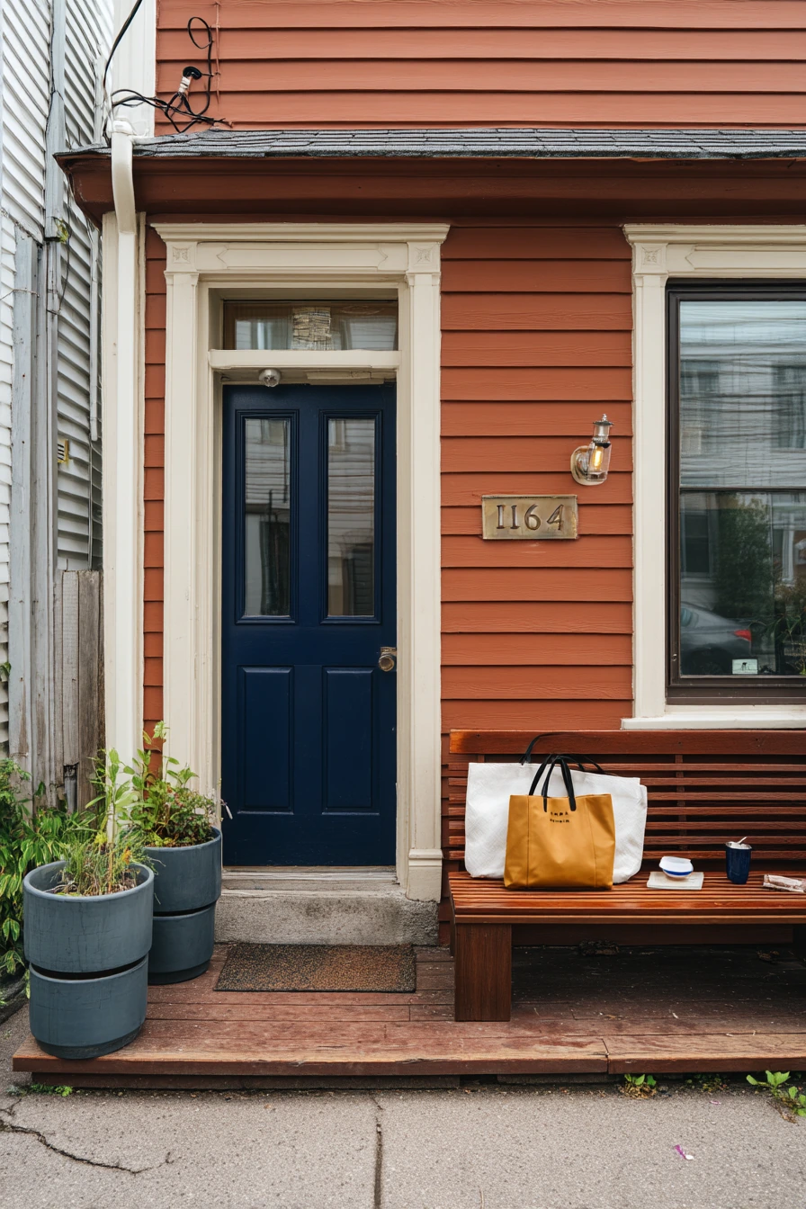
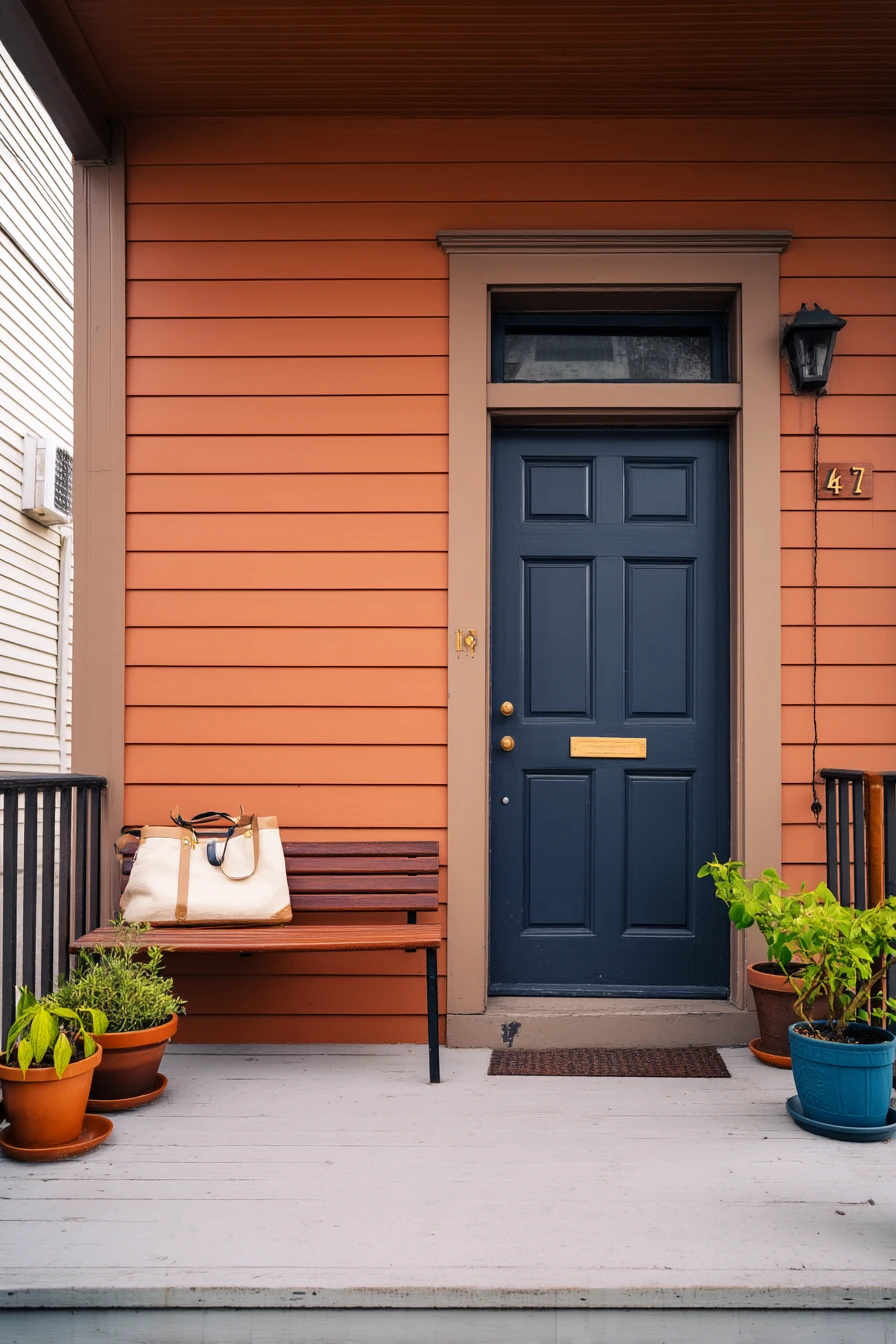
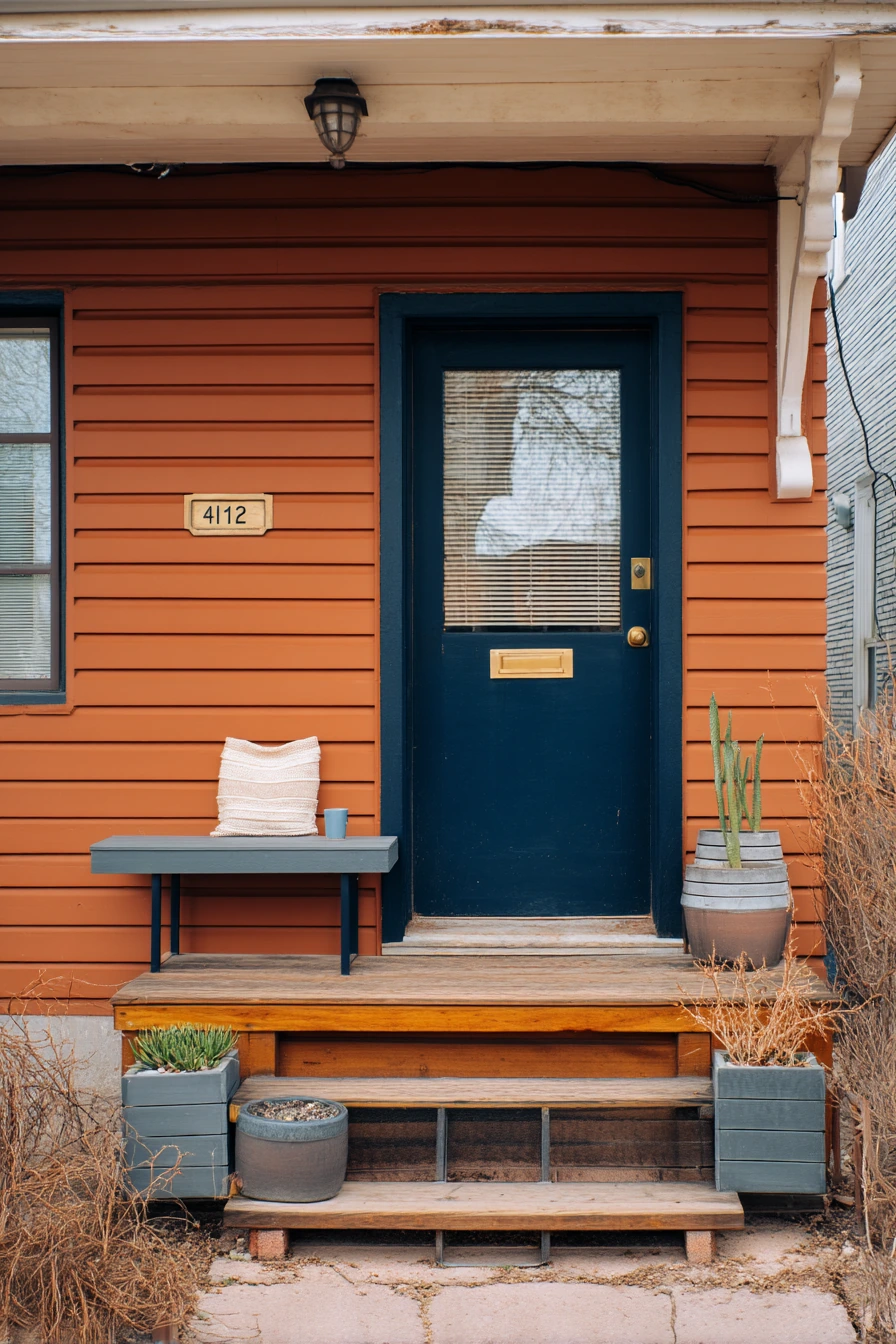
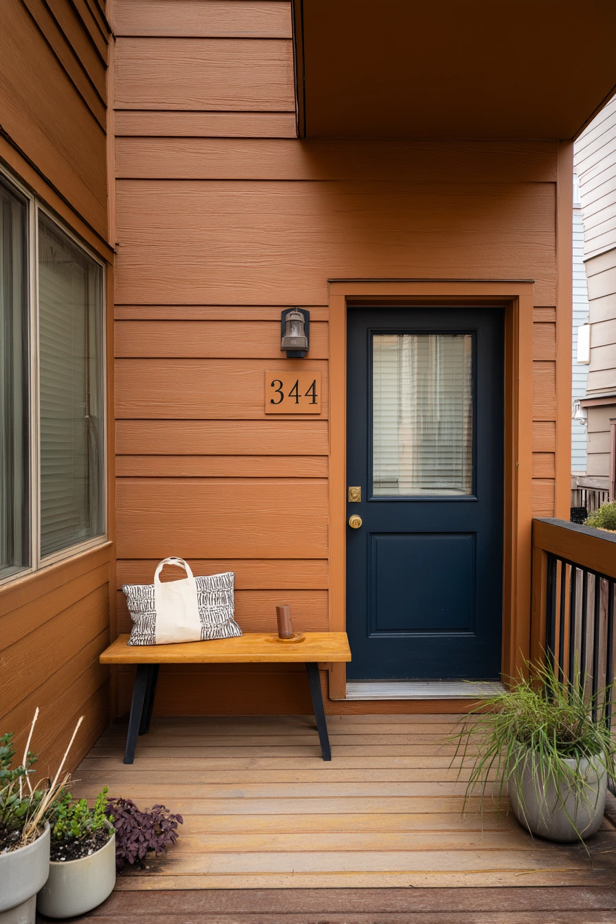
Warm terracotta is a strong porch paint color that still feels grounded, especially on a compact townhouse. It brings warmth to overcast daylight and helps an entry feel cozy instead of flat. A deep navy door adds crisp contrast and keeps the look from leaning too orange. Brass house numbers are a good match because they echo the warmth without blending in.
Because townhome porches are often small, go slim and vertical with decor. A narrow bench is enough for daily life, like setting down a tote bag, a book, or a mug. Stacked planters add greenery without taking up walkway space. If you have a phone cable near the screen door, hide it with a small outdoor basket or a hook so the area looks tidy.
To style terracotta well, keep other colors simple. Choose black, navy, or natural wood for furniture, and stick to one metal finish. A textured doormat and one patterned cushion can add interest without making the porch busy. Terracotta also looks good with plants that have strong leaf shapes, like snake plants in warm months or hardy evergreens in cooler seasons. If you want a softer look, pick a terracotta that is more clay than red.
- Use deep navy on the door to sharpen the terracotta siding color.
- Choose brass or aged gold numbers for warmth and easy visibility.
- Keep seating narrow and add comfort with one outdoor pillow.
- Stack planters to add height when floor space is tight.
- Use a simple hook or box to keep cords and small items out of sight.
Pro Design Tip: Repeat navy in one small item, like a planter or striped cushion, so the door color feels planned, not random.
Budget Considerations: If repainting siding is too much, paint only the front door navy and add terracotta through planters, a pot, and a porch rug.
3 Renter-Friendly Porch Update
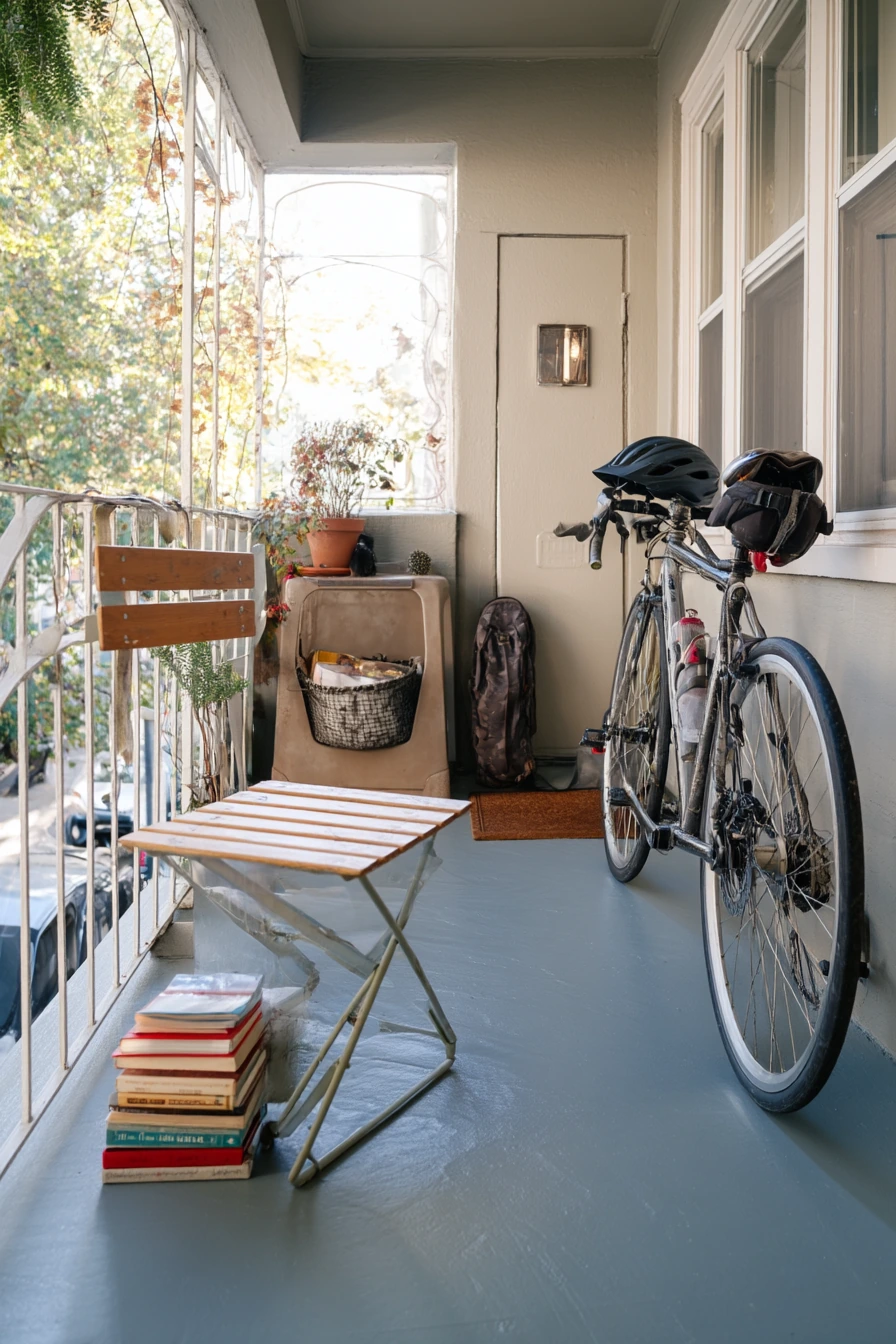
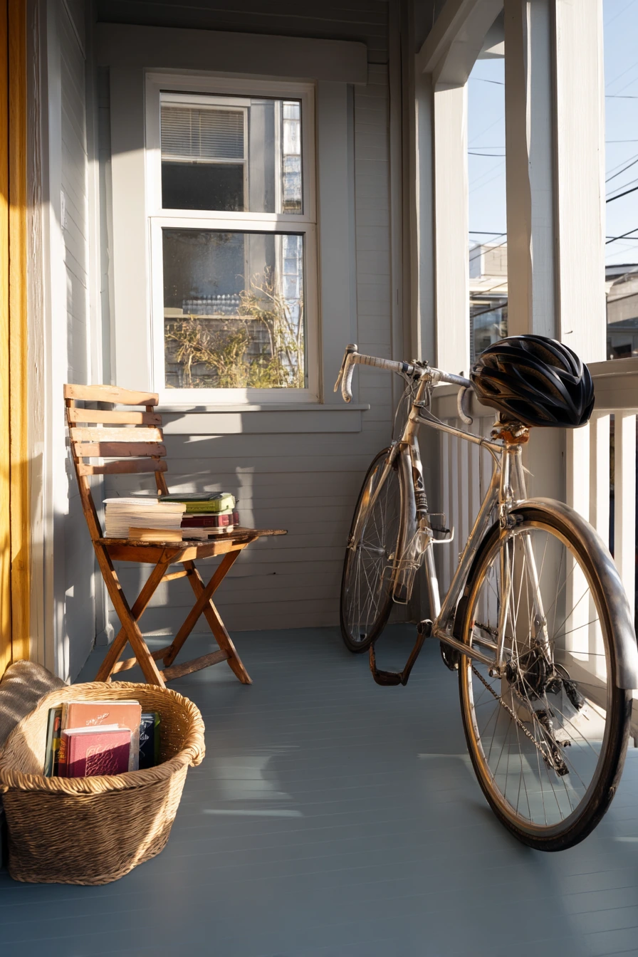
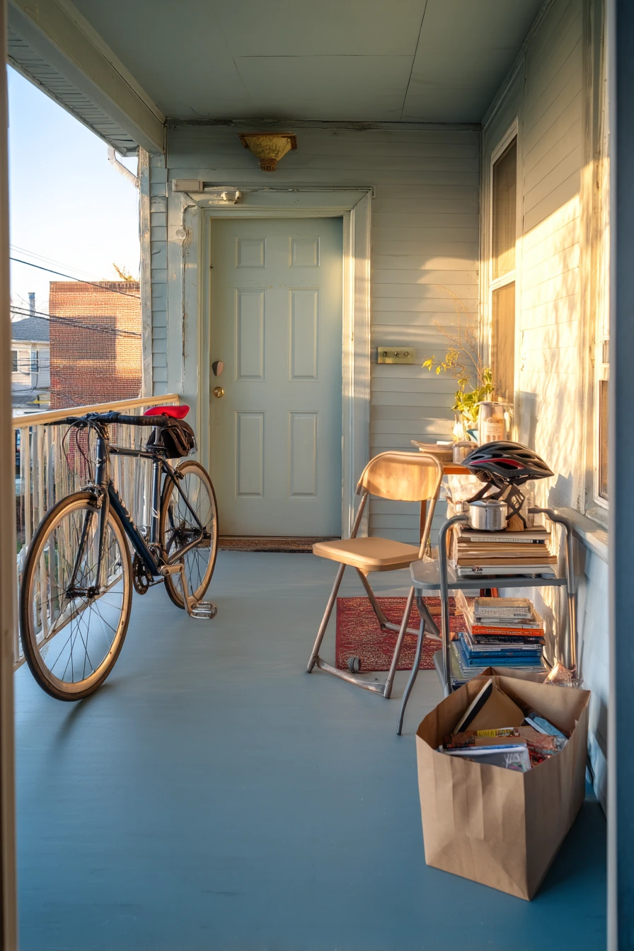
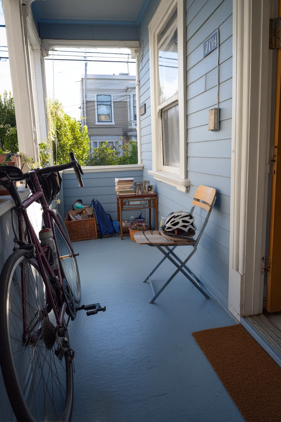
Dusty blue-gray is a smart porch floor color for a rental duplex because it feels clean but does not show every speck of dirt. It also works with many door colors, so you can keep the look flexible. If you can do a reversible painted floor, you get a big visual change without redoing the whole porch. A folding chair and a thrifted side table fit the rental vibe and are easy to move if rules change.
Make the porch feel personal using items that look normal in real life. A laundry basket by the door, a bike helmet on the rail, and a stack of library books can still look nice if the rest of the setup is simple. Use one small tray on the side table to gather keys and sunscreen. If you cannot drill holes, use removable peel-and-stick address numbers so the entry looks finished and helps deliveries.
To style dusty blue-gray, go for soft neutrals and a few warm touches. A tan coir mat, a small outdoor rug, and one plant in a black or galvanized pot work well. Late-afternoon light can make blue-gray look more blue, so choose a shade with a bit of gray to keep it calm. If the porch gets slippery, add a grit additive to the paint or use a rug pad designed for outdoor floors.
- Pick a blue-gray porch floor paint that is rated for foot traffic.
- Use peel-and-stick numbers for an easy, removable upgrade.
- Choose foldable seating so the porch can change with your needs.
- Style with one tray and one mat to keep small items contained.
- Add a plant and one small light for a welcoming look without clutter.
Pro Design Tip: Paint the floor and the first step the same color to make the small porch look wider and more put together.
Budget Considerations: Use porch-and-floor paint samples first and buy a small quart; in many rentals, one quart can cover a small porch with two coats.
4 Southern Porch with Soft White Paint
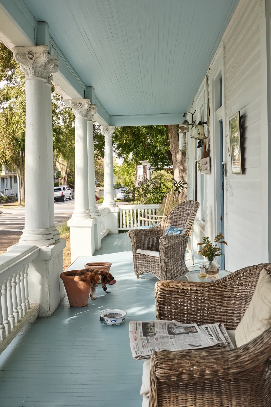
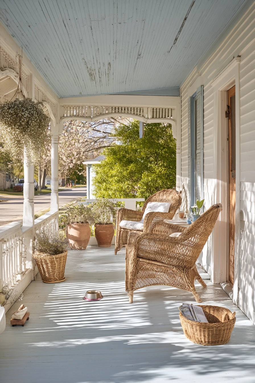
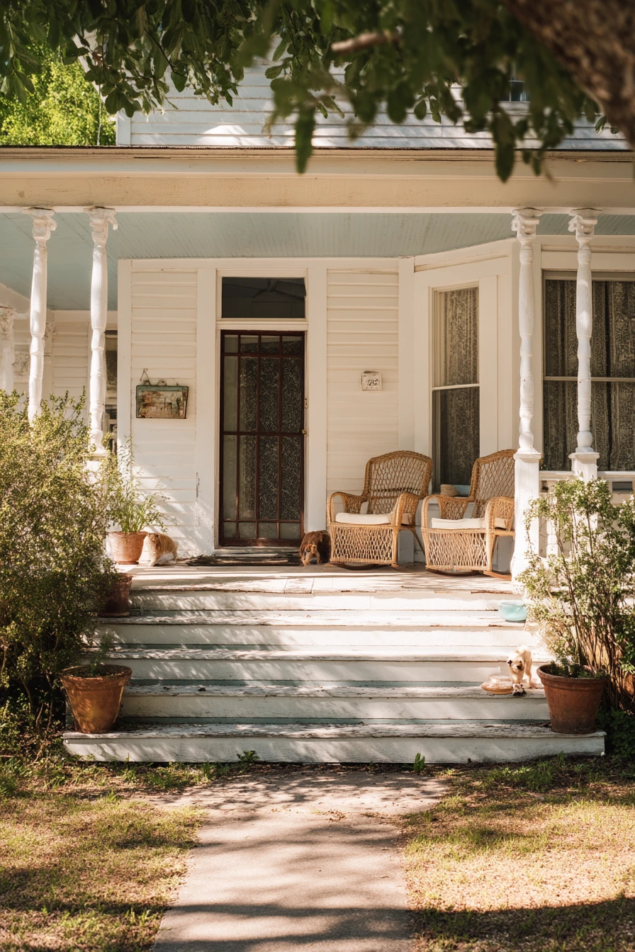
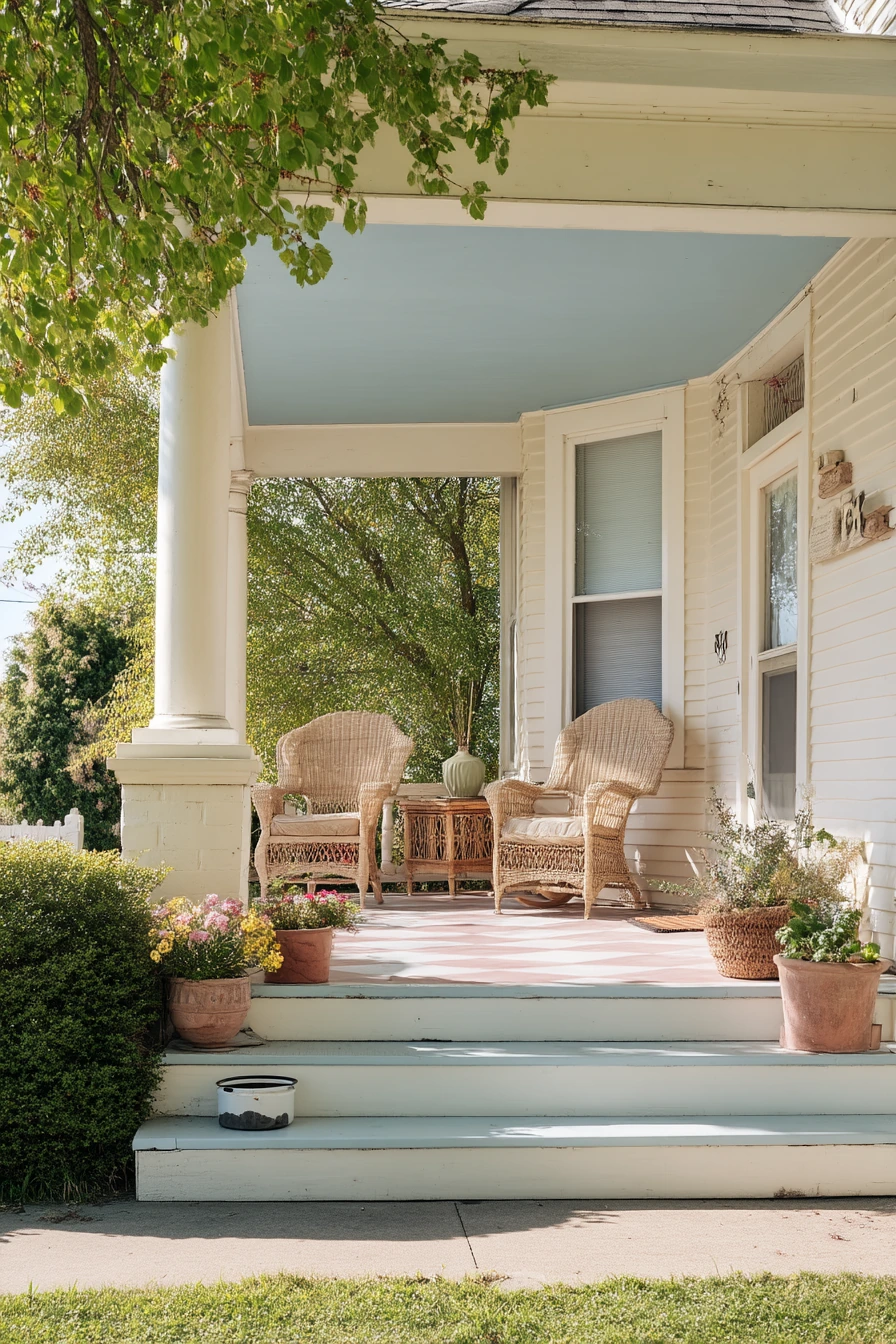
Chalky white porch paint is a classic choice for an older home with a wide front porch. It brightens shaded areas and makes architectural details like spindle columns stand out. A pale blue ceiling adds a soft, airy feel and can make the porch look taller. In gentle morning light, this color combo feels calm and clean without looking stark.
Because white shows wear, the key is choosing the right finish and adding warm textures. Wicker rocking chairs bring in natural color, and faded terra-cotta pots keep the space from feeling too crisp. Small everyday items, like a folded newspaper or reading glasses on a side table, can still look tidy when the furniture and planters are simple. If you have a dog bowl near the step, place it on a small tray so water drips do not stain the floor.
For styling, aim for a light palette with one or two darker anchors. A navy or charcoal outdoor pillow looks great on wicker. A striped porch rug adds pattern but still fits the traditional look. If your porch faces strong sun, the chalky white will reflect heat and help the space feel cooler. Choose a porch paint that resists mildew, since white can show spots faster in damp weather.
- Use chalky white on rails and columns to highlight the porch shape.
- Paint the ceiling pale blue to add softness and height.
- Add wicker seating and a simple side table for a relaxed, classic feel.
- Use terracotta pots and green plants for warmth against white paint.
- Keep decor to a few items so the wide porch stays open and graceful.
Pro Design Tip: Choose a white with a slight warm undertone so it does not look gray next to brick, stone, or older wood floors.
Budget Considerations: Skip new furniture and refresh what you have with outdoor cushions and a porch rug; they change the look fast for less than repainting everything.
5 Moody Charcoal Porch Trim
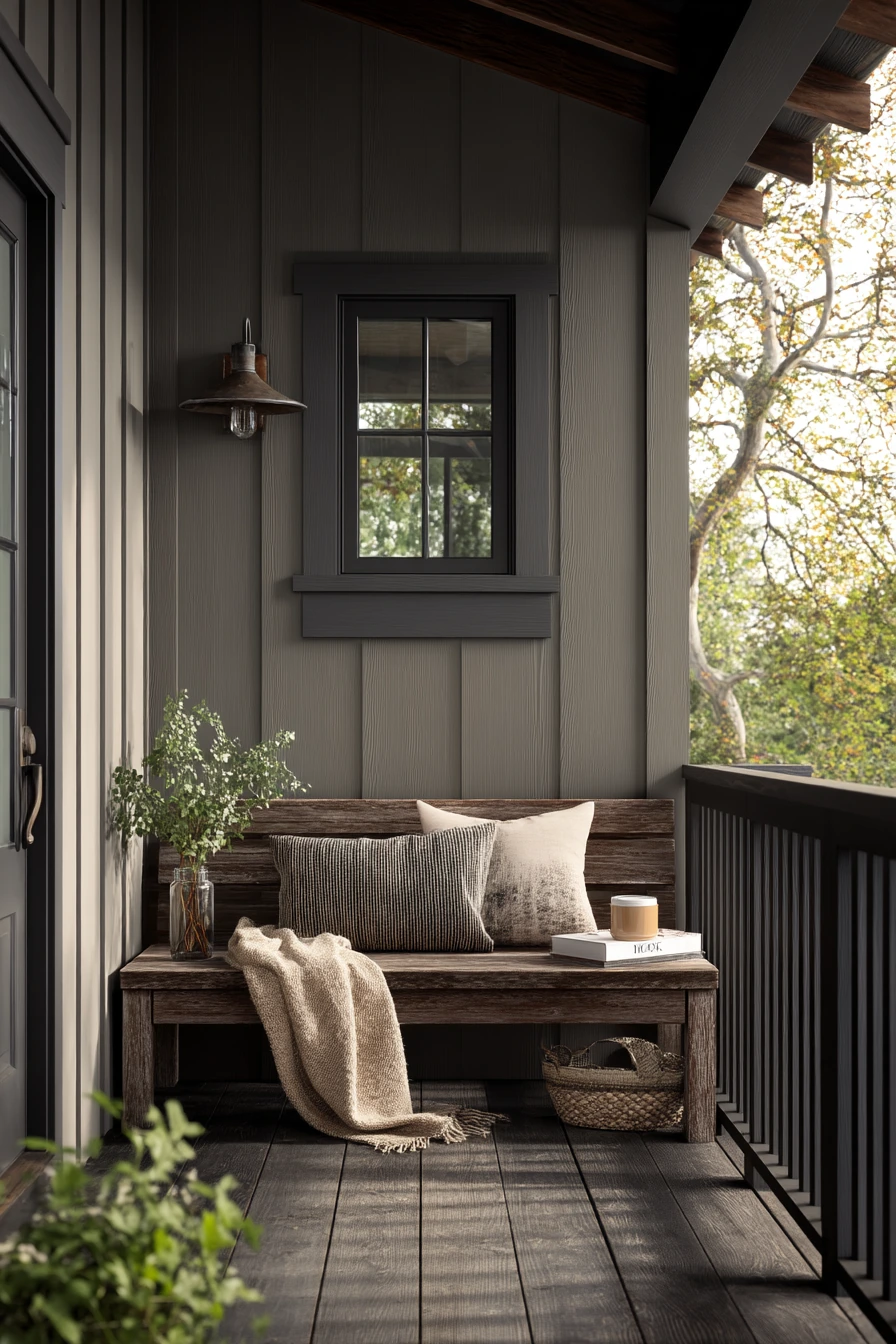
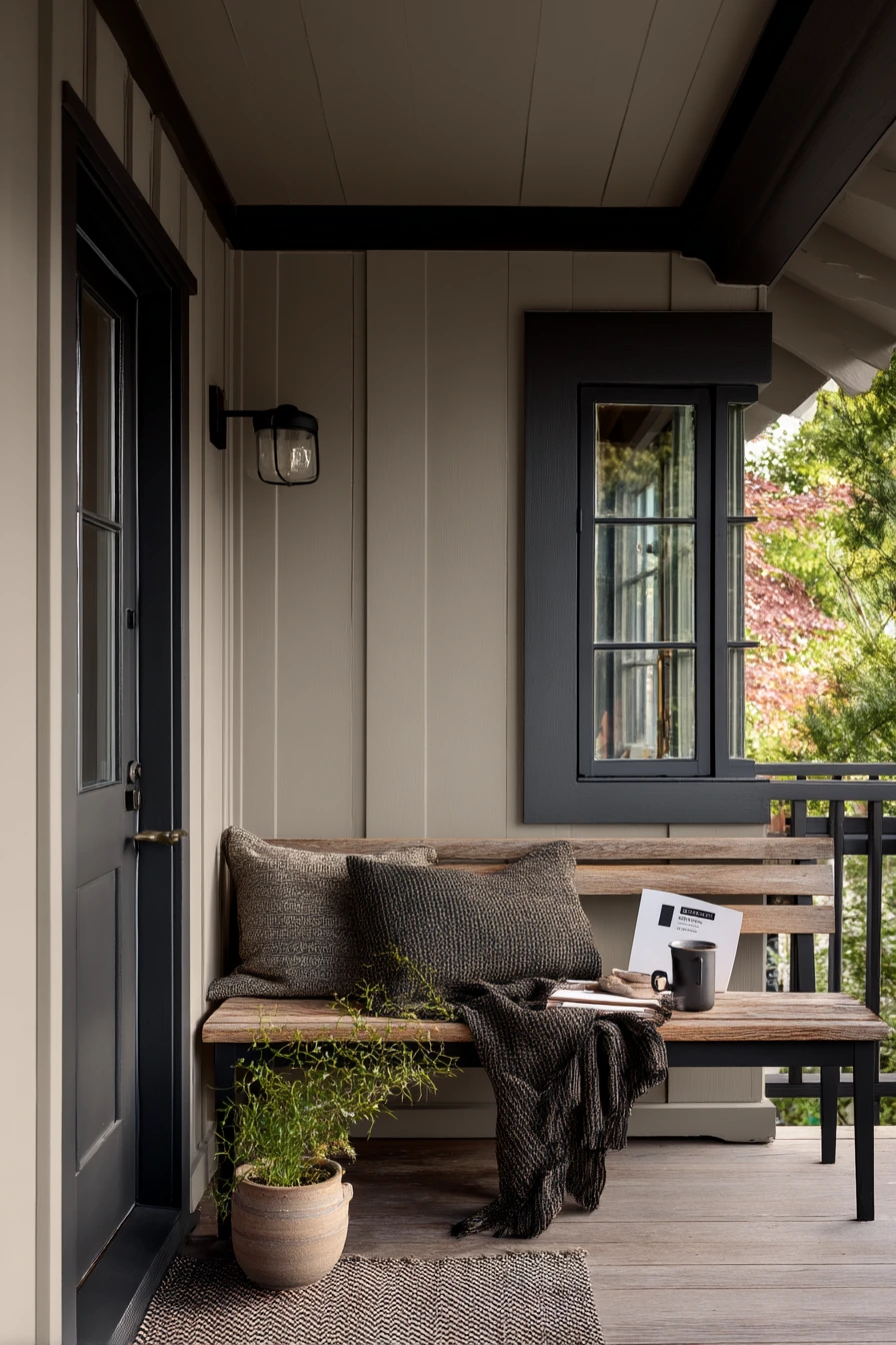
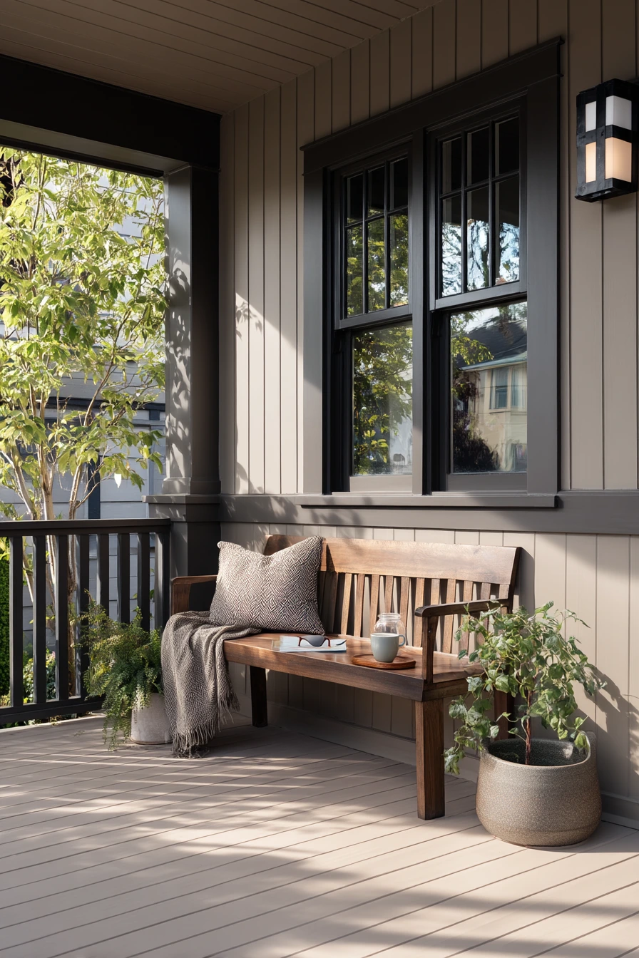
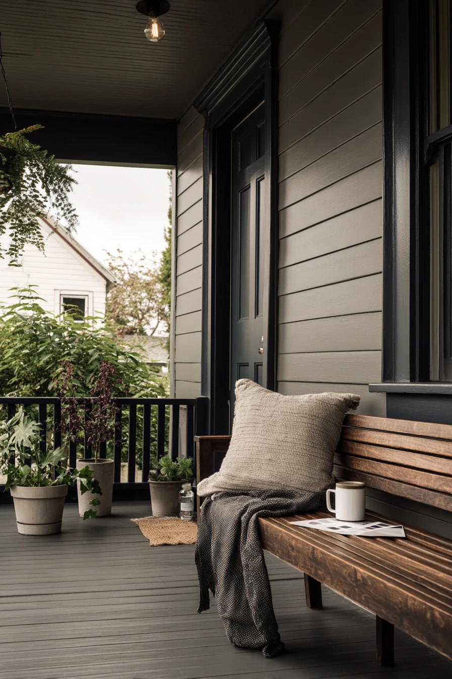
Muted greige siding with deep charcoal trim is a modern porch paint color combo that looks refined but still livable. Greige is a mix of gray and beige, so it feels softer than cool gray and more current than plain tan. Charcoal trim adds definition around windows, posts, and railings, and it makes matte black railings look intentional instead of heavy.
This look pairs well with simple, tactile materials. A cedar bench adds warmth, and a wrinkled throw keeps the porch from feeling too formal. If you like to tweak color choices, a paint swatch card on the ledge is realistic and fits the design process. Add one ceramic coffee cup and a plant cutting in a jar for a calm, everyday feel. Cloud-filtered daylight makes these tones look rich, so they are a good choice if your porch is shaded.
To style a moody porch, keep the palette tight. Think black, warm wood, and one soft textile. Use planters in concrete or black, and choose greenery with a strong shape, like boxwood or olive trees in pots. If you want more contrast, add a light outdoor rug in cream and gray. Because dark trim can show dust and pollen, a washable doormat and a quick weekly wipe of railings helps the porch stay sharp.
- Use greige as the main color for a warm, modern base.
- Choose charcoal trim to outline details and add depth.
- Add cedar or teak seating to prevent the palette from feeling cold.
- Keep decor minimal and repeat black in lights, numbers, and hardware.
- Use a light rug or cushion to balance the darker trim and railings.
Pro Design Tip: Match charcoal trim to your roof or driveway tones so the porch connects to the rest of the exterior, not just the front door.
Budget Considerations: If repainting trim is expensive, paint only the door and railings matte black, then add greige through an outdoor rug and planters.
6 Coastal Blue Porch for Everyday Living
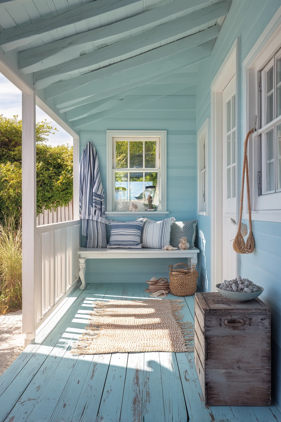
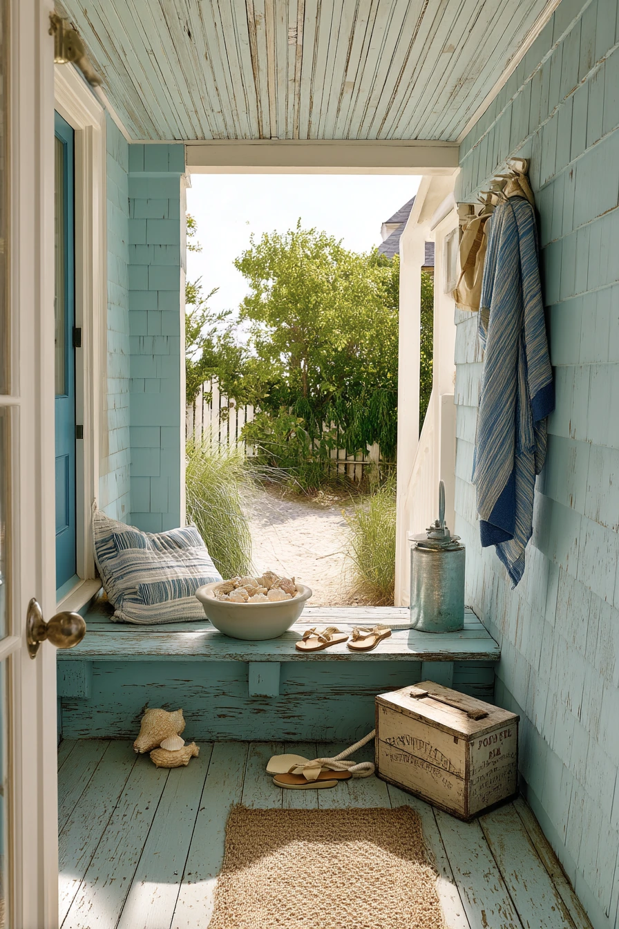
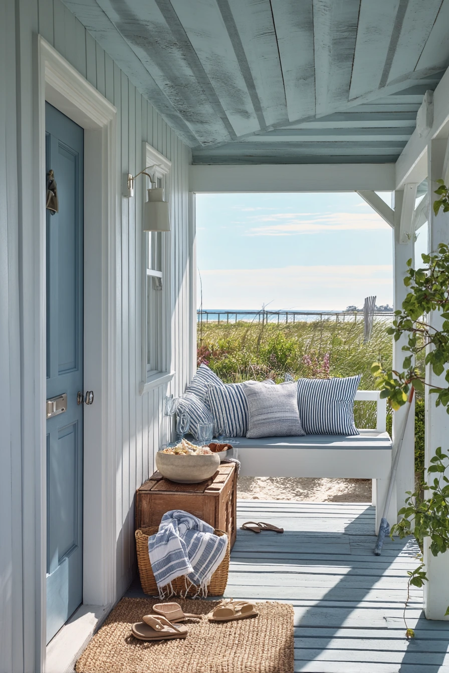
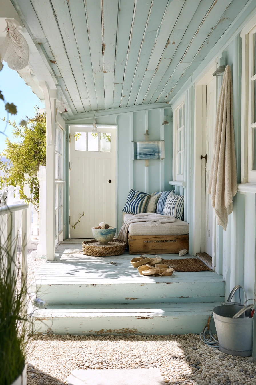
Faded sea-glass blue is a porch paint color that feels relaxed and fresh, especially with a white beadboard ceiling. It reads soft in bright coastal daylight and looks good with simple white trim. This color works well when the porch gets sandy and wet, since it hides small marks better than stark white floors and still feels light.
Beach cottage styling is about function first. A weathered milk crate for shoes is practical and fits the casual look. A striped cushion adds an easy pattern, and a shell-filled bowl can be a simple centerpiece without feeling fussy. If your porch is used by kids, expect flip-flops, a sand-dusted towel, and a coiled hose near the steps. The key is to give each item a spot so it looks organized, not messy.
To make sea-glass blue feel pulled together, pair it with natural textures and a few darker accents. Try a rope-style doormat, a small teak stool, and one black lantern light for contrast. Choose outdoor fabrics that resist fading since this porch will see sun. If the porch gets windy, use heavier planters and a rug with corner ties or a strong rug pad. This palette also looks great with white flowers and blue-green plants like rosemary.
- Pair sea-glass blue paint with bright white ceiling beadboard for a crisp look.
- Use a striped cushion to add pattern without adding more colors.
- Set up a shoe zone with a crate or low basket near the door.
- Choose outdoor hooks for towels so they do not end up on the floor.
- Add one dark light fixture or hardware piece for contrast and definition.
Pro Design Tip: Pick a sea-glass blue with gray in it, not pure aqua, so it stays calm and does not turn neon in strong sun.
Budget Considerations: Use a simple white paint for the ceiling and spend the extra on a quality exterior enamel for the floor where the wear is highest.
7 Budget Porch Makeover Weekend
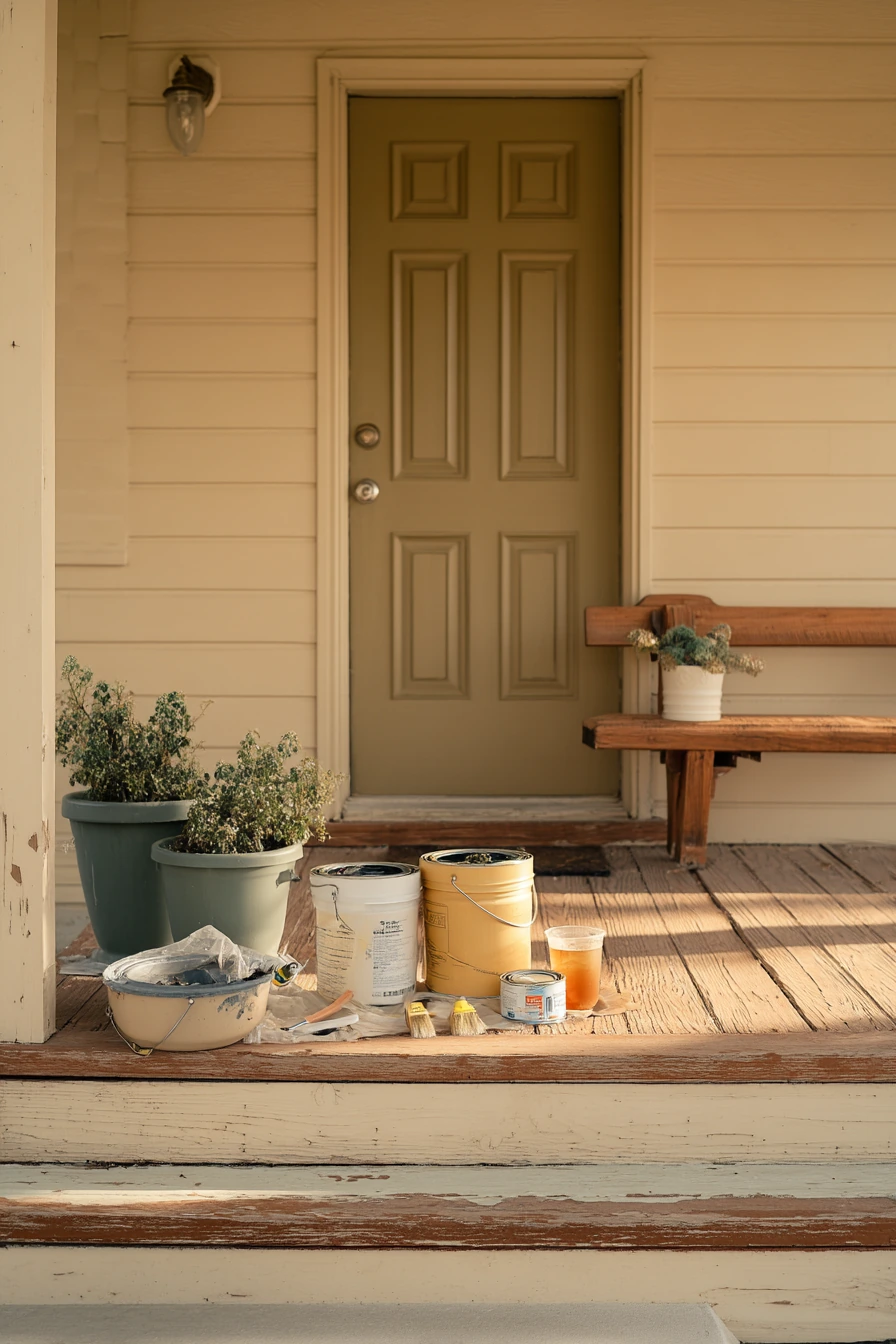
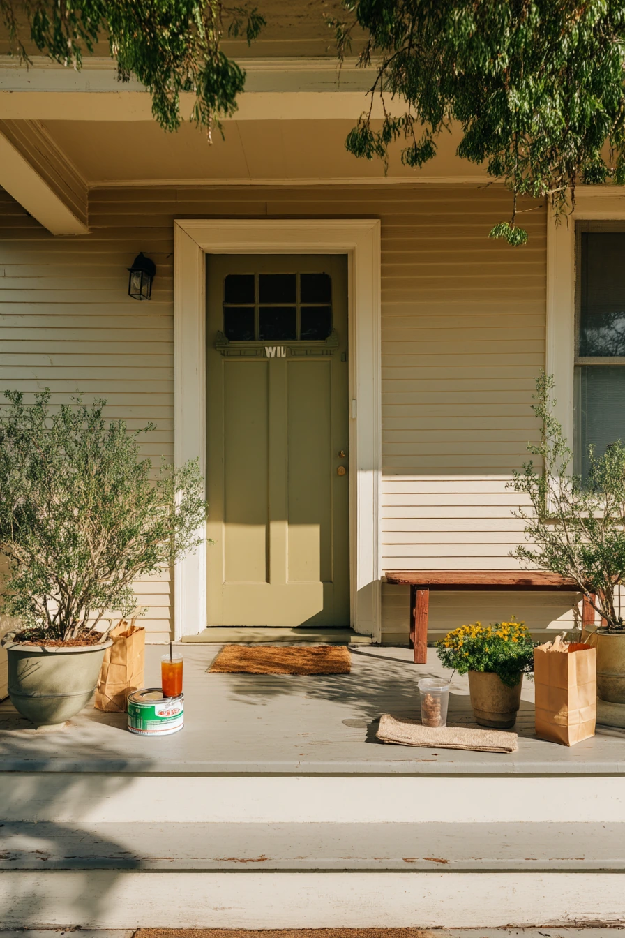
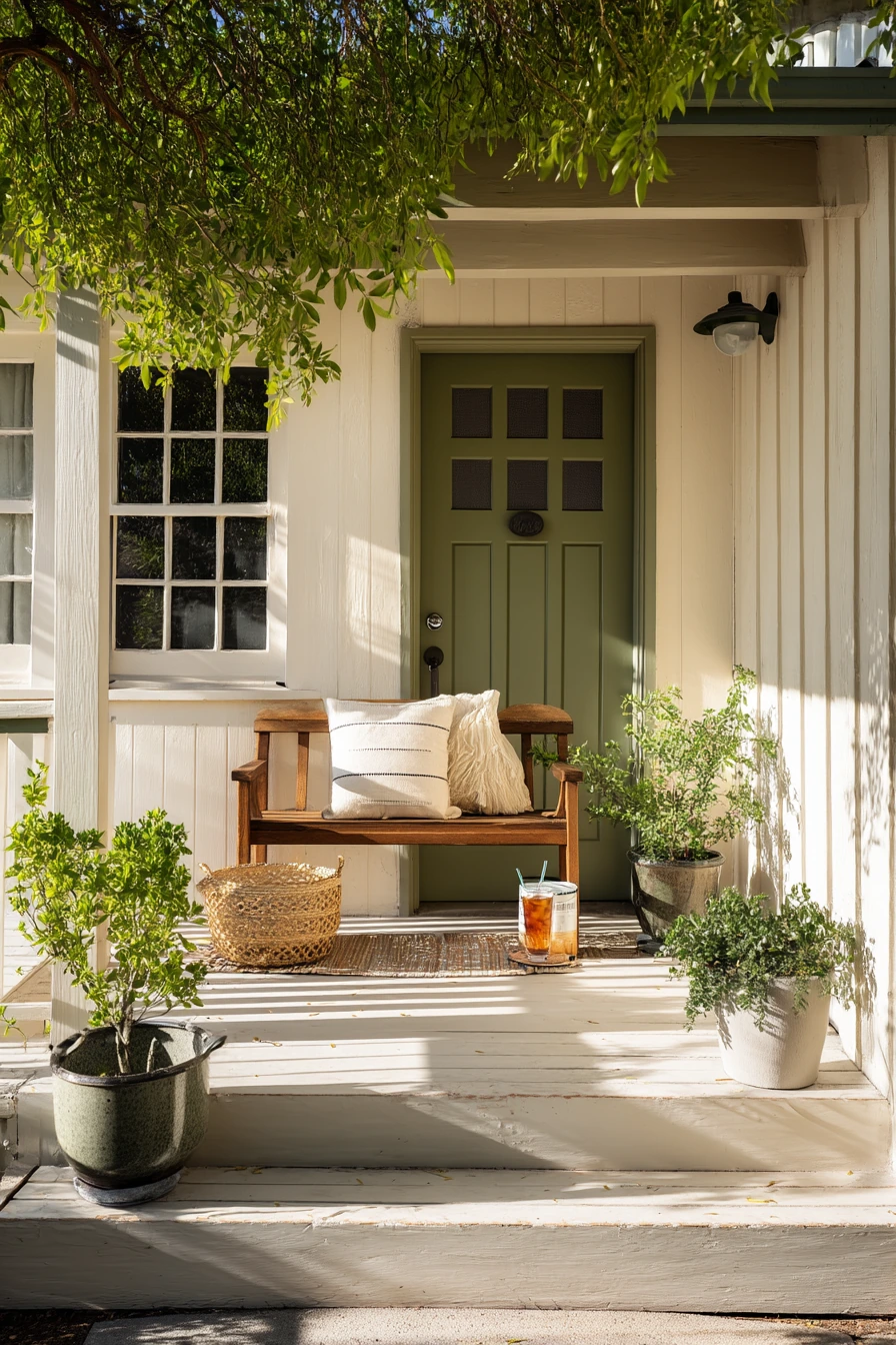
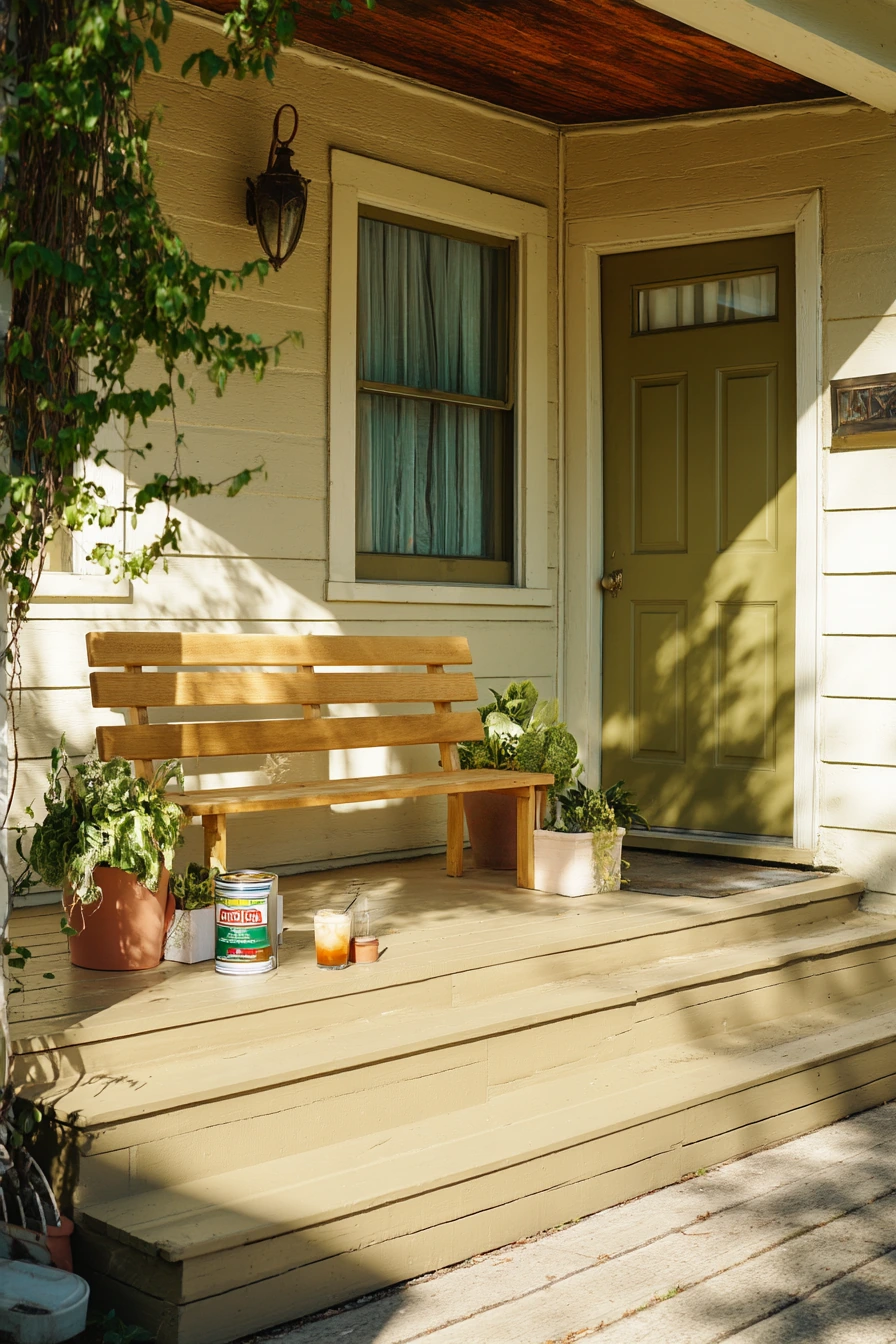
Warm beige is a safe, helpful porch paint color for a simple ranch house. It blends with many roof and brick tones and looks good in natural afternoon light. Olive-green door accents add just enough color to feel updated without standing out too much. This combo works well when you want a fresh look but prefer neutral exteriors.
This style fits a DIY weekend paint job. It is normal to have paint cans tucked aside, a roller tray, and a dropcloth corner showing. If you are painting, keep the porch usable by working in sections and leaving a clear path to the door. Secondhand planters and a thrift-store bench keep the porch friendly and low pressure. Add one drink or small item on the step, but avoid a pile of tools that makes the entry feel blocked.
To style a beige porch, rely on texture. Use a woven mat, a simple outdoor pillow, and pots in black, terracotta, or aged metal. Olive looks great with natural wood and brass. If your porch has a lot of sun, warm beige can look lighter than expected, so sample first. Choose a paint with good stain resistance since beige can show muddy footprints on high-traffic steps.
- Use warm beige as the main color to keep the porch calm and bright.
- Add olive accents on the door or shutters for a soft pop of color.
- Style with thrifted or secondhand pieces to keep it relaxed.
- Choose planters in simple shapes to match the ranch home lines.
- Finish with a durable porch-and-floor paint on steps for easy cleaning.
Pro Design Tip: Use the same olive tone in a small planter or cushion so the door color looks repeated and steady.
Budget Considerations: If you are repainting on a tight budget, focus on the door and the steps first; those areas make the biggest first impression.
8 Fall Porch Paint and Pumpkins
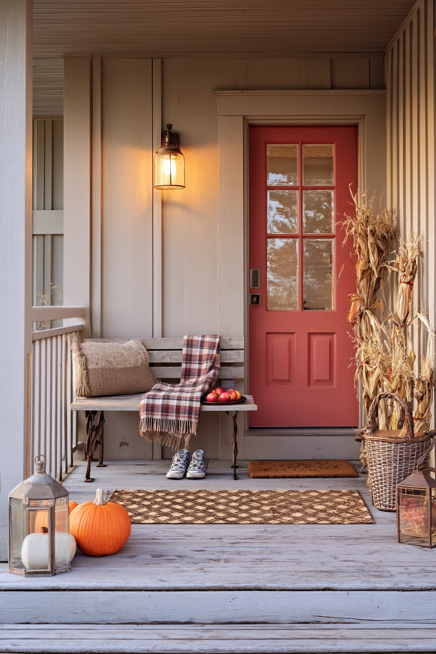
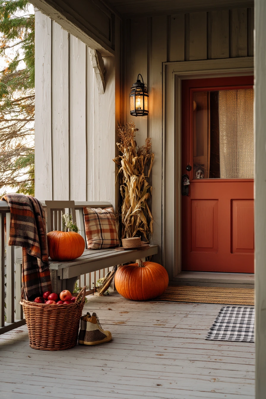
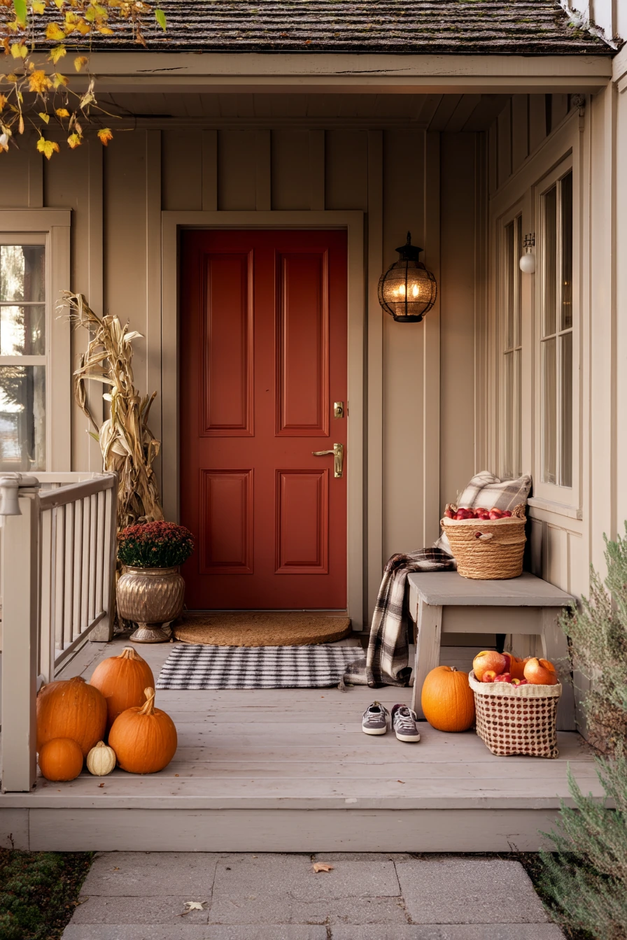
Soft mushroom taupe is a porch paint color that feels warm and neutral, making it a great backdrop for fall decor. It looks natural with wood, stone, and brick, and it does not fight with seasonal colors. A rust-red door adds a rich accent that fits autumn without looking like a holiday theme. In late golden-hour light, taupe and rust feel cozy and grounded.
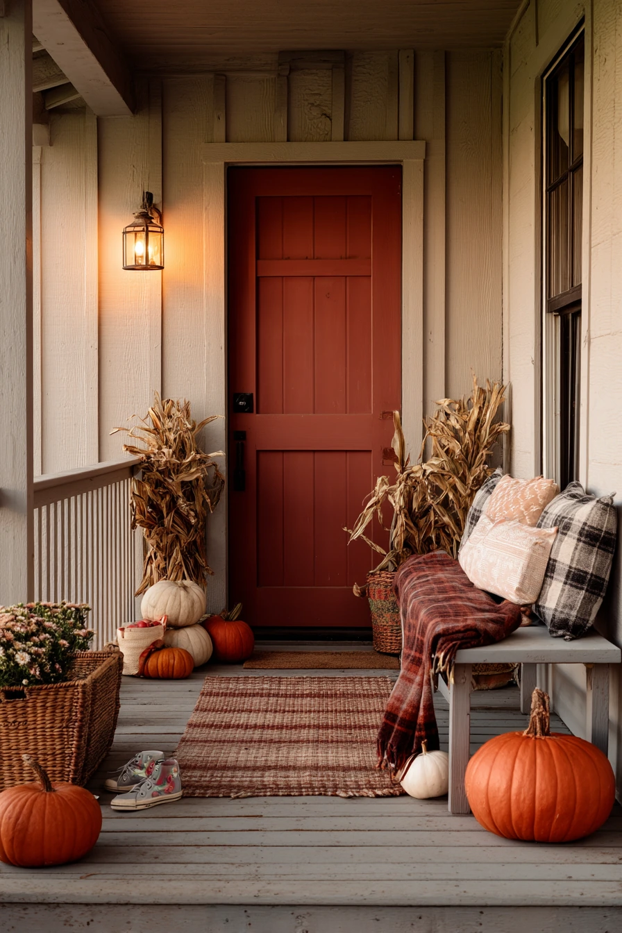
Fall styling works best when it is simple and layered. Stacked pumpkins by the door add height and color. Dried cornstalks near a railing give texture and movement. A lantern with a warm glow makes the porch feel welcoming as days get shorter. Keep the bench useful by adding a plaid scarf or throw, and expect real life items like kid sneakers by the mat. A small basket of apples can work as decor and a snack plan.
To keep this look from becoming cluttered, choose a tight color group: taupe, rust, cream, and a little black. Use planters in terracotta or black to match the season. If your porch gets wet leaves, pick a mat that is easy to shake out. Taupe can shift under different light, so test it next to your door color before painting. A satin finish often looks best because it wipes clean and still looks soft.
- Use mushroom taupe as a flexible base for seasonal porch styling.
- Paint the door rust-red for a warm focal point that suits fall.
- Stack pumpkins in two or three sizes to create height near the entry.
- Add one lantern and one basket to keep decor simple and useful.
- Use a plaid textile for pattern without adding extra colors.
Pro Design Tip: Choose a rust-red that leans brown, not bright red, so it looks timeless after you pack away the pumpkins.
Budget Considerations: Instead of buying new decor, use grocery-store pumpkins and a thrifted basket; they create a full fall look for a small cost.
9 Spanish Revival Porch Entry
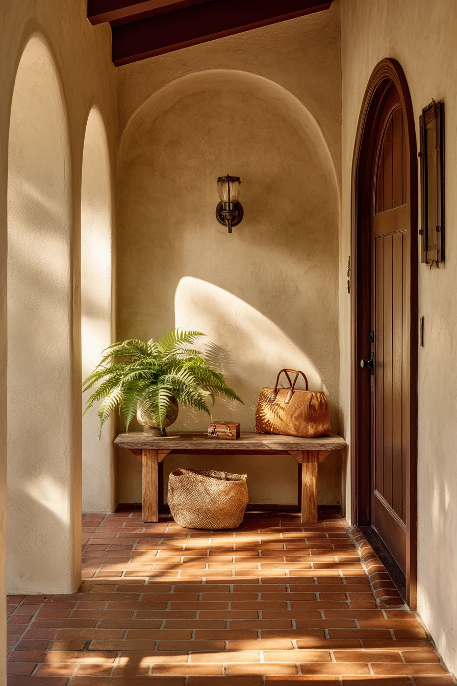
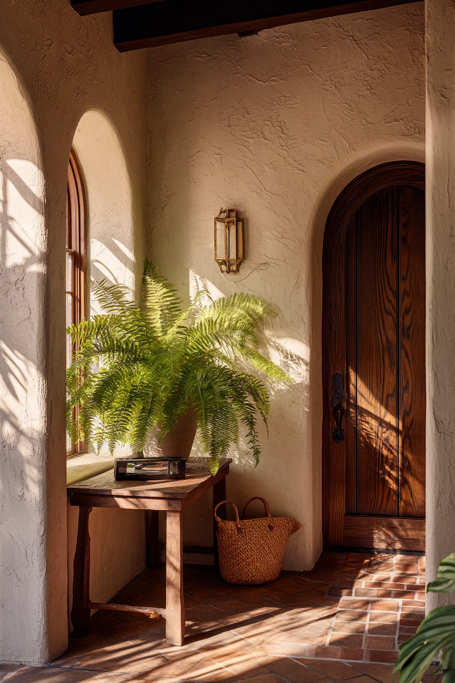
Warm clay-colored paint is a natural match for a Spanish revival porch. It pairs well with creamy stucco arches, dark wood doors, and patterned terracotta tile. The key is choosing a clay tone that looks sun-baked, not orange. In soft afternoon window light, this palette feels earthy and quietly elegant.
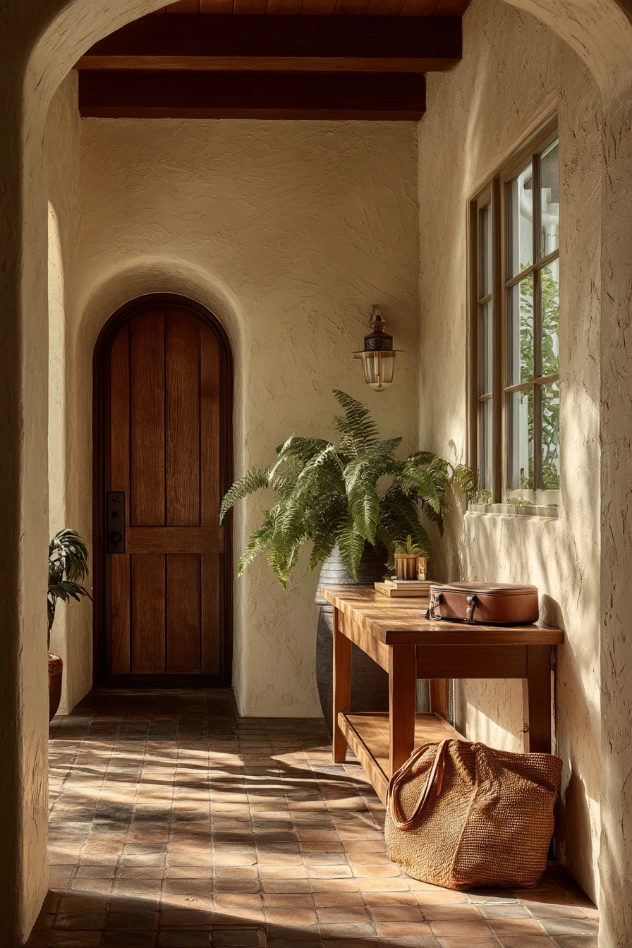
Spanish-style porches look best with strong shapes and a few special details. Let the arches and tile be the star, then keep furniture minimal. A slim console table or small bench can hold a market bag, keys, or a sunglass case without taking over the space. A leafy fern casting shadows across the wall adds life and makes the entry feel cooler. If your porch is narrow, use wall-mounted hooks or a small lidded box to keep items contained.
For styling, focus on texture and contrast. Dark wood looks rich against clay and cream. Use black iron for a lantern or door hardware if it fits your home. Choose a simple woven rug or leave the tile uncovered to show the pattern. If the clay paint is on stucco, prep matters, since older stucco can be dusty and uneven. A breathable masonry-safe coating helps the finish last and reduces peeling.
- Pick a warm clay paint that works with existing terracotta tile tones.
- Keep decor minimal so arches and stucco details stand out.
- Use dark wood or black iron accents to add contrast and depth.
- Add a fern or olive plant for soft shadows and natural texture.
- Use a simple entry table to hold daily items without clutter.
Pro Design Tip: Pull your clay color from the darkest shade in your terracotta tile so the paint and tile look related, not competing.
Budget Considerations: If repainting stucco is costly, refresh only the door and add clay tones through pots and an outdoor rug that matches the tile.

10 Paint-Swatch Decision Moment
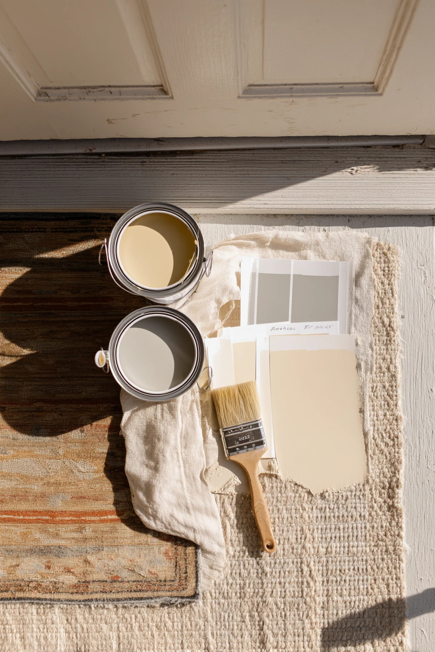
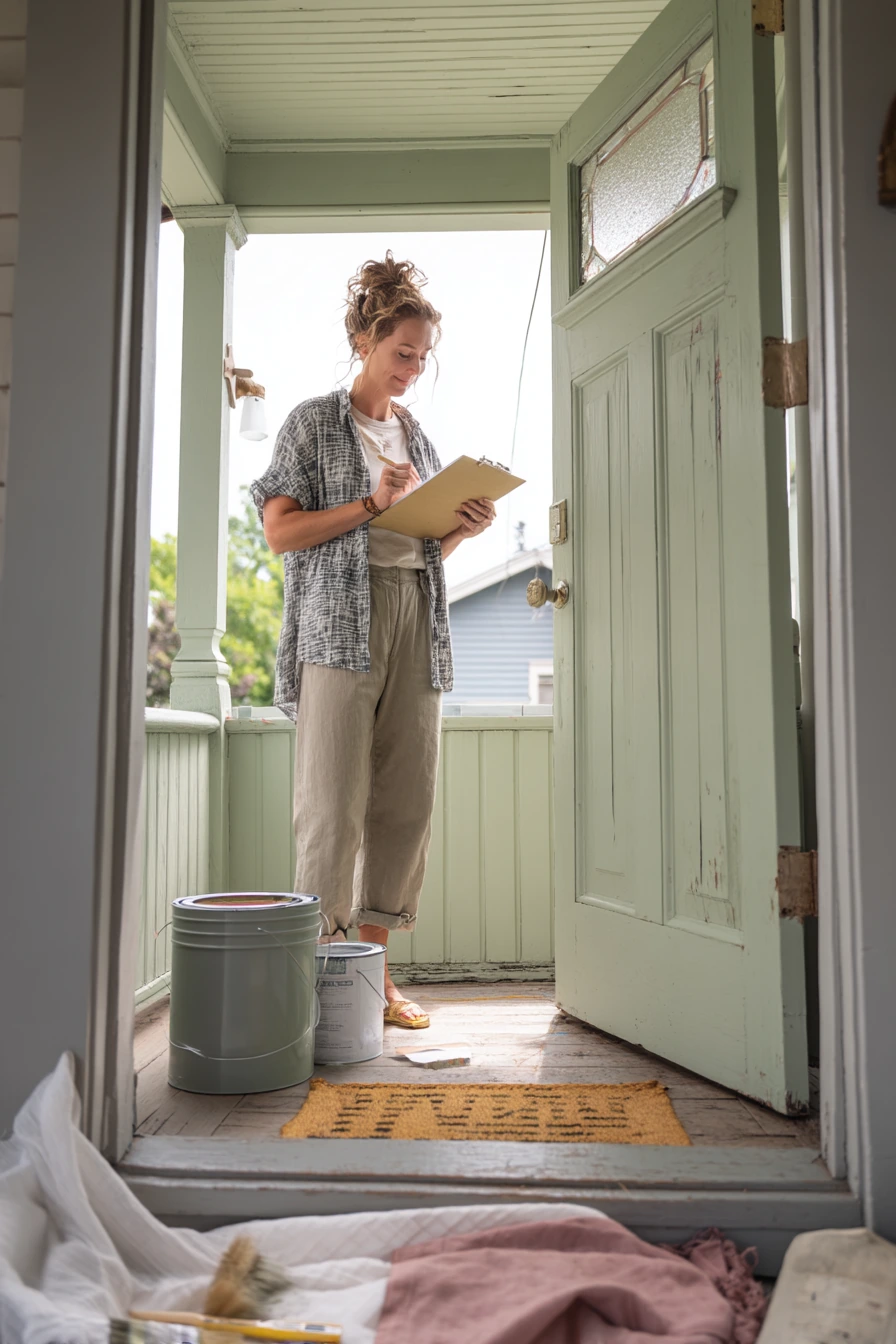
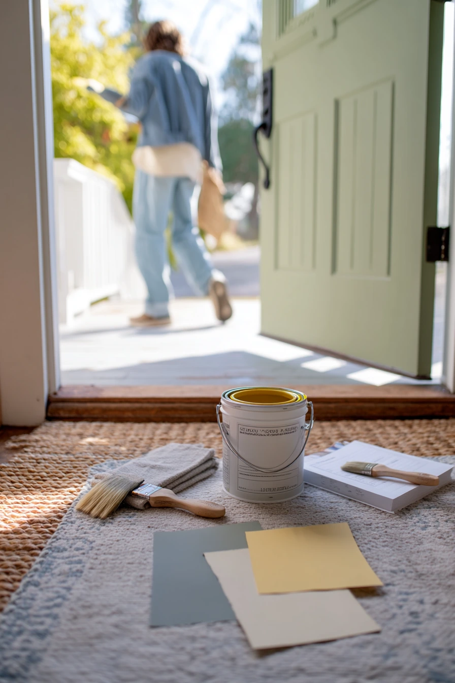
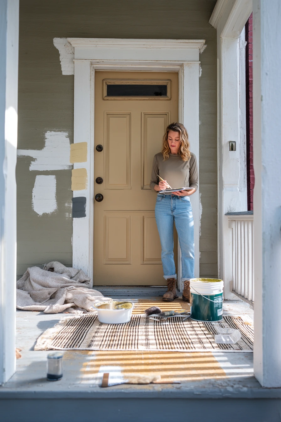
Choosing between porch paint colors is easier when you compare real samples in the same light. If you have three options pinned beside the door, like pale olive, dusty slate, and creamy sand, you can see which one works with your trim, roof, and walkway. Morning light often makes colors look cooler, so this is a good time to check if a shade turns too gray or too yellow.
Start by thinking about how you use the porch. If you have a porch rug that gets moved or folded back while you paint, pick a color that still looks good when the rug is off. Keep a notebook with color notes, like which sample looks best next to the door, and which one hides dirt. A half-open paint bucket and a brush in hand is a normal part of the process, so plan for drying time and a clear path in and out of the house.
As a general guide, pale olive feels soft and welcoming, dusty slate reads modern and calm, and creamy sand is warm and bright. The right choice depends on fixed items you are not changing, like brick, stone, or trim. Once you pick a winner, buy the right sheen. Floors usually do best with a porch-and-floor enamel in satin or low gloss for easier cleaning. Also check slip resistance, especially on steps.
- View samples in morning, afternoon, and evening to catch color shifts.
- Hold the samples next to trim, door color, and any brick or stone.
- Write quick notes on what you like and what looks off.
- Test at least a 2 foot square on the floor, not just a tiny patch.
- Choose a durable finish made for porches and steps to reduce scuffs.
Pro Design Tip: Pick the sample that looks best when you squint, since that shows the overall undertone and contrast without getting distracted by small details.
Budget Considerations: Use sample pots and paint poster boards first; it costs less than repainting after the full gallon dries a different color than you expected.
Porch paint colors work best when they match the way you live, not just a photo. Start with your fixed materials, then choose a main porch color that looks steady in your light.
If you want calm and classic, try sage green, chalky white, or warm beige. If you like richer contrast, go with terracotta and navy or greige with charcoal trim.
Test samples, pick a durable porch-and-floor paint, and style with a few useful pieces like a mat, a bench, and planters. Small choices add up to a porch that feels clean, welcoming, and easy to keep up.
FAQ
What is the best paint finish for a porch floor? A porch-and-floor enamel in satin or low gloss is a common choice because it cleans easily and holds up to foot traffic.
How do I choose a porch paint color that hides dirt? Mid-tone colors like dusty blue-gray, greige, and taupe usually hide dust and scuffs better than bright white or very dark black.
Should the porch match the front door color? It should coordinate, not match. A neutral porch color often looks best with a stronger door color like navy, olive, or rust-red.
Do I need to paint the ceiling of the porch? Not always, but a light color can brighten the space. A pale blue ceiling is a classic look on older homes.
How many paint samples should I test? Three is a good number. Test them in different times of day and next to your trim and door.
What is a quick, low-cost way to update a porch without repainting? Replace the doormat, add one outdoor rug, refresh planters, and update house numbers or a light fixture if needed.