
Painting kitchen cabinets is one of the fastest ways to change how a kitchen looks and feels. You can keep the layout, save money, and still get a fresh style.
This guide shares painting kitchen cabinet ideas based on real homes, from creamy white family kitchens to deep navy apartment setups and warm putty beige makeovers. Each idea includes color pairing tips, hardware choices, and simple ways to style the counters without looking staged.
You will also learn what works for busy life, like kid stuff on the island, a coffee station, a narrow runner, or open shelves with mismatched dishes. These details matter because they are what you see every day.
Use the sections to pick a cabinet color that fits your light, your counters, and your habits. Each section ends with a pro design tip and a budget note to help you plan.
1 Fresh White Cabinets, Real Family Morning
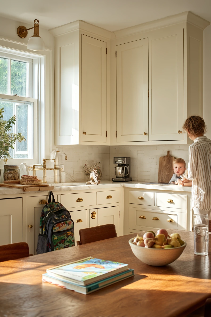
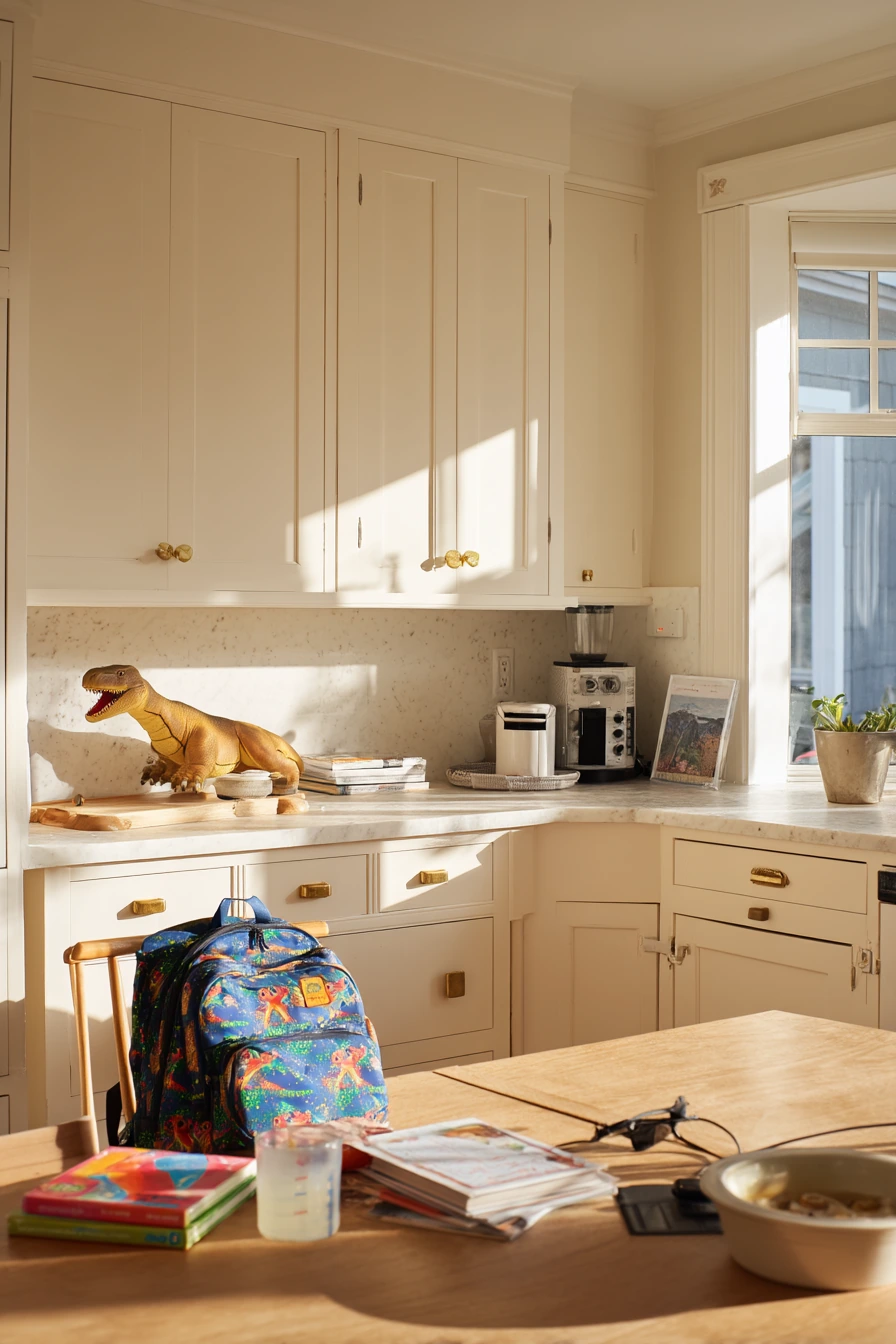
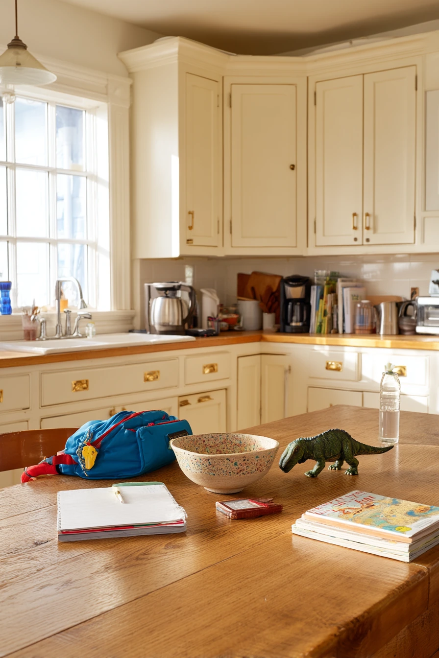
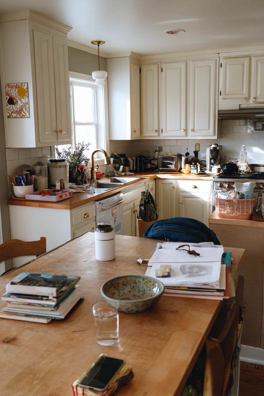
Creamy white painted cabinets are a safe choice when you want the room to feel brighter but not cold. In a busy family kitchen, this color hides small dust better than bright white, and it pairs well with worn oak furniture. Add brass pulls to warm it up and keep the look classic.
To make creamy white feel real, lean into everyday items. A chipped ceramic fruit bowl, a stack of cookbooks, and a half-full water glass give the space life. Keep the counters mostly clear, but allow a few daily-use pieces like a coffee setup near the window light.
Style the island for family flow. Leave a spot for a child’s backpack or a small toy bin so clutter has a home. Use one tray to hold the phone charging cable and keys, so the “drop zone” looks tidy even when it is in use.
- Choose creamy white when your kitchen gets soft window light and you want a sun-drenched feel.
- Pair with brass pulls for warmth and a slightly vintage look.
- Balance white cabinets with a worn oak table or wood stools to avoid a flat finish.
- Use a ceramic fruit bowl and one cookbook stack to add texture without mess.
- Create a charging station on a small tray to control cords on the counter.
Pro Design Tip: Pick a creamy white with a small yellow or beige undertone, then test it next to your countertop at morning and late-day light so it does not turn gray.
Budget Considerations: If new brass hardware is pricey, mix in a few statement pulls on main drawers and use matching knobs on the rest to lower the total.
2 Navy Lower Cabinets in a Busy Small Kitchen
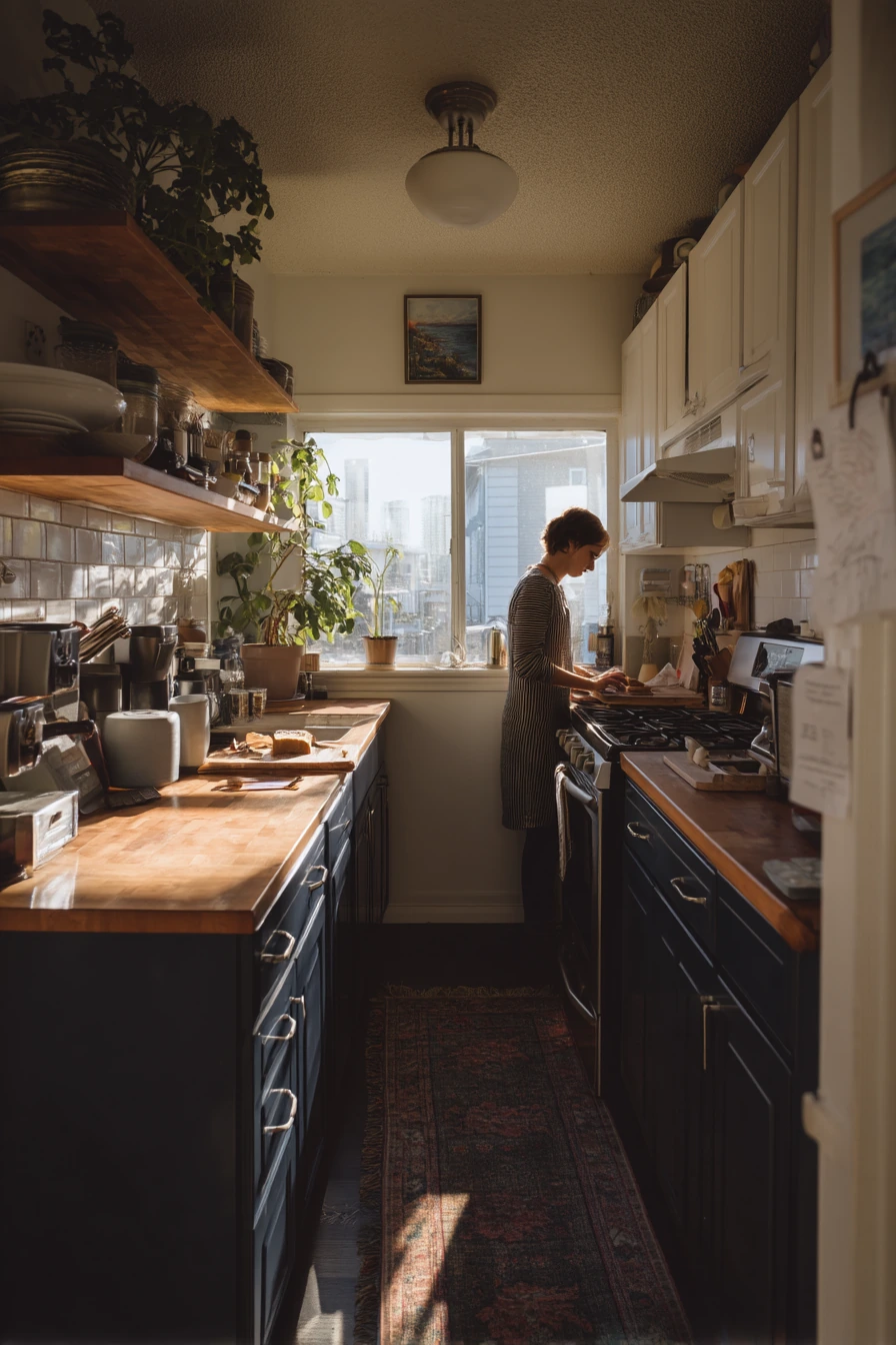
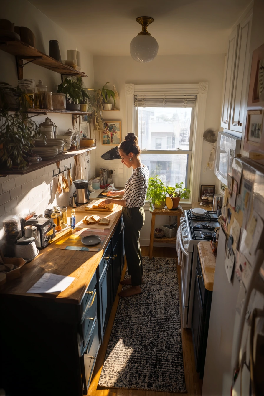
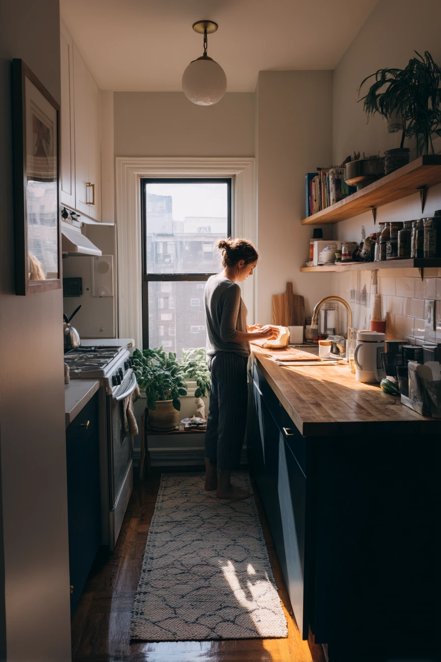
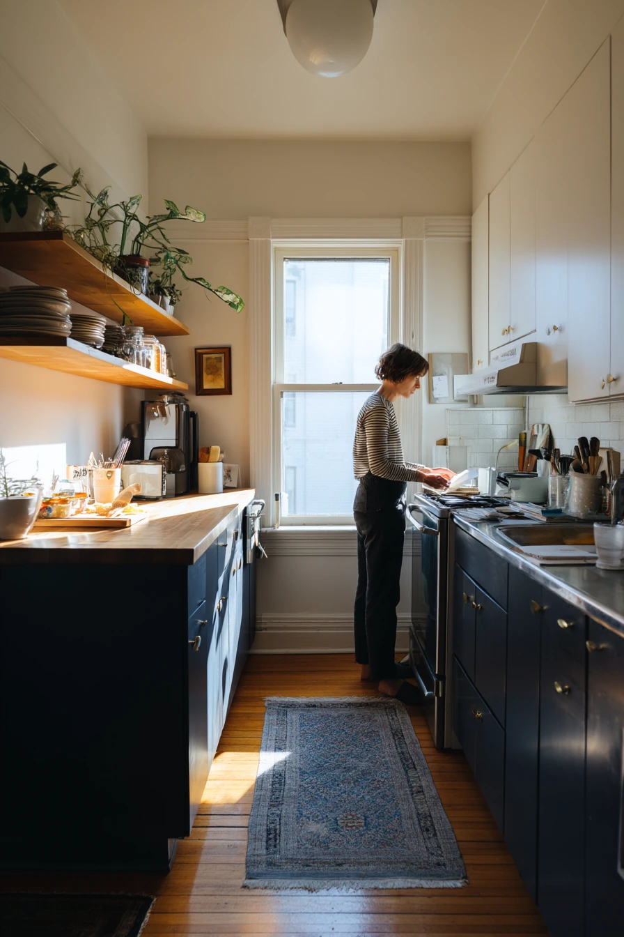
Deep navy painted lower cabinets can make a compact apartment kitchen feel grounded and clean. Keeping warm white uppers helps the room feel open, especially with soft morning window light. This two-tone approach also makes upper cabinets blend in so the space feels less boxy.
Butcher block counters are a natural match for navy because the wood tone adds warmth and breaks up the dark color. A slim floating shelf can hold the everyday basics like a mug, salt, and a small jar of oats. Keep your “real-life clutter kept tidy” by grouping papers and mail in one shallow tray.
For styling, add one plant that works hard, like basil near the window. It looks good and is useful for cooking. A narrow runner down the main walkway softens sound and adds pattern. Choose a washable rug since this is often the busiest path in a small kitchen.
- Use navy on lowers to hide scuffs where shoes and bags bump the cabinets.
- Keep warm white uppers so the room stays bright and practical.
- Pair navy with butcher block for a calm, natural contrast.
- Style a floating shelf with only daily-use items so it does not look crowded.
- Use one tray to corral mail, a grocery receipt, and small papers.
Pro Design Tip: Match your navy to the darkest tone in your runner or backsplash so the whole palette feels planned, not random.
Budget Considerations: If butcher block is out of reach, look for a good-quality wood-look laminate that has a matte finish and warm grain.
3 Sage Green Cabinets for a Soft Cottage Feel
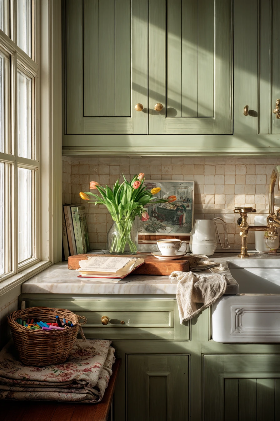
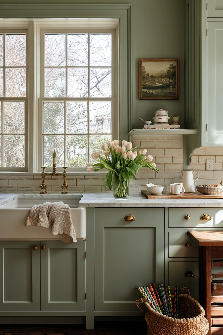
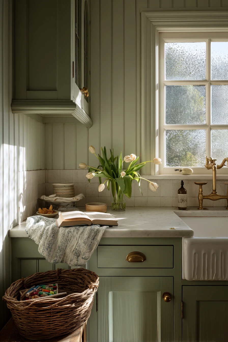
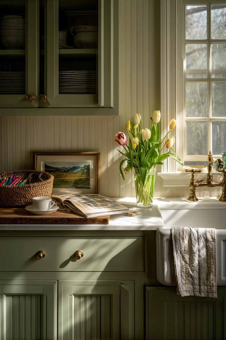
Sage green painted cabinets bring a gentle, cottage feel without looking too themed. This color works well with cream tile and beadboard backsplash because it sits in the middle of warm and cool. Add aged brass knobs to keep the room soft and traditional.
To style this look, focus on small, cozy details. A grocery-store tulip vase on the counter adds color that is not permanent. A wrinkled tea towel and an open cookbook make the kitchen feel used in a good way. If you have kids, a basket of crayons on a bench keeps supplies close but not scattered.
Keep the palette calm so the sage stands out. Choose cream or off-white accessories, then add one natural wood cutting board for warmth. If you have an enamel sink, let it be a feature by keeping the area around it simple and clean.
- Pick a sage green that looks muted, not bright, for a mellow cottage mood.
- Combine with beadboard backsplash for texture that fits older homes.
- Use aged brass knobs to add warmth and a little patina.
- Style with tulips and one wood cutting board for easy, low-cost charm.
- Use a basket on a bench to hold kids’ crayons and keep the table clear.
Pro Design Tip: Choose a slightly gray sage if your kitchen has warm afternoon light, so the color stays steady and does not turn too yellow.
Budget Considerations: Beadboard can be done with thin panels or peel-and-stick options; paint it the same tone as your trim to keep costs down.
4 Renters’ Paint Update with Peel-and-Replace Hardware
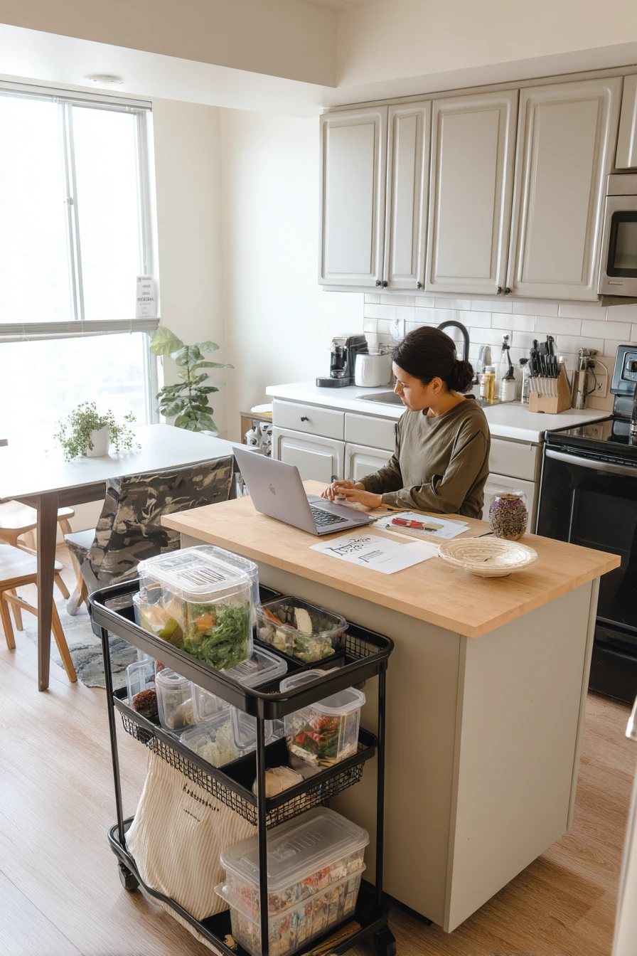
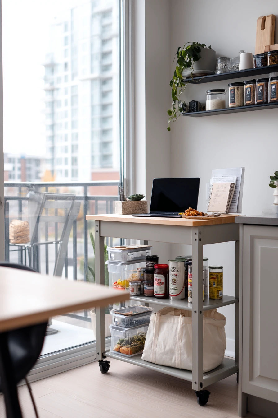
Light greige painted cabinets are a smart rental kitchen move because the color feels modern but still neutral. Greige sits between gray and beige, so it works with many floors and counters. Pair it with simple matte black hardware for a clean, updated look that does not need extra décor.
When you rent, flexibility matters. A portable island cart adds work space without a remodel. Open pantry bins inside a cabinet or on a shelf make it easier to stay organized, even if the storage is awkward. A removable backsplash film can add pattern and wipe clean, which is helpful for cooking nights.
Style this kitchen to look calm and functional. Keep one houseplant near the window for life and color. Use a reusable tote and a takeout menu in a small basket so daily items are easy to find. If you sometimes work at the table, a laptop can live in a slim caddy that moves to a drawer when guests come.
- Choose light greige to blend with many rental floors and counters.
- Swap to matte black hardware for a quick, high-impact change.
- Add a portable island cart to gain prep space without construction.
- Use open pantry bins to make small cupboards work harder.
- Try removable backsplash film for easy style that is not permanent.
Pro Design Tip: Keep your greige consistent with your wall color by matching undertones, then repeat black in two places, like hardware and a simple faucet, for balance.
Budget Considerations: Ask your landlord about painting first; if you cannot paint, use peel-and-stick vinyl wraps on flat cabinet fronts for a similar effect.
5 Two-Tone Cabinets Around a Sunday Lunch Mess
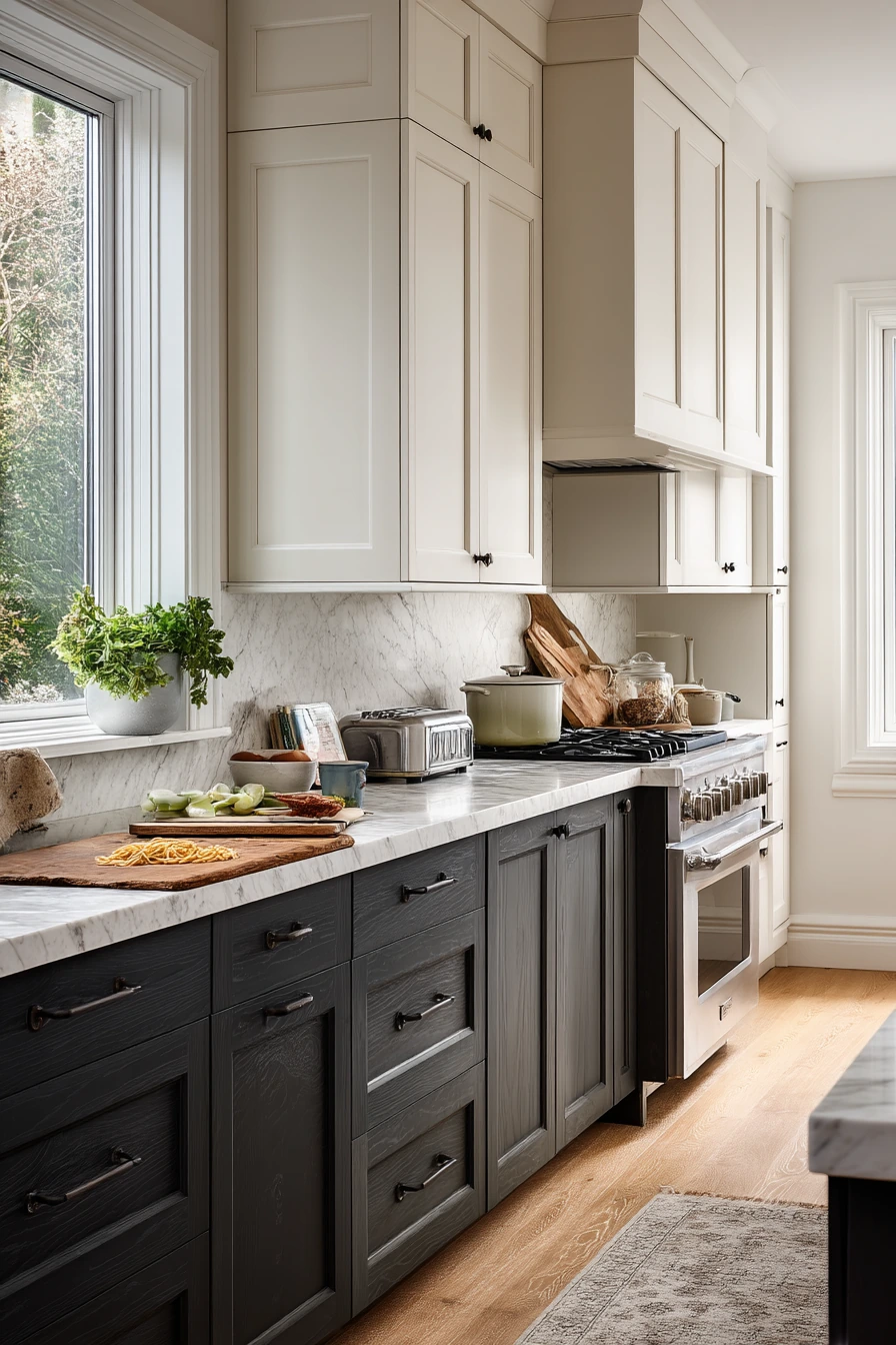
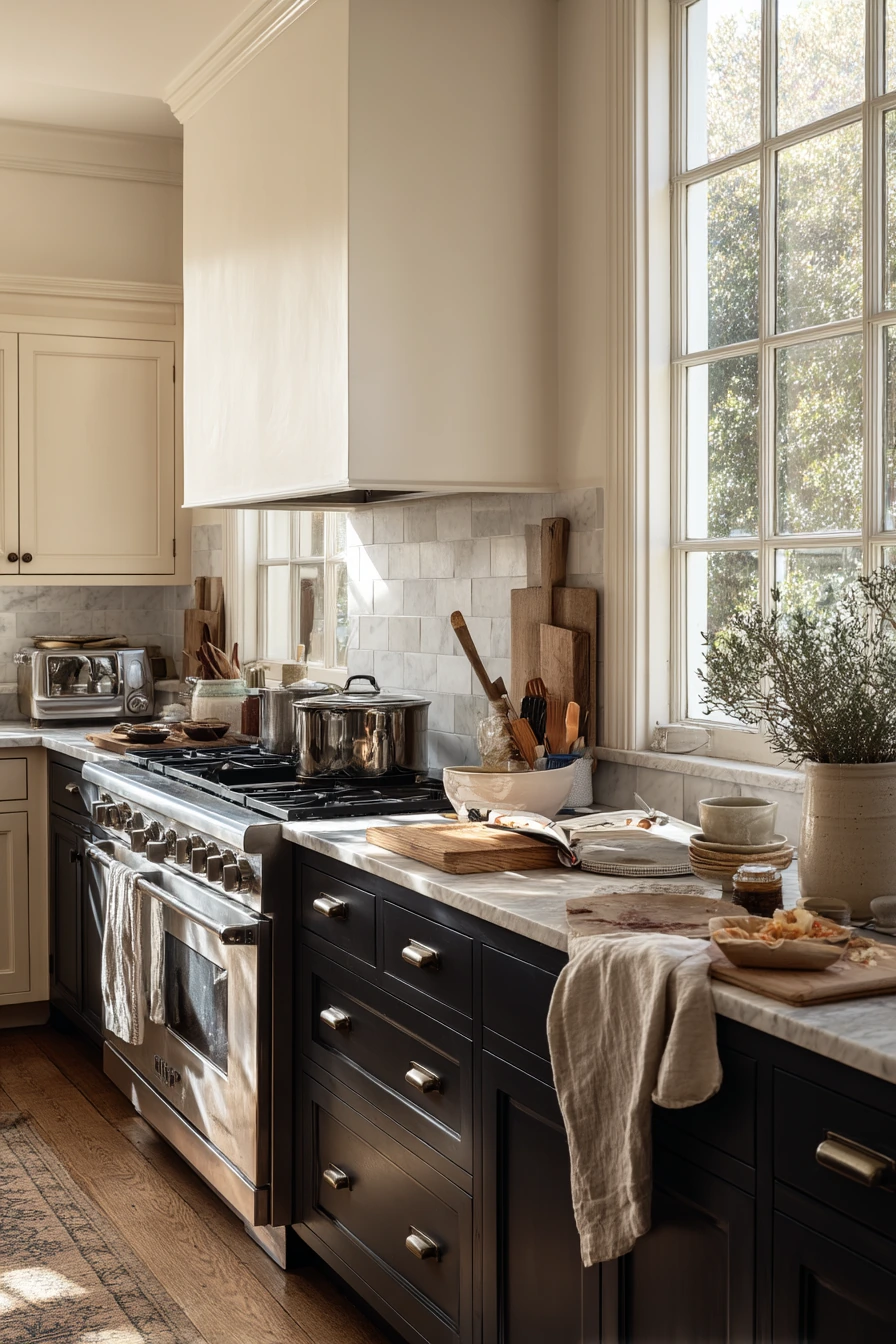
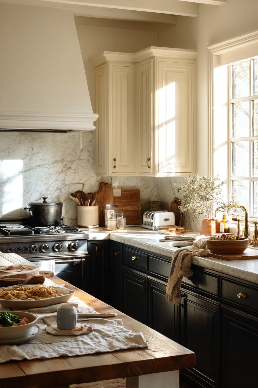
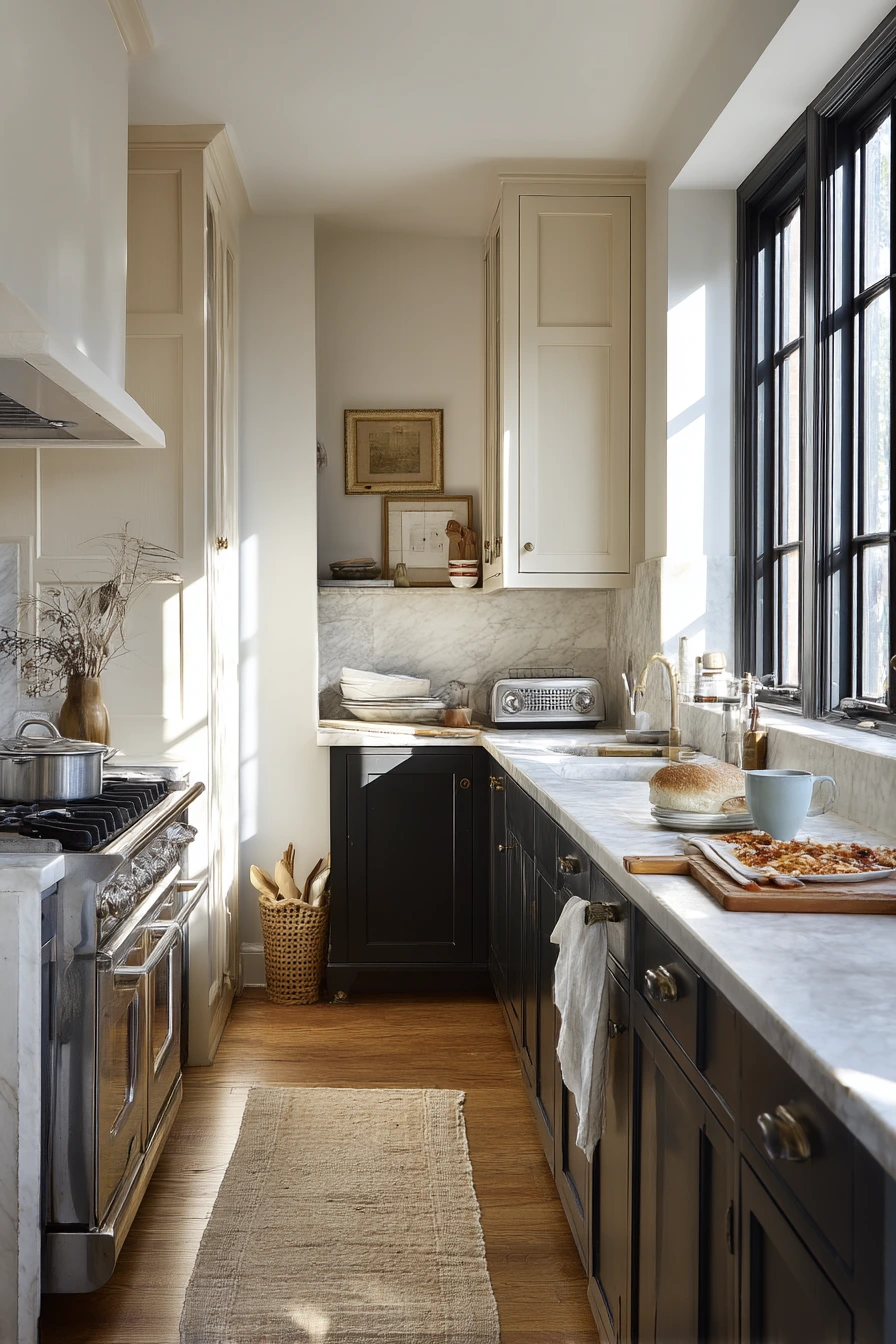
Two-tone cabinets with cream uppers and charcoal base cabinets are great when you want contrast without harsh lines. The cream keeps the top half light, while the darker base hides marks near the floor. This combo looks strong with marble-look counters and a vintage runner for softness.
This style fits an active kitchen because it does not demand perfection. A pasta pot on the stove, crumbs near the toaster, and a kid’s cup can exist without making the room feel messy. Add a chunky wooden cutting board as a daily landing spot for snacks, bread, or a quick lunch prep.
To style it, keep most surfaces simple, then add a few textures. Use one wrinkled dish towel for a relaxed look, not a pile. Leave an open recipe book on a stand if you cook often. If you want more warmth, bring in wood with stools or a small shelf.
- Use charcoal on base cabinets to handle wear in a high-traffic kitchen.
- Choose cream uppers so the room stays bright in late-morning light.
- Pair with marble-look counters for a clean, quiet contrast.
- Add a vintage runner to soften the dark base and protect the floor.
- Style with one thick wood cutting board and a single towel for texture.
Pro Design Tip: Keep your charcoal a true neutral (not too blue) if your cream is warm, so the two tones feel connected instead of competing.
Budget Considerations: Marble-look laminate or quartz-look solid surface can give the same feel as stone for less, and it is often easier to maintain.
6 Budget DIY Cabinets with a Painter’s Tape Moment
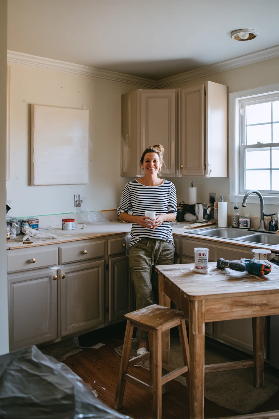
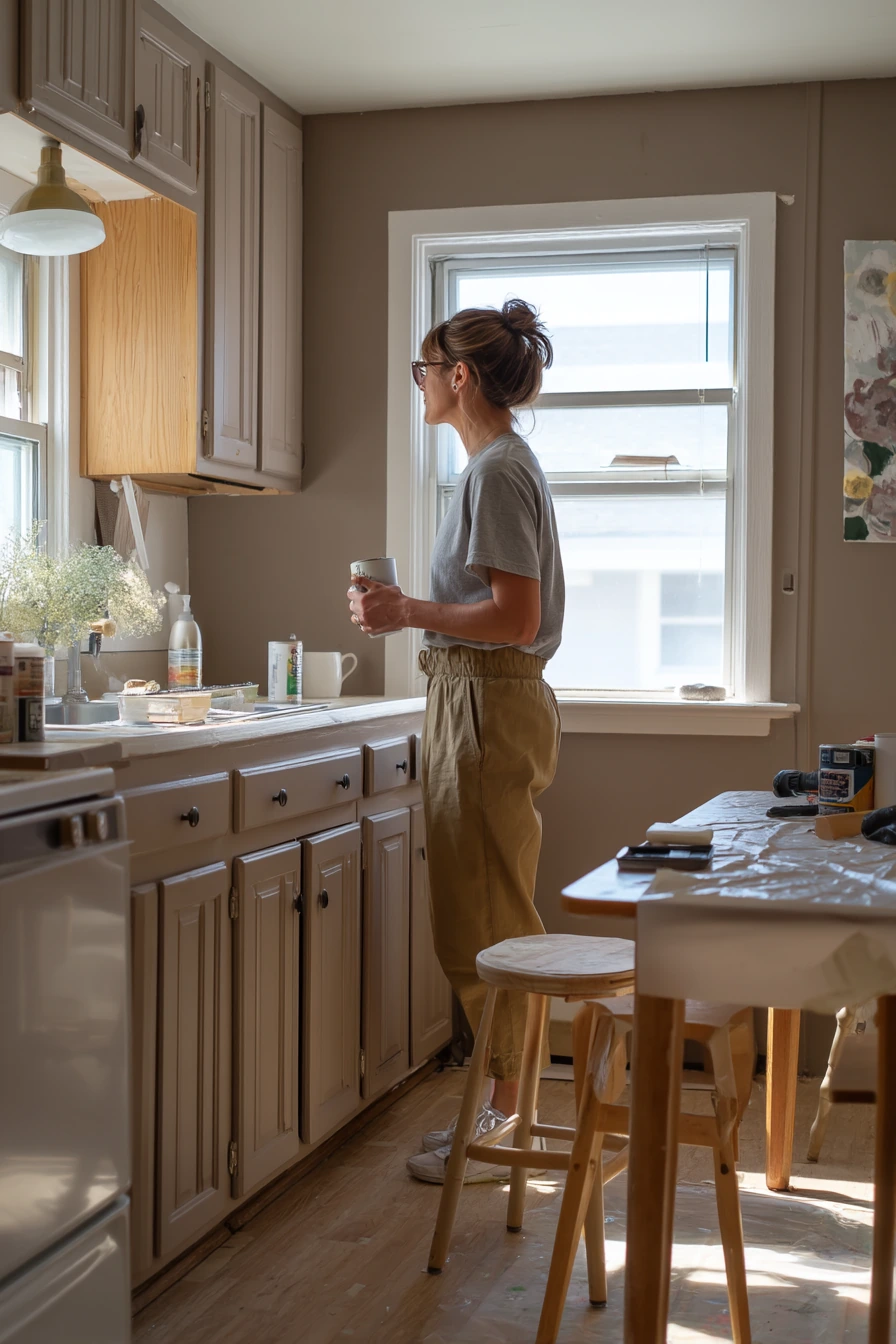
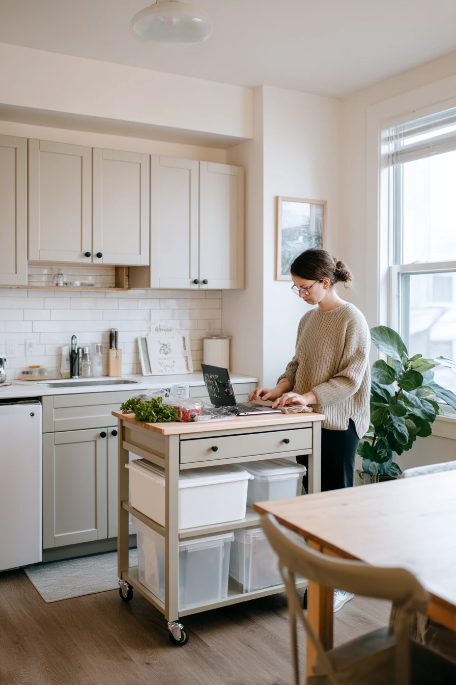
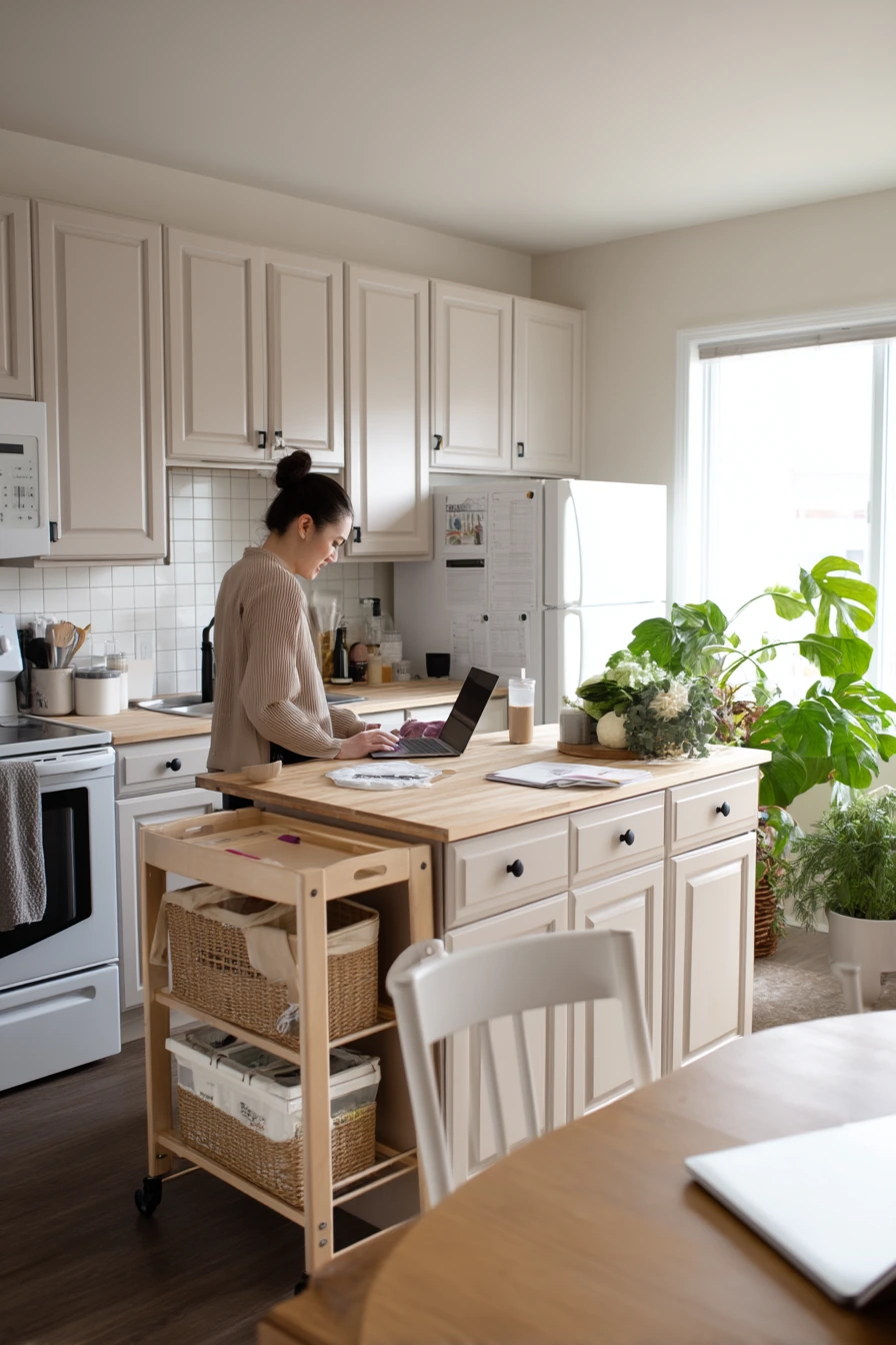
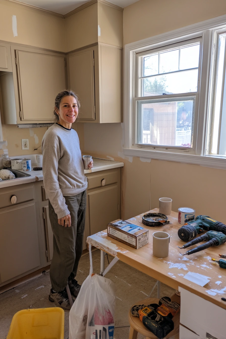
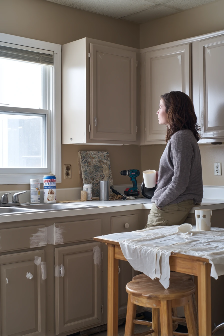
Soft mushroom taupe is a helpful cabinet color when you want something warmer than gray but not as yellow as beige. It looks calm in natural window light and hides small roller marks better than very dark paint. In a mid-refresh kitchen, this color still looks good even when the job is not finished.
Plan your DIY steps so your space stays usable. Keep painter’s tape on only the section you are actively working on, and label doors and drawers as you remove them. Set up a small “tool zone” on the table for the power drill, coffee mug, and extra screws, so you are not hunting for things.
Styling matters even during a refresh. Inexpensive ceramic knobs can look charming with taupe and feel softer than shiny metal. A thrifted stool can add character and give you a seat while you wait for coats to dry. Keep a drop cloth folded neatly when not in use to reduce the messy look.
- Pick mushroom taupe for a warm neutral that works with many counters.
- Use painter’s tape to protect edges, but remove it before paint fully cures.
- Keep a primer can and supplies near the sink for easy cleanup.
- Try ceramic knobs for an easy, classic finish on a budget.
- Add a thrifted stool to bring in lived-in style while you work.
Pro Design Tip: Sand lightly between coats and use a small foam roller on flat areas to reduce texture, then finish with a quality brush on edges.
Budget Considerations: Borrow or rent a sander and buy one good brush; tools you already own can matter more than pricey paint.
7 Moody Charcoal Cabinets in an Evening Home
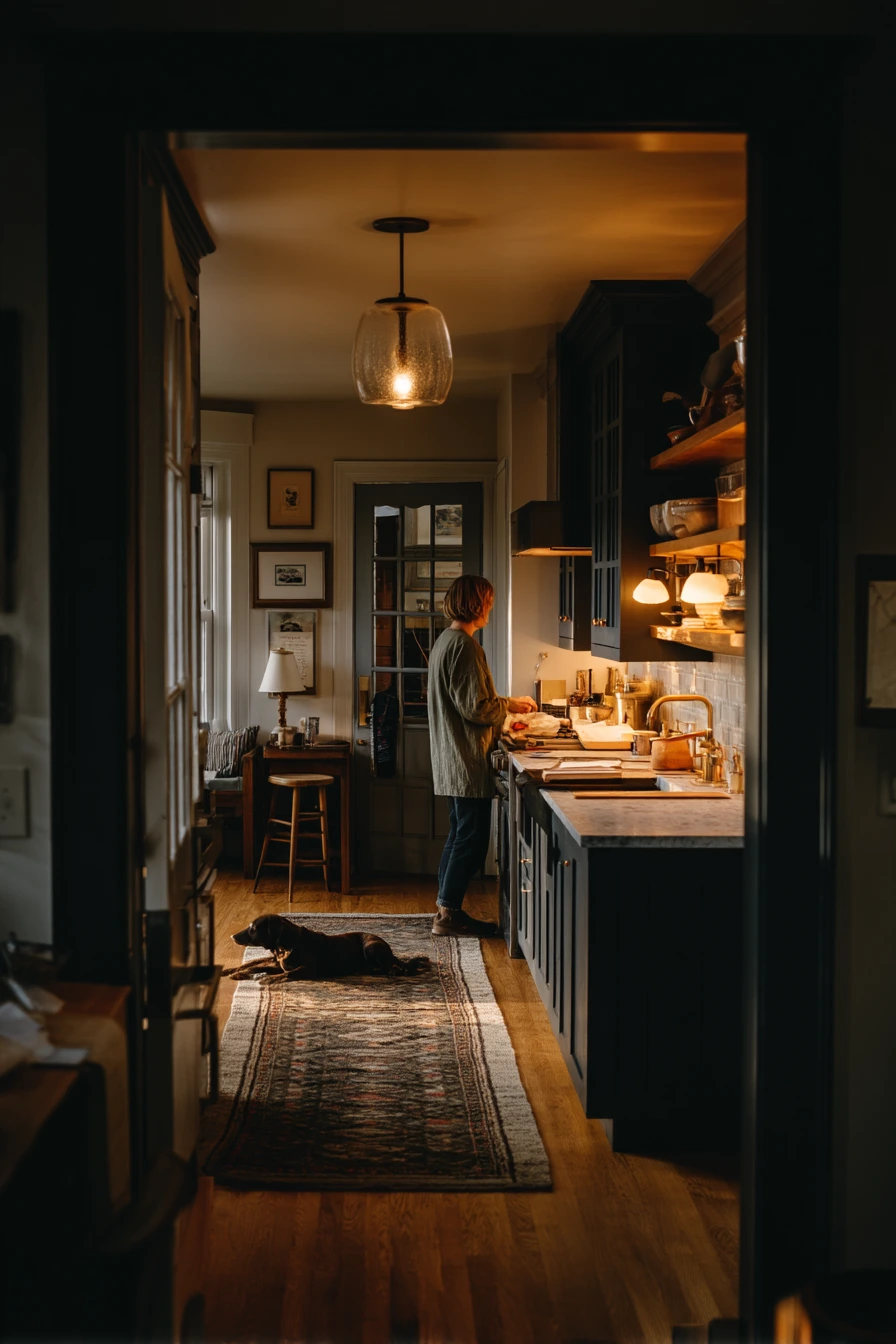
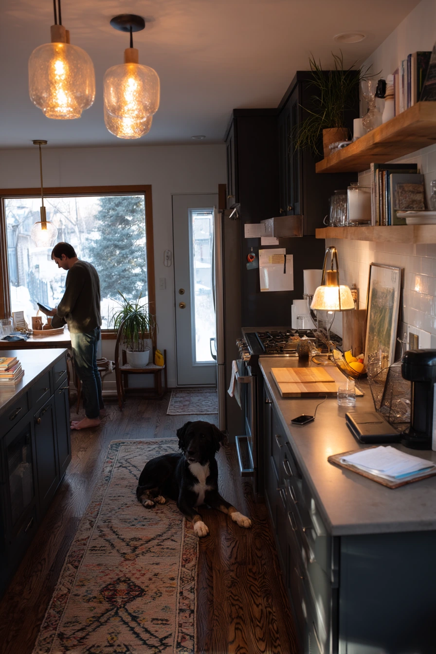
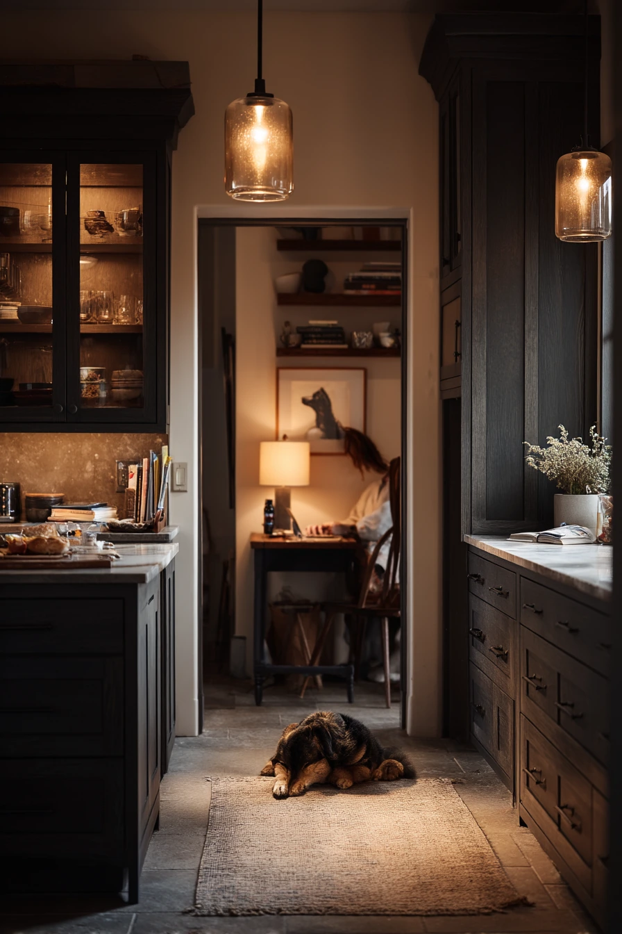
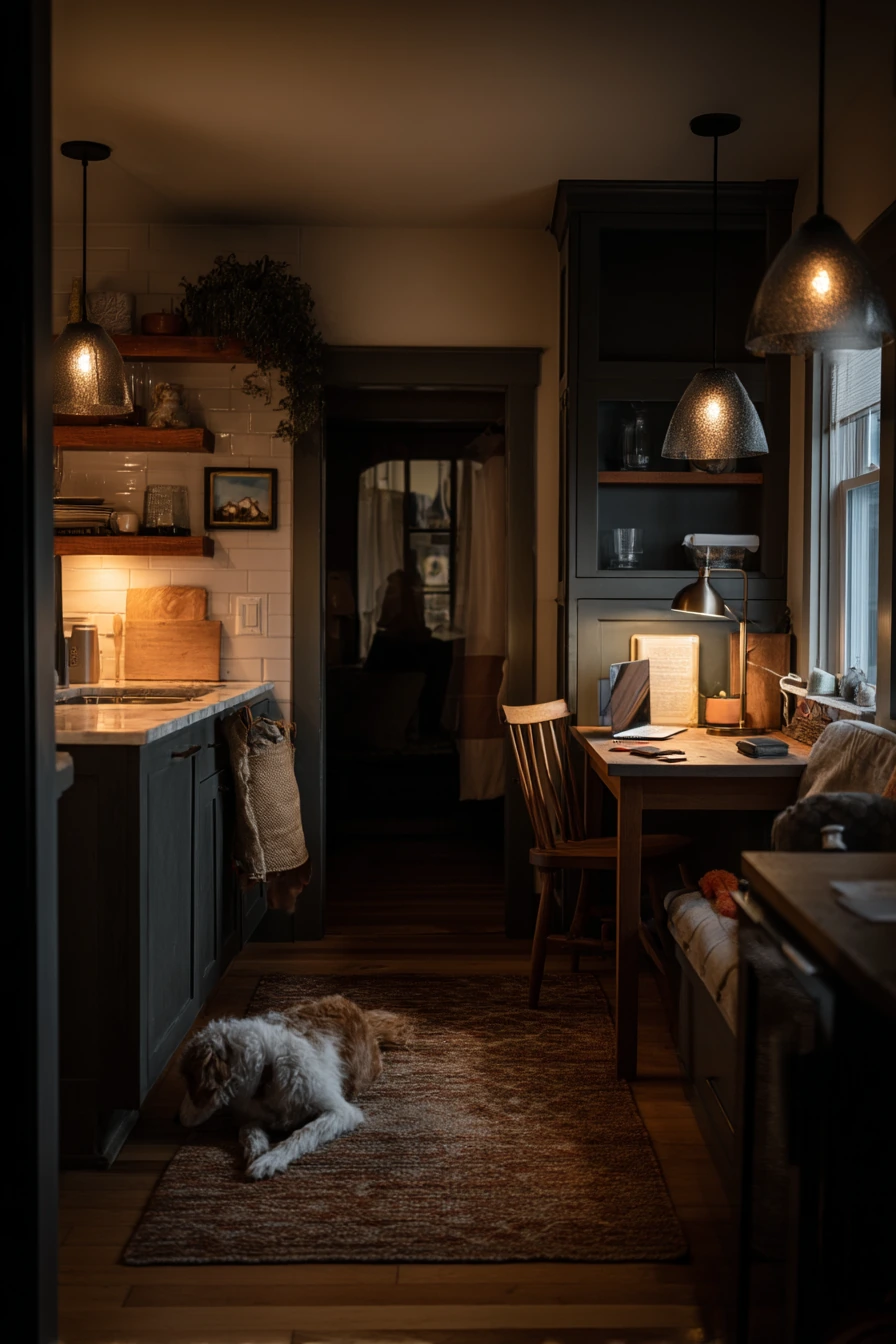
Charcoal painted cabinets create a moody kitchen that feels cozy at night. The key is warmth: add oak shelves, smoked glass pendants, and a pale stone counter so the room does not feel heavy. Deep shadows and amber tones can make this look feel intimate and relaxed after work.
Because dark cabinets show dust and fingerprints more, set up simple habits that keep the space looking good. Keep a small tray for mail and a spot for the laptop charger, so items do not spread. Use a rug that hides crumbs and is easy to vacuum, especially if a sleepy dog likes to rest nearby.
For styling, lean into contrast and glow. Warm bulbs in the pendants and a lamp in the dining nook make charcoal look rich instead of flat. Add one clear surface on the counter, then use a wood board or a stone bowl for texture. A single wine glass on a coaster can feel real and still tidy.
- Pair charcoal cabinets with warm oak shelves to soften the dark paint.
- Choose a pale stone counter to reflect light and balance the mood.
- Use warm lighting to keep charcoal from looking cold in the evening.
- Create a landing zone for groceries, mail, and cords to reduce clutter.
- Add a durable rug that can handle pets and daily traffic.
Pro Design Tip: Use a satin finish on charcoal cabinets for wipe-ability, then keep walls a soft warm white so the cabinet color stays the focus.
Budget Considerations: If new pendants are expensive, swap in warmer bulbs and add one plug-in lamp to get the same cozy effect.
8 Blush Painted Cabinets for a Gentle Family Space
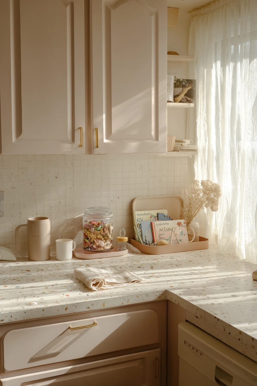
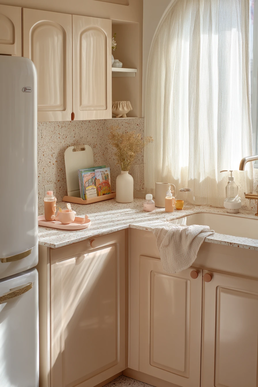
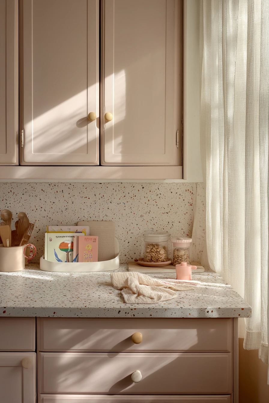
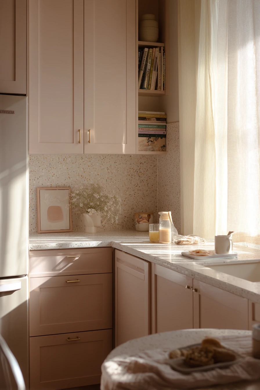
Blush-painted cabinets can feel gentle and clean when you keep the rest of the finishes simple. Creamy tile and rounded vintage handles make the pink tone look classic, not trendy. This is a good choice for kitchens that get sunlight through sheer curtains, because the color reads soft and airy.
In a family space, design should support daily routines. A toddler snack station near the fridge can keep little hands from pulling out everything. Use one tray, like pale terrazzo, to hold a sippy cup and tiny spoon so the counter stays organized. Add a folded bib hook nearby to prevent piles.
To style blush cabinets, choose a tight color mix. Cream, light wood, and small black accents keep the room grown-up. Picture books can be stored in one basket so the kitchen still feels like a kitchen. Keep your countertop décor low, so the cabinet color stays the main feature.
- Pick a blush that leans warm and muted for a calm look.
- Pair blush cabinets with creamy tile to keep the palette soft.
- Use rounded vintage handles to match the gentle style.
- Create a toddler snack station with one tray to prevent clutter.
- Store picture books in a basket so the counter stays open for prep.
Pro Design Tip: Repeat blush in a small way, like a tea towel stripe or a bowl, so the cabinet color feels intentional and tied to the room.
Budget Considerations: If you cannot change tile, use a washable cream runner and cream accessories to soften the look around blush paint.
9 Blue-Green Cabinets in a Light-Filled Breakfast Nook
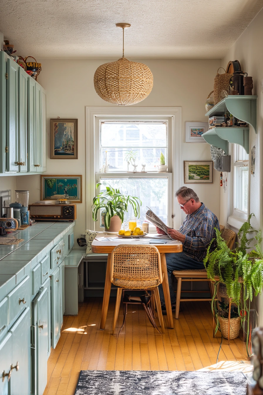
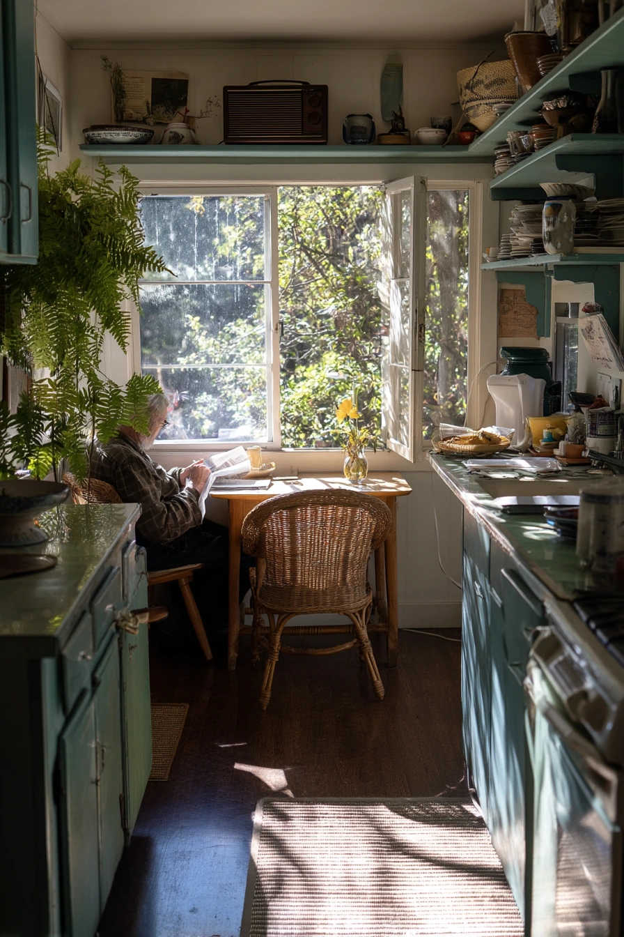
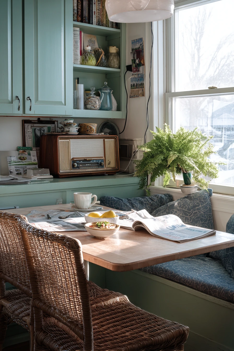
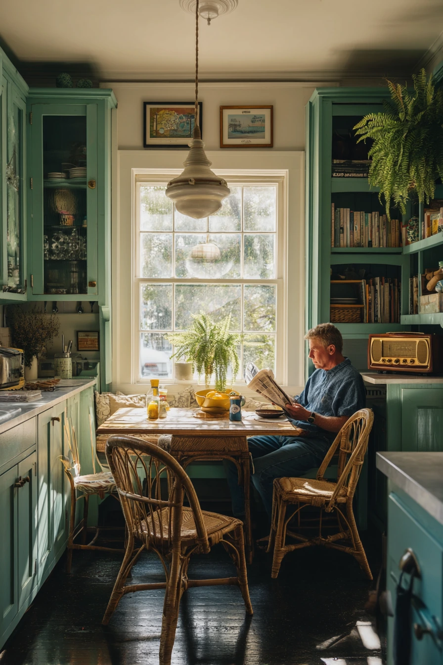
Blue-green painted cabinets are a strong choice for a kitchen that connects to a breakfast nook. The color feels fresh in soft morning light and pairs well with a white oak table and woven chairs. It also looks great with small vintage touches, like an old radio on a shelf.
For everyday styling, keep it simple and useful. A lemon bowl adds bright color and looks good year-round. Let breakfast dishes dry on a rack without hiding them, as long as the area stays clean. A charging cable can be part of real life, but give it one spot so it does not drape across the counter.
Plants look especially good with blue-green. A potted fern stretching toward the window adds movement and softness. Keep the rest of your accessories neutral, like clear glasses and white dishware, so the cabinet color stays the star. If you want a warmer feel, add a small wood cutting board or a cane tray.
- Choose a blue-green that feels balanced, not too bright or too gray.
- Pair with white oak for a crisp but warm breakfast nook look.
- Add woven chairs or baskets for texture next to painted cabinetry.
- Style with lemons and clear glass for easy, clean color accents.
- Use one plant, like a fern, to bring life without extra clutter.
Pro Design Tip: Make sure your blue-green works with your floor undertone; test a large sample near the base cabinets where the color will live.
Budget Considerations: If you cannot buy new woven chairs, add woven seat pads or thrift a single basket to get the same texture for less.
10 Before-and-After Feeling: Painted Cabinets, Still Home
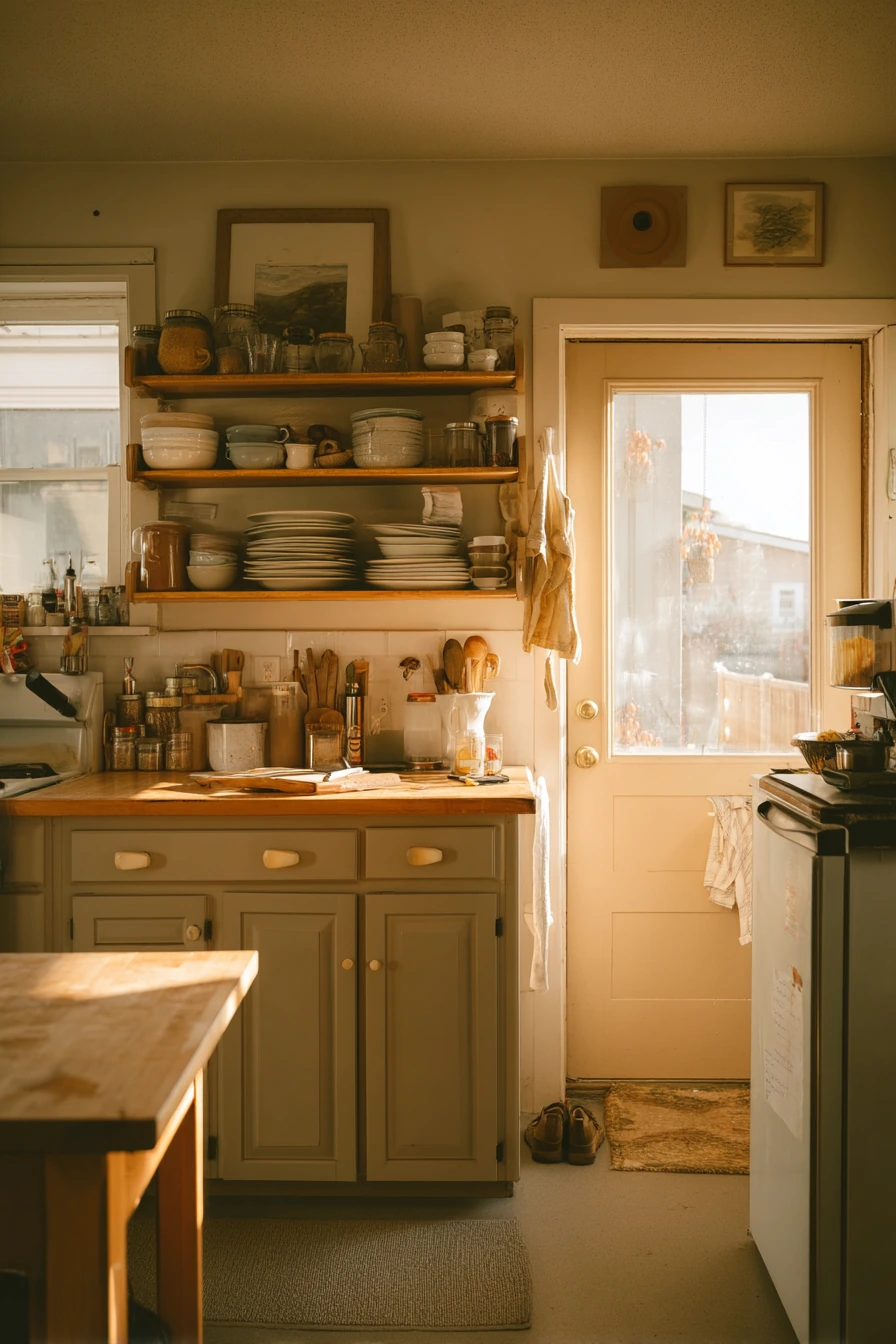
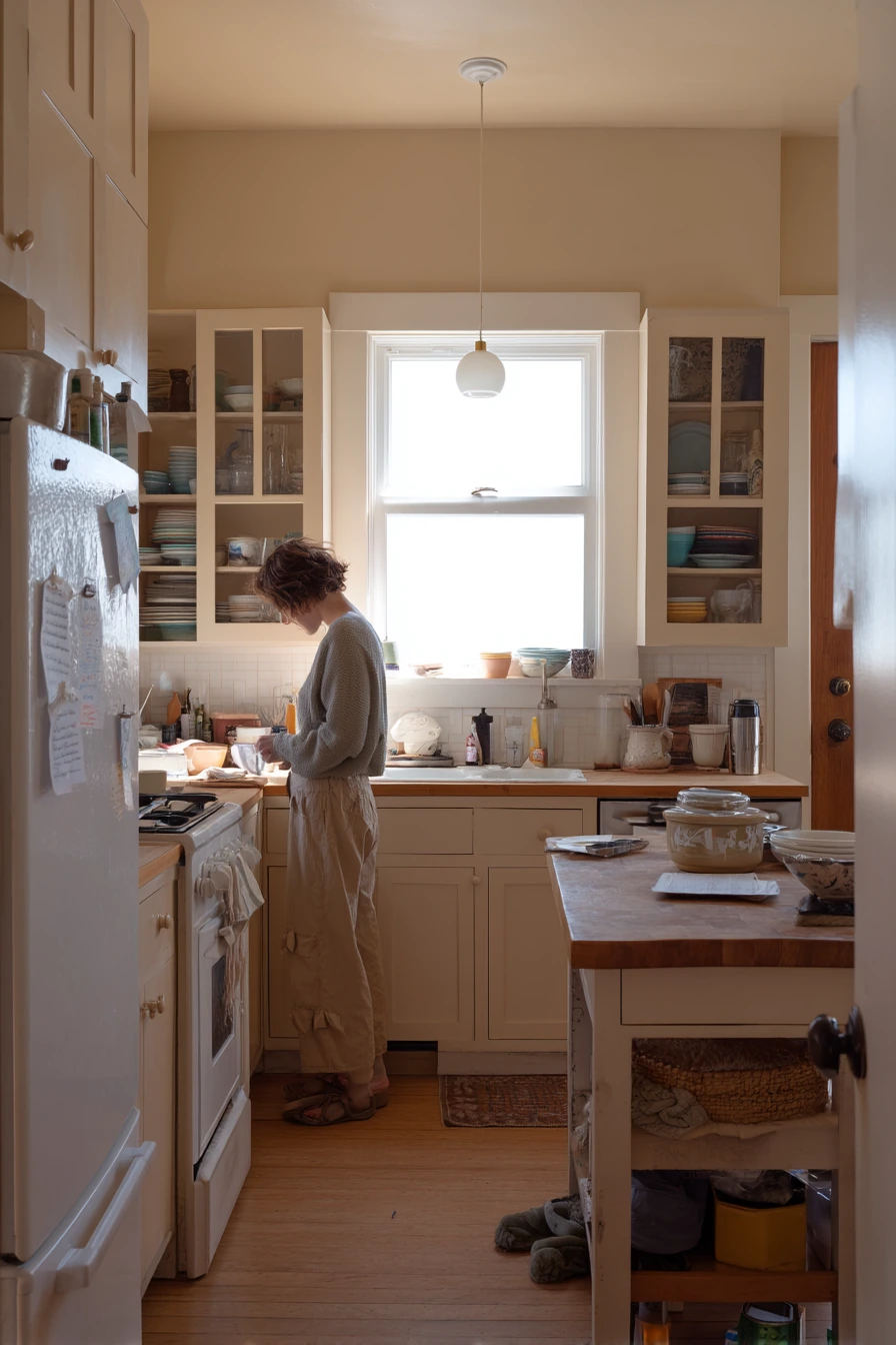
Warm putty beige cabinets are a great option when you want a fresh look but still want it to feel like your home. This shade is soft, earthy, and forgiving, especially in late golden window light. Keeping the original cabinet frames can preserve character while the paint makes everything look updated.
Open shelving with mismatched dishes can look charming if you keep the shapes simple and the colors tied together. Choose mostly cream and white pieces, then add a few darker items for depth. A butcher block island adds warmth and gives you a work surface that fits the relaxed, real-home feel.
For styling after dinner, keep it honest but calm. A homeowner wiping the counter, a pot lid drying, and a napkin stack can stay out if they are grouped neatly. Hide the shoe pile near the back door with a small mat and a basket. A grocery list on the fridge is fine, but limit it to one clip or one magnet area.
- Pick warm putty beige for a soft neutral that suits many kitchens.
- Preserve original frames if they are solid to keep a classic look.
- Style open shelves with a simple color mix so mismatched dishes look planned.
- Add a butcher block island to warm up beige cabinetry and increase prep space.
- Create one drop zone near the door for shoes, bags, and lists to reduce mess.
Pro Design Tip: On open shelving, repeat three item types, like bowls, plates, and glasses, and leave a little empty space so the shelf looks clean.
Budget Considerations: If new shelves are too costly, paint the wall behind existing shelves and edit your dish display to get a similar “after makeover” effect.
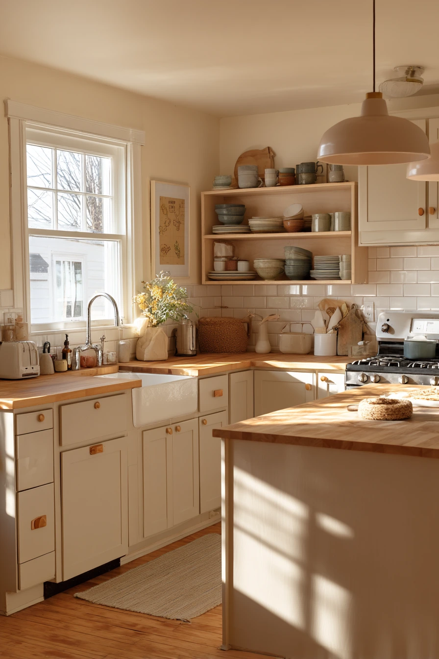
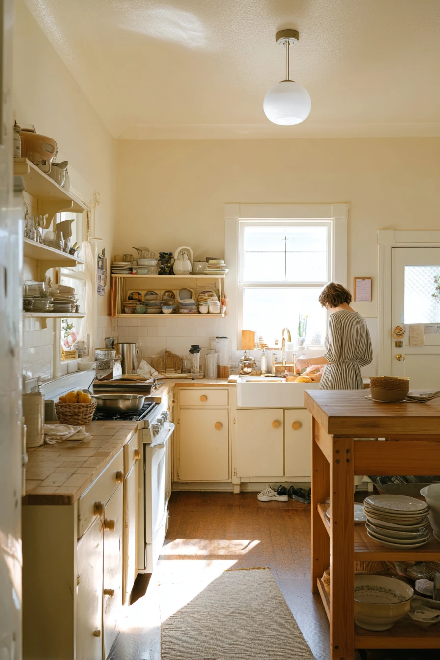
Painting cabinets can make a kitchen feel cleaner, warmer, or more modern without changing the layout. The best color is the one that fits your light, your counters, and how you live in the space.
Use these painting kitchen cabinet ideas to choose a palette, then finish the look with hardware, a runner, and a few practical counter zones. Small styling choices, like trays, baskets, and one good plant, keep the room looking pulled together.
FAQ
1) What is the best paint finish for kitchen cabinets? Satin or semi-gloss is usually best because it wipes clean. Satin looks a bit softer, while semi-gloss is tougher and shinier.
2) Do I need primer before painting cabinets? Often yes, especially if the cabinets are glossy, stained, or have knots. Primer helps paint stick and improves the final color.
3) How do I choose between white, greige, and beige cabinets? Look at your counters and floor undertones. White brightens, greige feels modern and flexible, and beige adds warmth and hides dirt better.
4) Are dark cabinet colors like navy or charcoal hard to maintain? They can show dust and fingerprints more. A good satin finish, soft-close hardware, and quick daily wipe-downs help a lot.
5) Can I paint cabinets in a rental? It depends on your lease and landlord approval. If you cannot paint, consider removable vinyl wraps, new knobs, and peel-and-stick backsplash options.
6) What hardware looks best with painted cabinets? Brass warms up whites and greens, matte black looks clean with greige and modern colors, and ceramic knobs work well for cottage and soft neutrals.
7) How long should cabinet paint cure before heavy use? Paint can feel dry in a day, but curing takes longer. Try to be gentle for about 1 to 2 weeks, and avoid harsh cleaners until fully cured.