
Two tone kitchen cabinet ideas are popular because they make a kitchen feel more personal and more useful. Using two colors or finishes can add contrast, help a small room look taller, and hide everyday wear where it happens most.
In this post, you will see two tone kitchen cabinets in real homes, from warm oak lowers with creamy uppers to deep navy islands with soft white wall cabinets. Each section includes simple styling ideas you can copy, plus a pro design tip and a budget note.
If you came from Pinterest, use this guide to pick a color pair that fits your light, your counters, and your routine. You will also learn small choices that matter, like hardware finish, open shelves, and where to place the darker tone.
These examples keep the messy, lived in details too: mugs on an open shelf, mail on the island, a lunchbox by the sink, and a kettle steaming. That is the point, because a kitchen should look good on a normal day.
1 Oak Base, Cream Upper in a Busy Family Kitchen
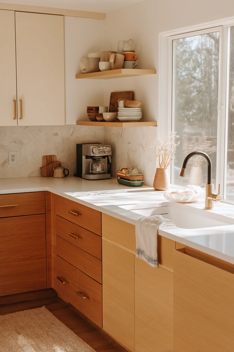
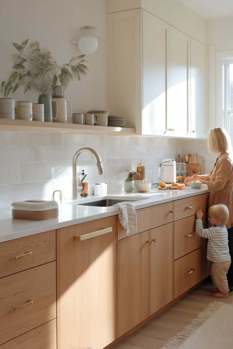
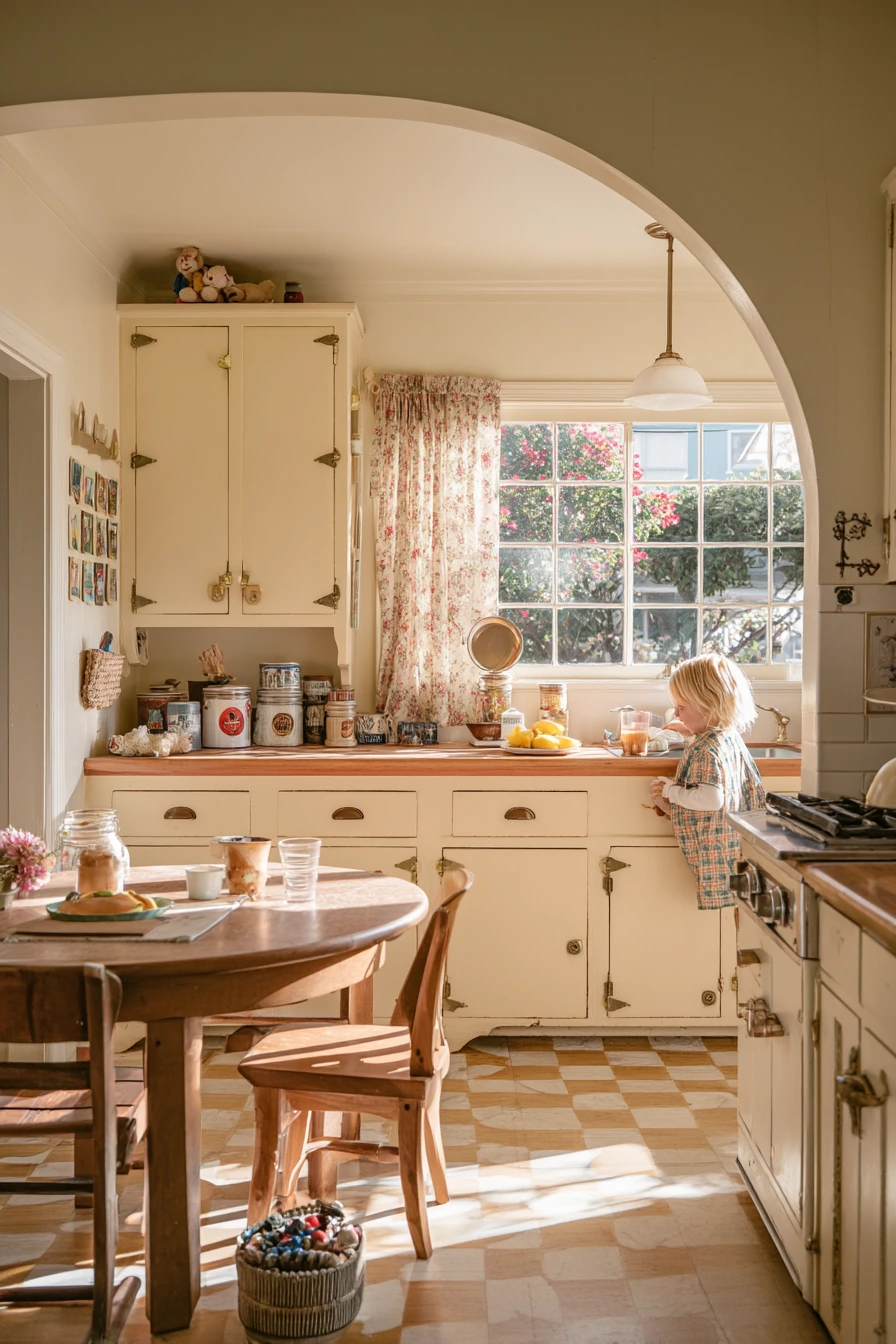
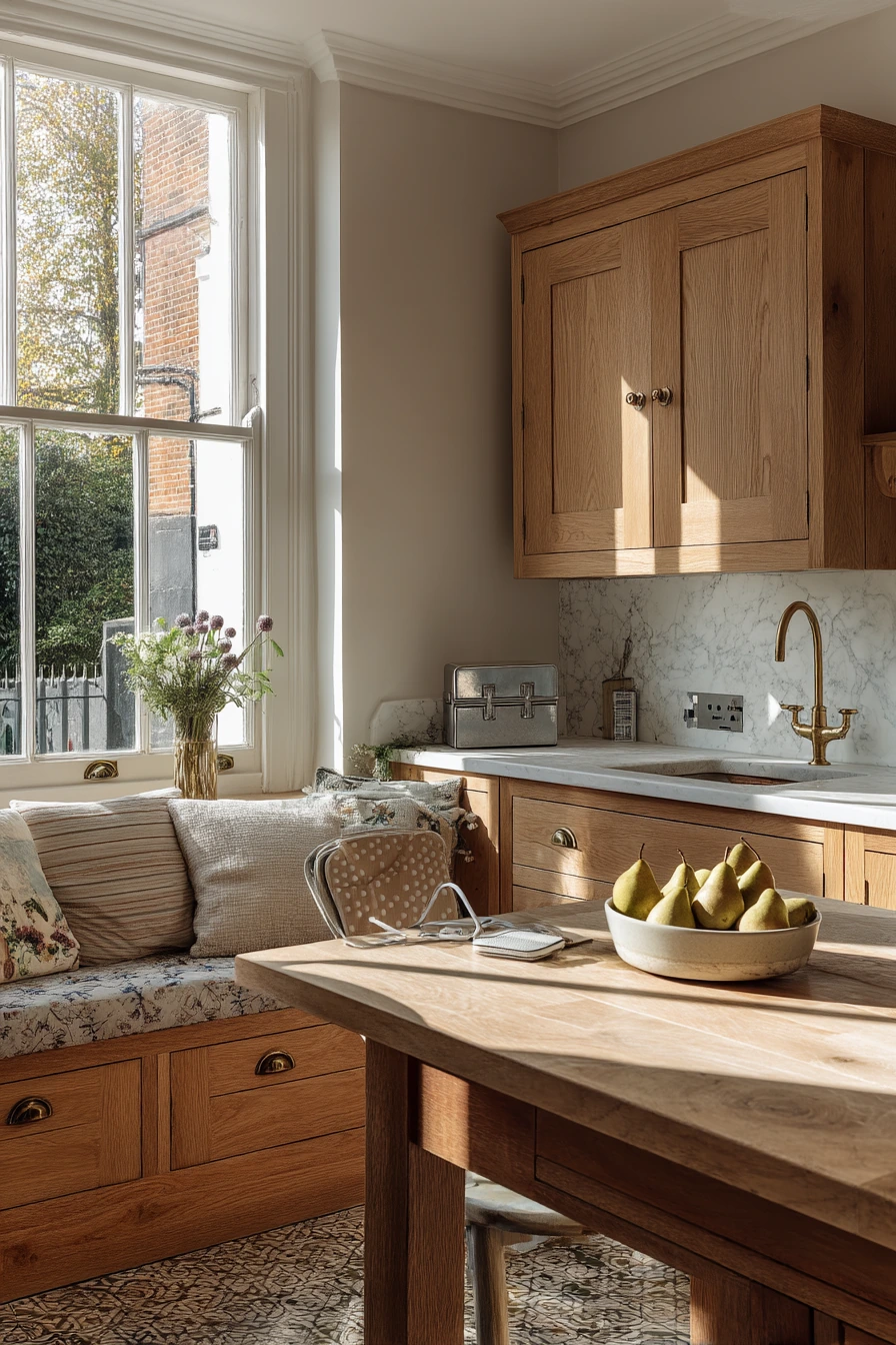
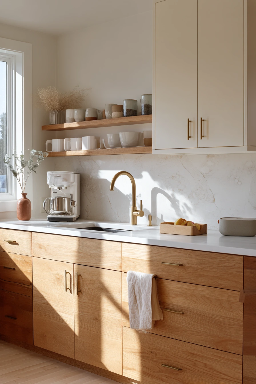
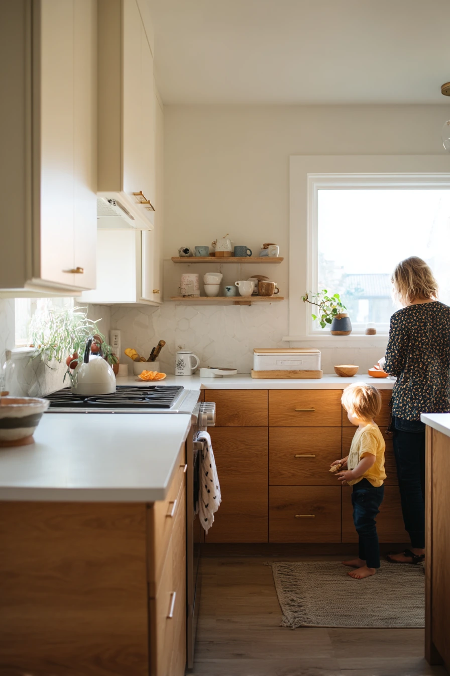
Warm oak lower cabinets with creamy upper cabinets are a safe, welcoming two tone kitchen cabinet idea for a busy family. The wood base adds warmth and hides scuffs, while the lighter uppers keep the room airy in natural window light. This pairing also works well with quartz counters because the soft veining ties the two tones together.
Style it like a real home, not a showroom. Add an open shelf with everyday mugs, a child’s snack bowl on the counter, and a slightly wrinkled tea towel near the sink. Matte brass pulls are a strong match here because they look warm next to oak and still stand out against cream paint.
To keep it cohesive, repeat the wood tone in one or two places. A small cutting board, a stool, or picture frames can do the job. If you have plant shadows across the backsplash, keep the backsplash simple so the light becomes part of the look.
- Choose a creamy white, not a bright white, so it blends with oak.
- Use quartz counters in a warm white or beige base for an easy match.
- Limit open shelving to one section to avoid visual clutter.
- Pick matte brass pulls for a soft contrast that does not feel shiny.
- Add a washable runner to handle spills and snacks.
Pro Design Tip: Keep the uppers one shade lighter than the counters and backsplash so the top half of the room feels taller and brighter.
Budget Considerations: If new oak cabinets are pricey, use oak veneer panels on existing bases or add oak toe kicks to bring in the wood look for less.
2 Navy Island, Soft White Perimeter in a Small City Apartment
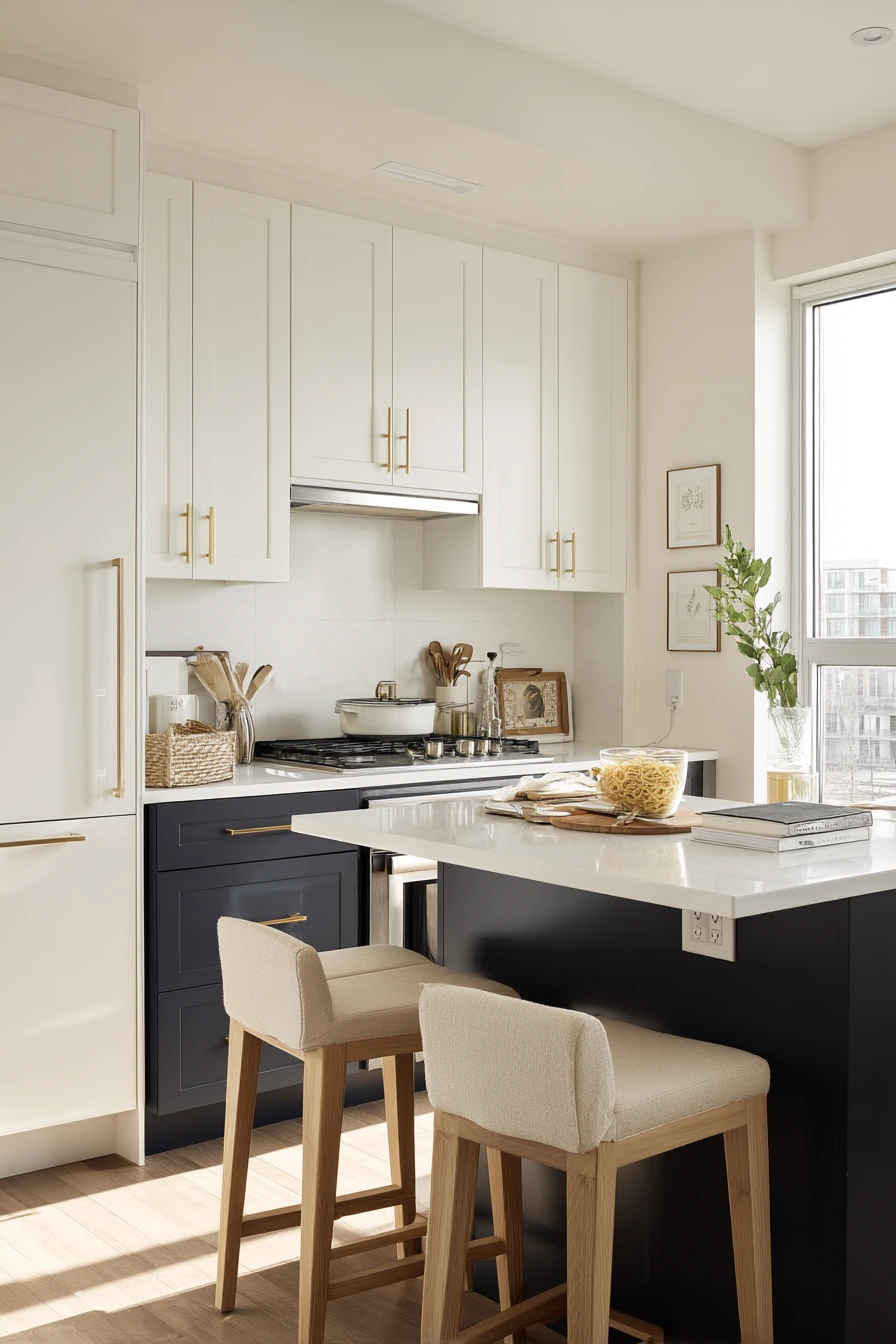
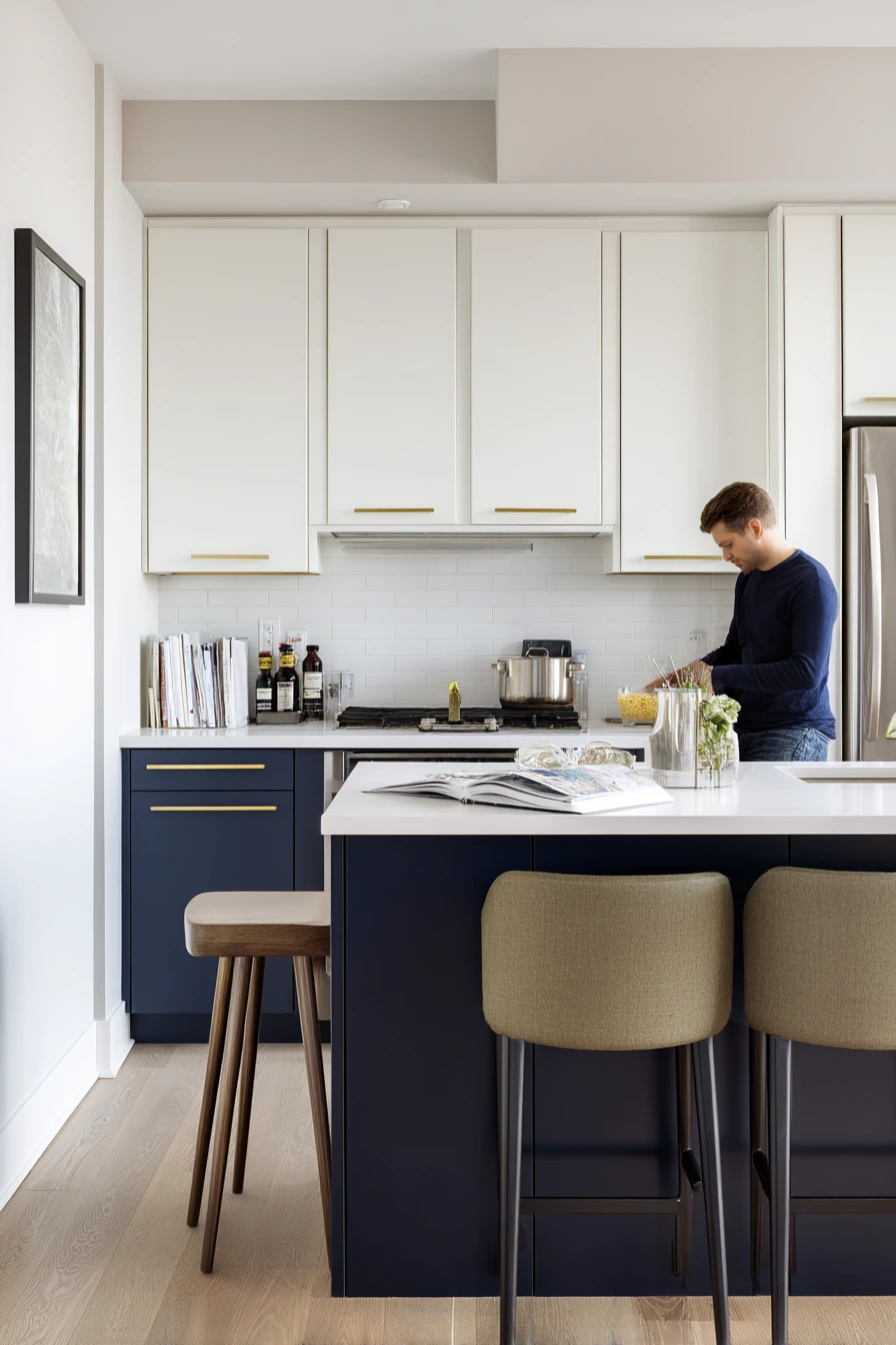
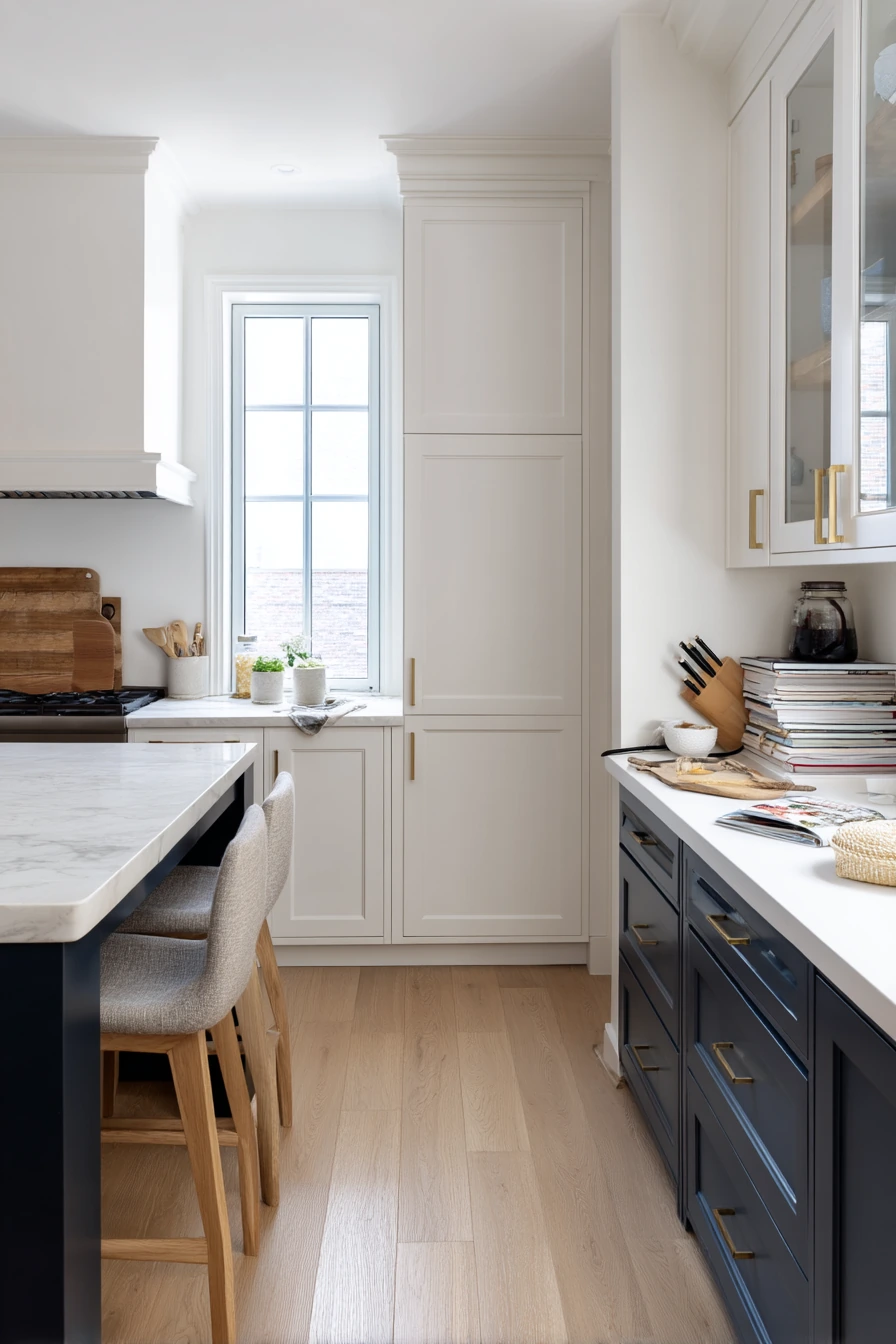
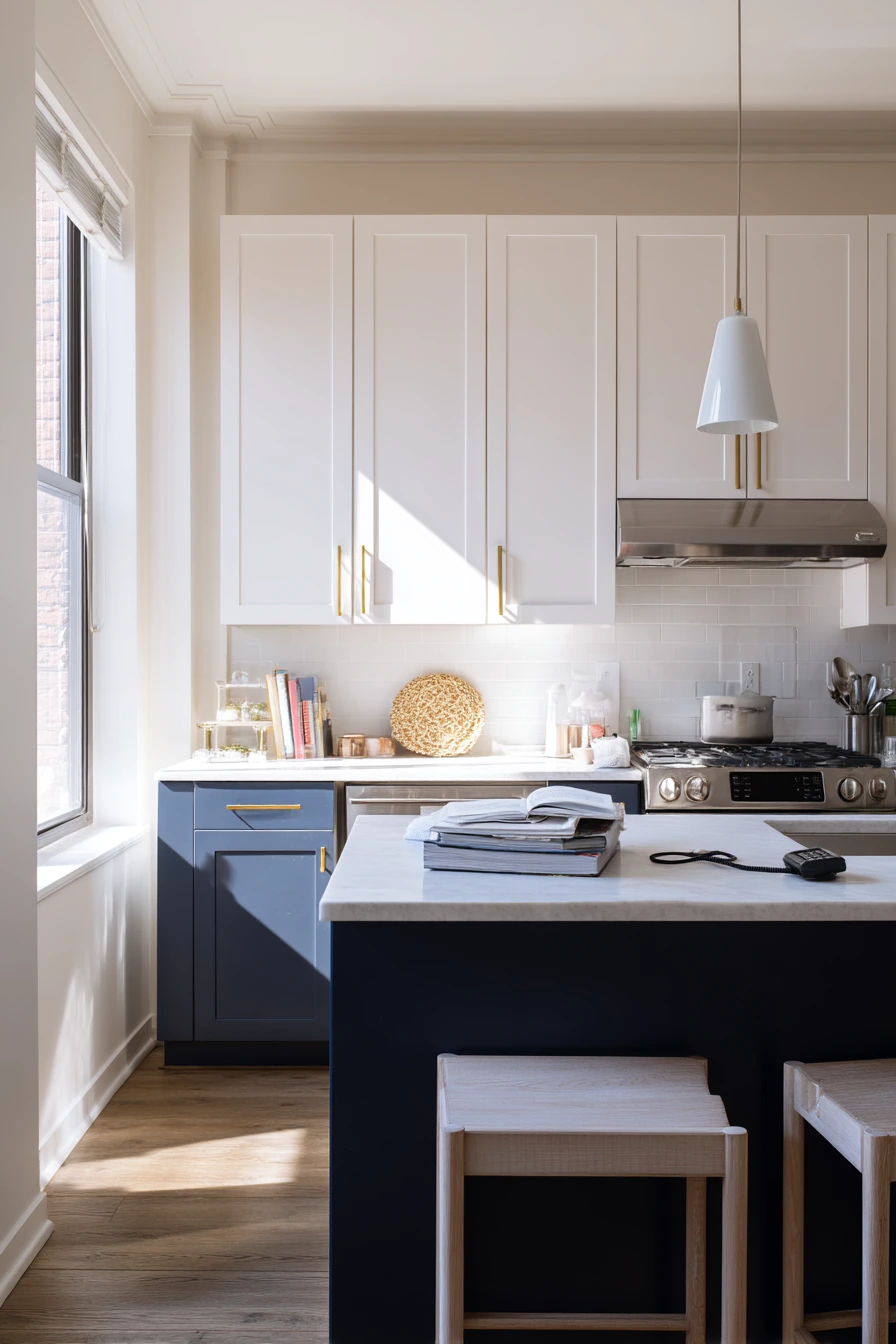
In a compact apartment kitchen, two tone kitchen cabinet ideas work best when the darker color is limited to one main feature. Soft white wall cabinets keep the space open, while a deep navy island adds depth and a clear focal point. Slim brass handles bring a little warmth without making the room feel busy.
For a practical, intimate look, keep everyday items visible but tidy. A cookbook stack on the counter, a charging cable near a phone, and one grocery tote half unpacked make the kitchen feel used. Pale oak bar stools lighten the navy and connect to other warm finishes in the room.
To style it, use a simple color rule. Let navy be the only strong color, then add small touches in white, brass, and oak. If your window light comes from one side, place the island where the light hits it, so the navy reads rich instead of flat.
- Use soft white uppers to bounce light in a small kitchen.
- Choose navy for the island to ground the room without closing it in.
- Keep hardware slim so it suits tight drawers and doors.
- Add pale oak stools to soften the dark base color.
- Store cables in a small tray so counters look calmer.
Pro Design Tip: Match your island paint to a darker tone in nearby rooms, like a rug or artwork, so the island feels planned, not random.
Budget Considerations: If replacing an island is too much, paint the existing island and swap pulls for brass; that gives the two tone look with a small spend.
3 Sage Lower Cabinets for a Renter-Friendly Refresh
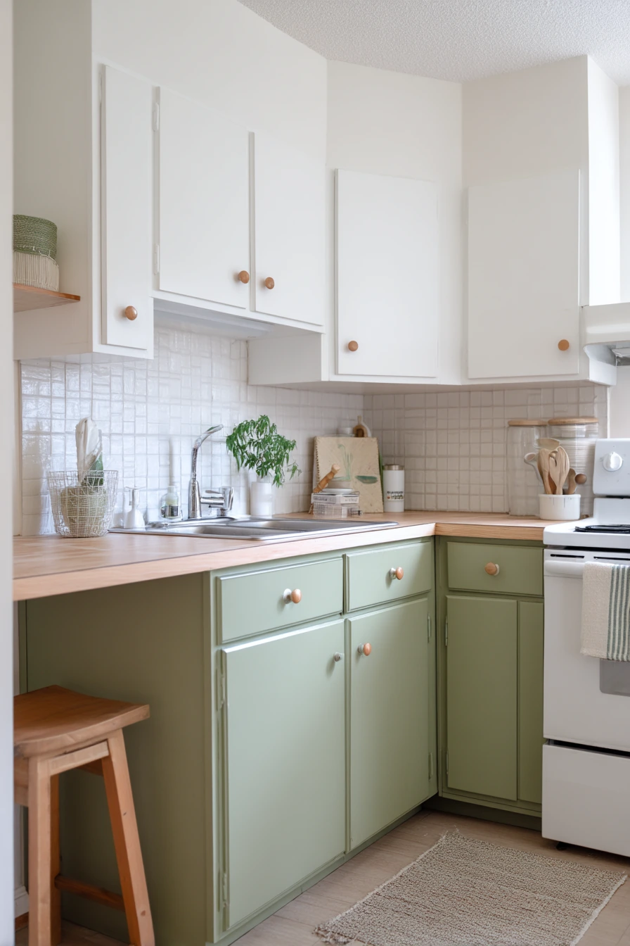
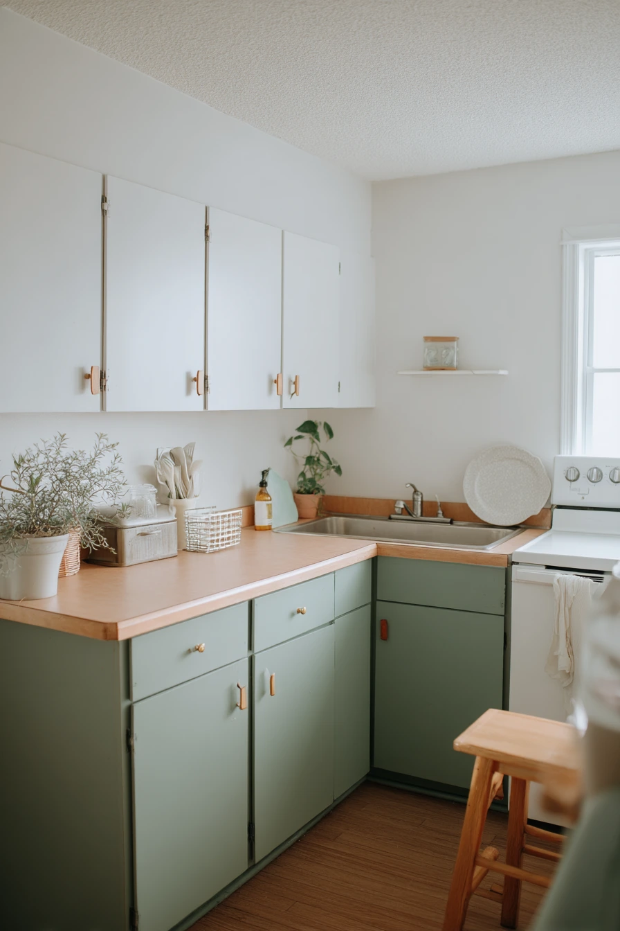
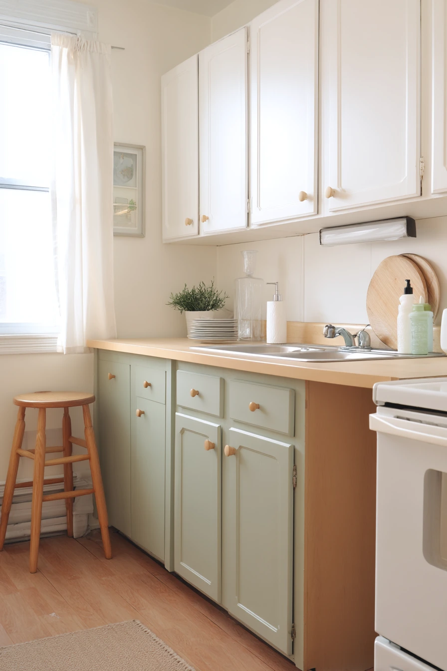
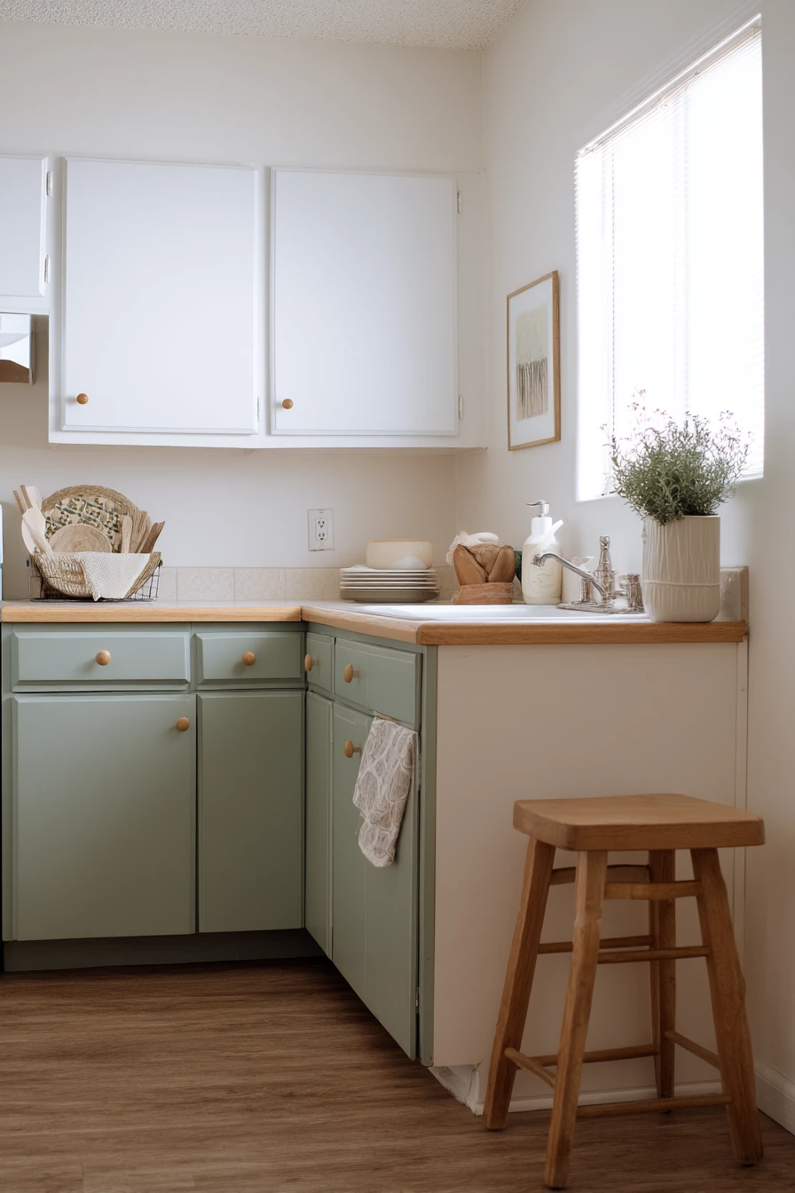
Sage green lower cabinets with soft white uppers are a calm, renter friendly two tone kitchen cabinet idea. The green feels fresh but gentle, and it pairs well with laminate counters and simple wood knobs. If you want a change that does not feel permanent, this color combo looks good even with basic finishes.
Lean into small, removable upgrades to make it charming. A peel-and-stick backsplash can add texture without a renovation. Add a ceramic soap dispenser, a dish rack with two plates, and a small herb pot by the sink for lived in warmth. A thrifted stool tucked in can bring in natural wood and make the space feel collected.
To keep sage from looking dull, focus on balance. Use the soft white uppers to keep the room bright, especially in cool morning light. Then repeat green once or twice in towels or a small bowl, and stop there. Too much green can make a small kitchen feel heavy.
- Pick a muted sage that works with warm or cool lighting.
- Use peel-and-stick tile with a simple pattern to avoid visual noise.
- Choose wood knobs to make painted cabinets feel softer.
- Add one herb pot to bring life without adding clutter.
- Keep counters mostly clear so the two tones stand out.
Pro Design Tip: Test sage paint on the cabinet toe kick and one door first, then check it in morning and evening light before you commit.
Budget Considerations: Ask your landlord about paint rules; if paint is not allowed, use temporary vinyl wraps on the lower doors for a similar two tone effect.
4 Charcoal and Maple in an Open-Plan Loft
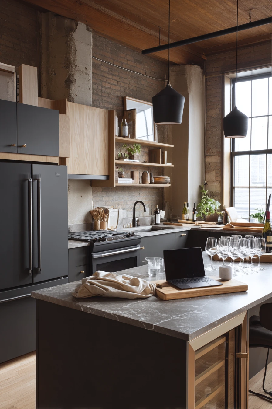
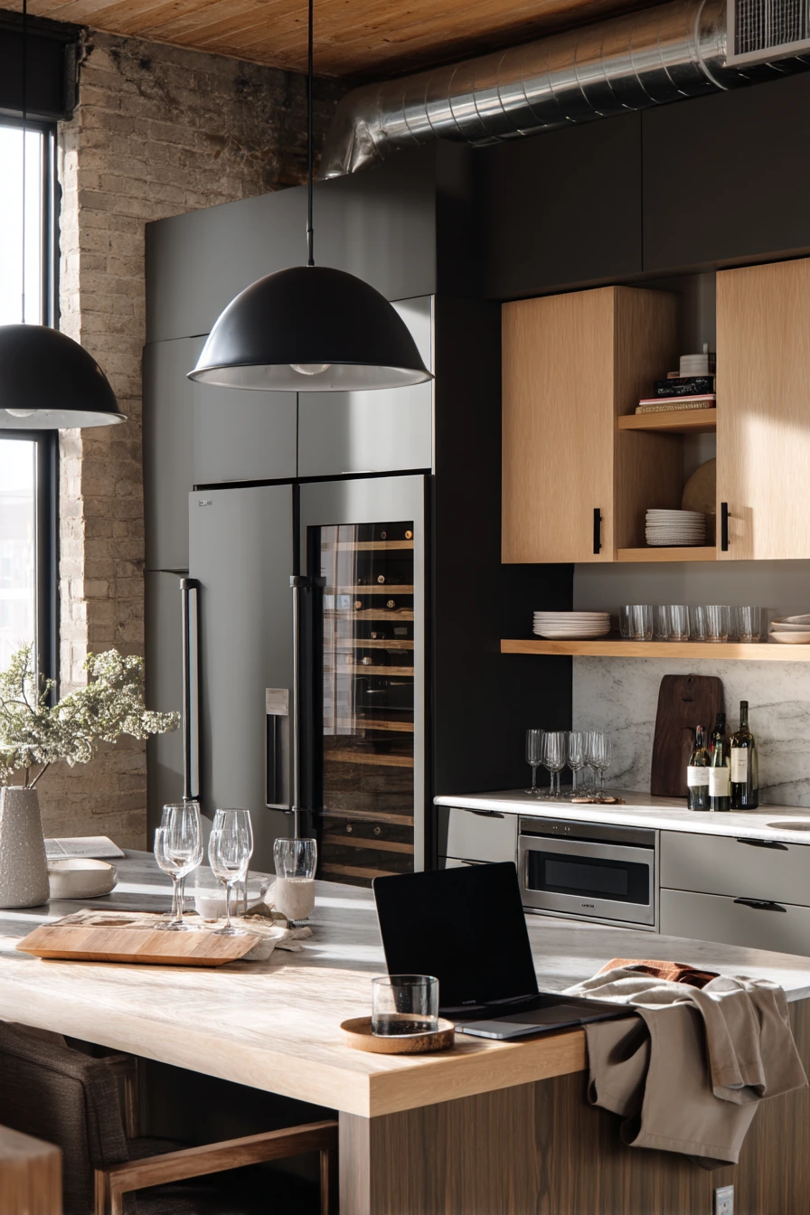
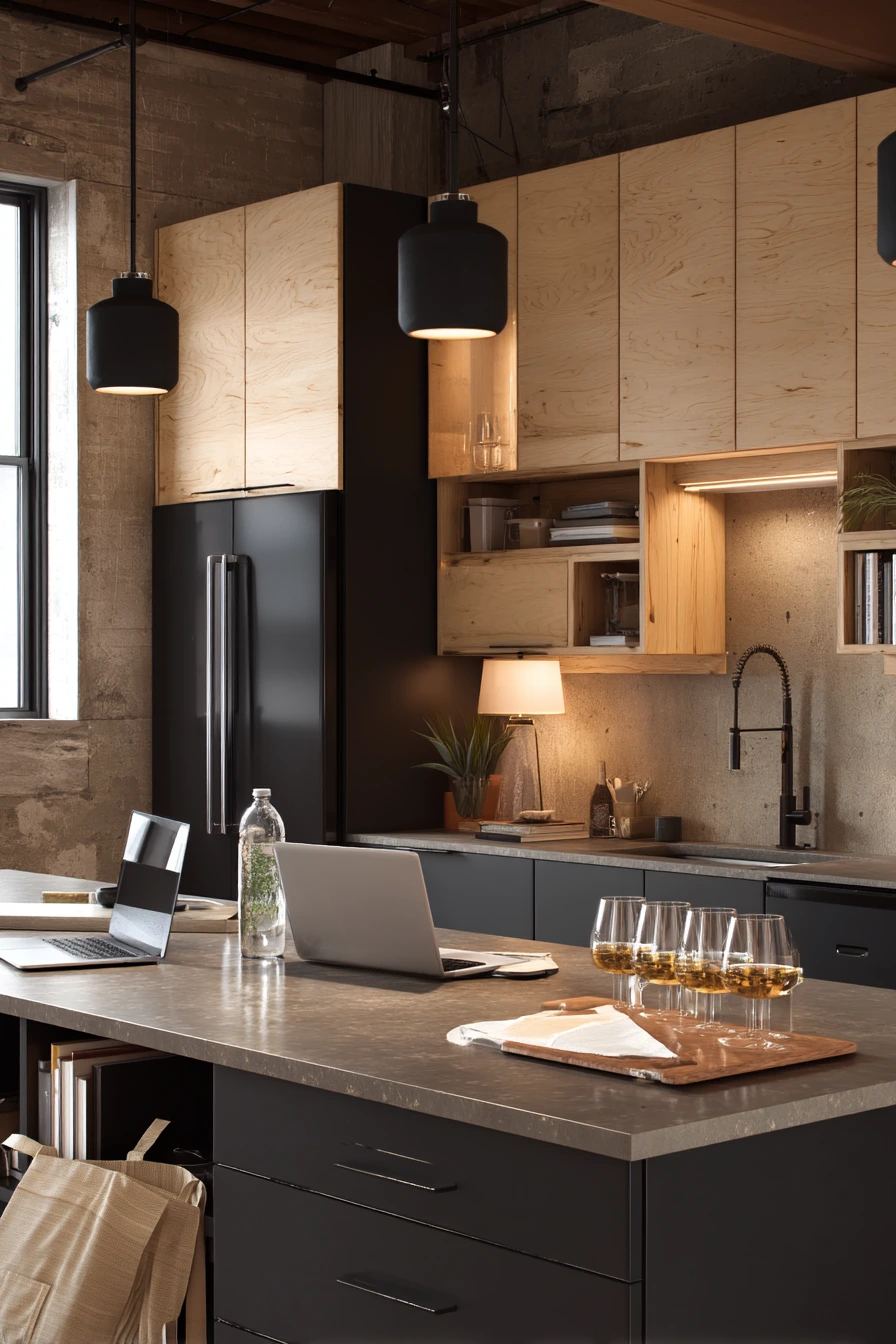
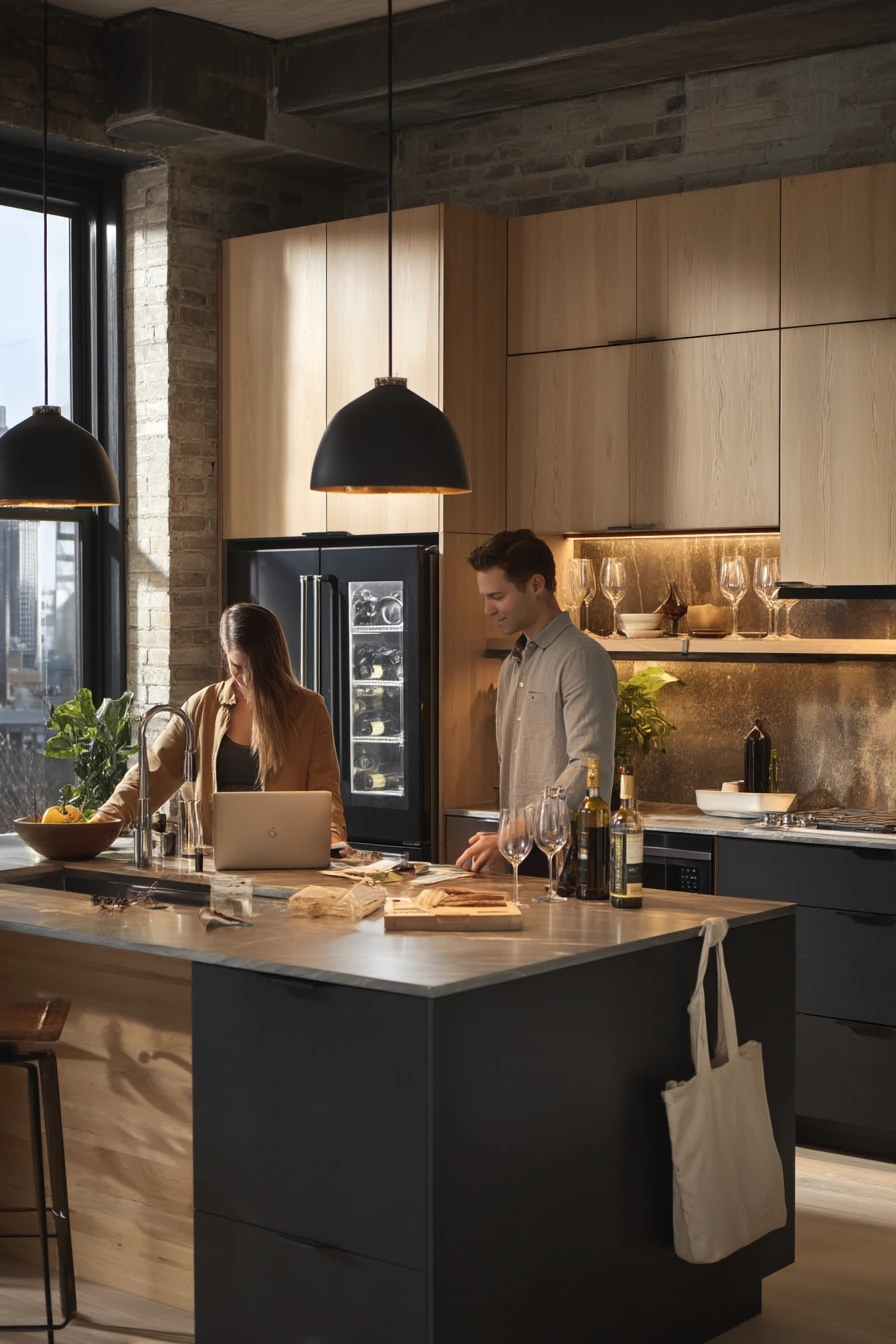
Charcoal base cabinets with maple uppers create a refined two tone kitchen cabinet idea that fits an urban loft. The darker base feels grounded and hides daily marks, while maple uppers add warmth without needing bright paint. With a stone counter and an integrated fridge, the whole kitchen can feel clean even when life is happening on the island.
Style it with real objects you use. A row of wine glasses near a cutting board, a water glass, and a folded tote show a normal evening. If a laptop is left open on the island, keep the rest of the counter simple so it looks relaxed, not messy. Black pendant lights can stay off and still add shape above the space.
Because charcoal can feel heavy, pay attention to lighting. Warm lamp light mixed with fading window light makes the charcoal look rich instead of harsh. If the loft has open sightlines, repeat maple in shelving or stools so the uppers connect to the rest of the room.
- Use charcoal on lower cabinets to reduce the look of scuffs and dust.
- Choose maple uppers for warmth and a natural grain.
- Keep counters in a stone finish that is not too glossy.
- Group wine glasses on a tray to look tidy and easy.
- Add one soft textile, like a runner, to balance hard surfaces.
Pro Design Tip: Use the same charcoal on the toe kick and side panels so the base reads like one solid block, which looks higher end.
Budget Considerations: Maple uppers can cost more; a budget option is maple-look laminate doors or stained birch with a similar warm tone.
5 Buttercream and Walnut for a Sunlit Breakfast Nook
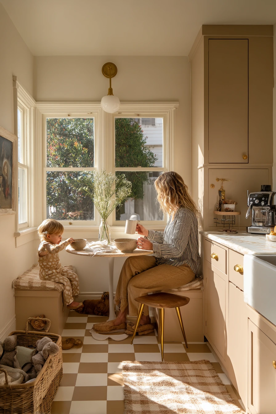
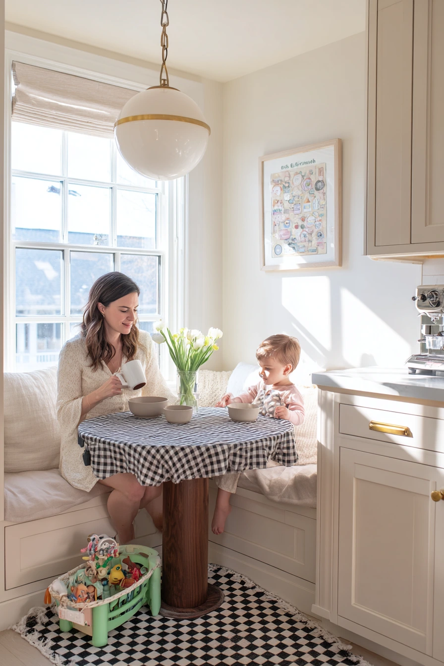
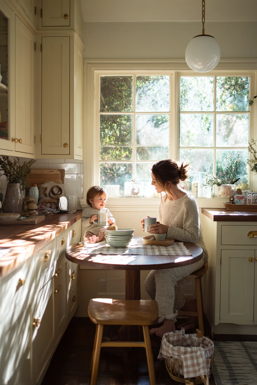
Buttercream uppers and walnut lowers are a cheerful two tone kitchen cabinet idea that still feels grown up. The creamy yellow tone adds warmth in sun drenched window light, and the walnut base brings depth. Rounded brass hardware fits this look well because it feels soft, not sharp.
Keep the styling simple and cozy. A checkered runner adds pattern without taking over. Stacked breakfast bowls, a tiny vase of cut stems, and a spoon in a mug look natural on a daily morning. If there is a toddler’s toy basket near the table, match it to the color palette, like woven seagrass or a neutral bin, so it blends in.
To make buttercream look clean, pair it with clear, quiet surfaces. A light counter and a simple backsplash help the uppers read as warm, not dingy. Walnut lowers also look best when you keep the floor and rugs lighter, so the bottom half does not feel too dark.
- Choose buttercream with a soft undertone, not bright yellow.
- Use walnut on the lowers to anchor the nook and hide wear.
- Pick rounded brass pulls for a gentle, friendly look.
- Add a small vase with stems to bring height without clutter.
- Use a washable runner in a simple check to handle spills.
Pro Design Tip: Balance buttercream with crisp white trim or ceiling paint so the color looks intentional and fresh.
Budget Considerations: If walnut cabinets are out of reach, use walnut stain on existing wood lowers or choose walnut-look thermofoil doors.

6 Black Island, White Cabinets in a Farmhouse Remodel
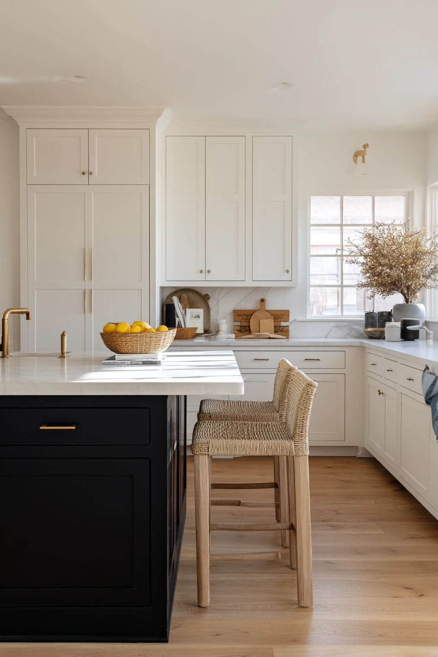
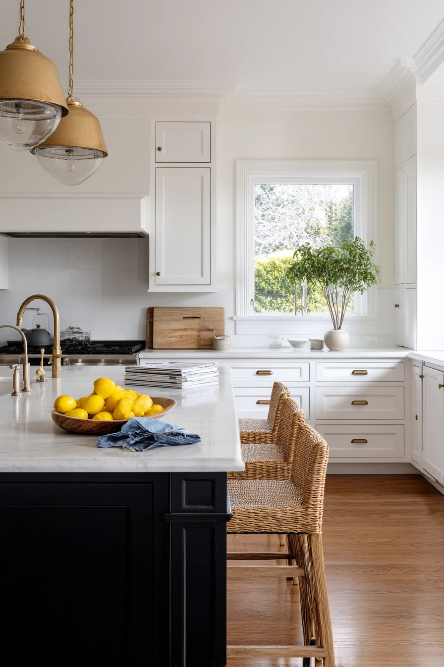
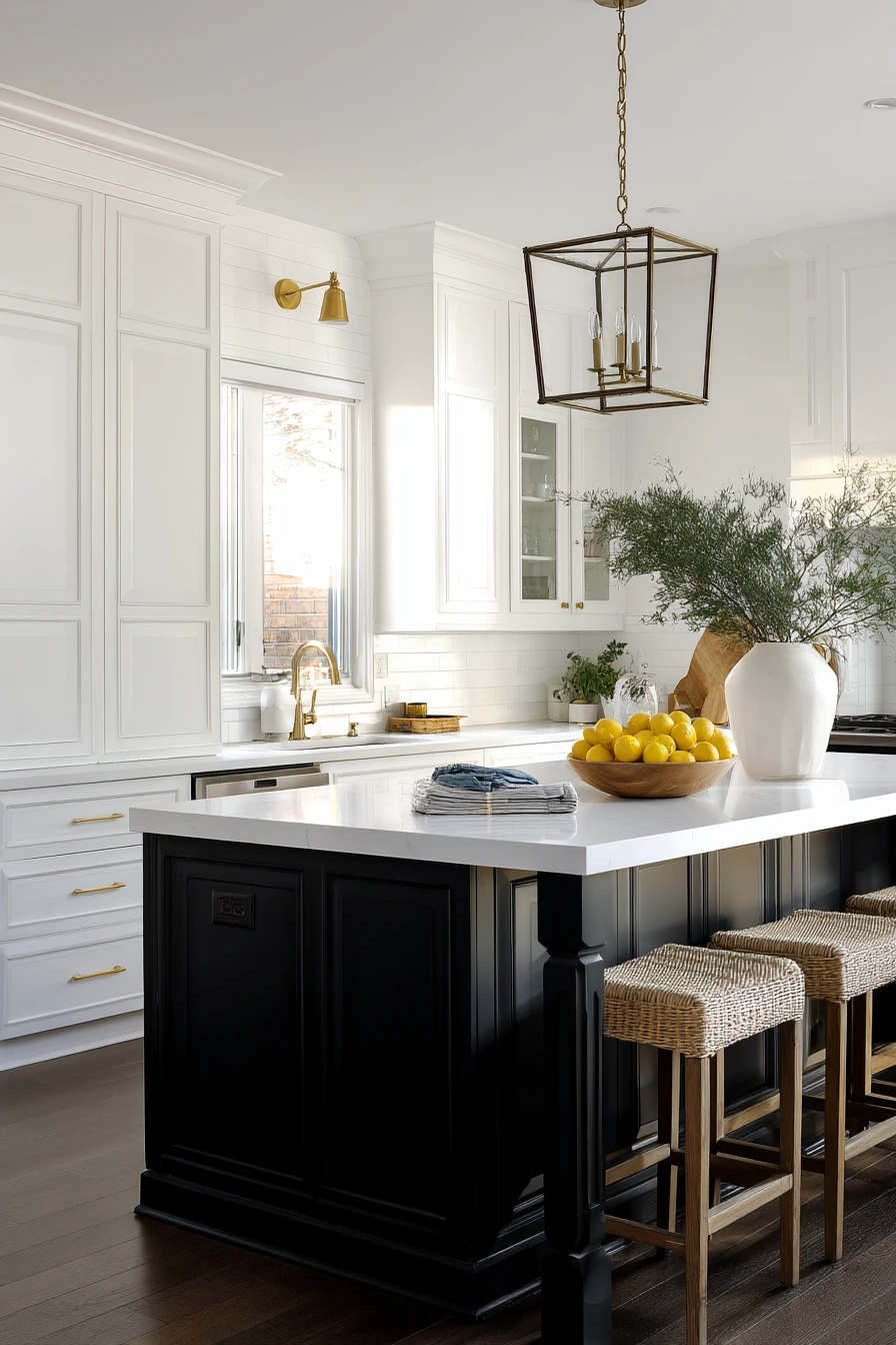
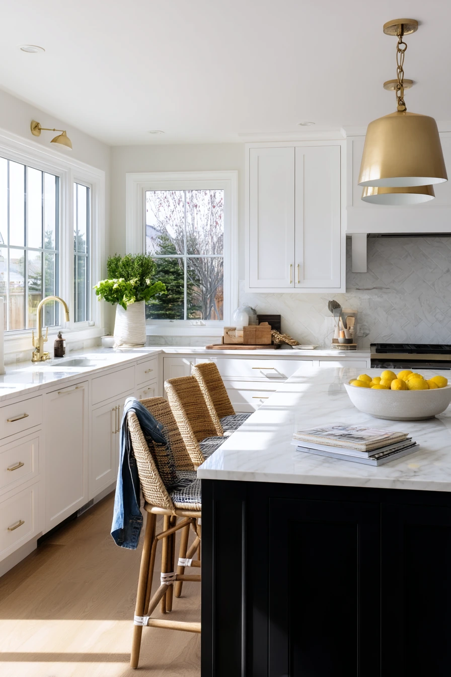
White shaker uppers with a matte black island is a classic two tone kitchen cabinet idea that suits many homes. The crisp uppers keep the room bright, while the black island creates a strong center. Honed stone counters add a soft finish that feels calm, not shiny, and an unlacquered brass faucet warms up the black and white contrast.
This style looks best when it feels used. A bowl of lemons, a stack of mail, and a denim apron on a chair make the kitchen look real. Woven counter stools add texture, which helps matte black feel less strict. Late afternoon light is perfect here because it softens the black and makes the brass look mellow.
To style it, keep your countertop items in small groups. One fruit bowl, one tray for papers, and one canister set is enough. If you want more contrast, add a black framed print or a dark utensil crock, but avoid adding many other bold colors.
- Use white shaker uppers to reflect light and keep it timeless.
- Choose a matte black island for a clean focal point.
- Pick honed stone to reduce glare and fingerprints.
- Add woven stools to bring warmth and softness.
- Keep daily clutter in a tray so the island stays useful.
Pro Design Tip: Repeat matte black in two small places, like pendant cords or a barstool frame, so the island feels connected.
Budget Considerations: Painting an existing island matte black is usually cheaper than replacing it; spend on durable primer and a hard wearing top coat.
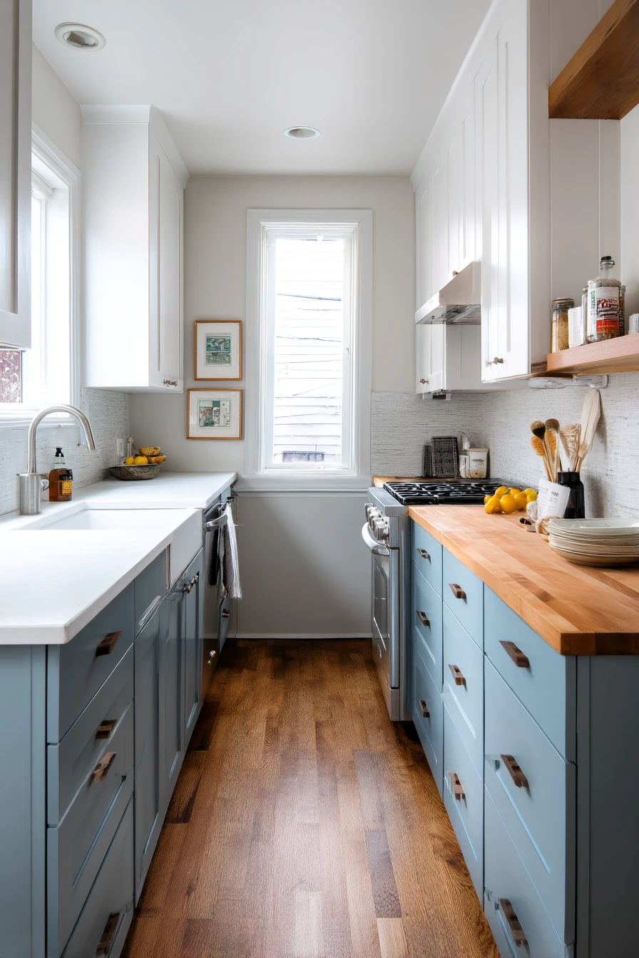
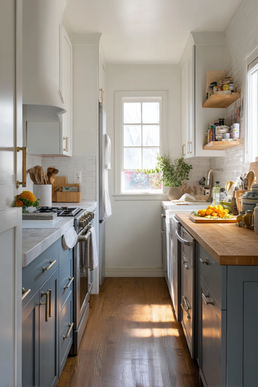
7 Dusty Blue and White in a Narrow Galley Kitchen
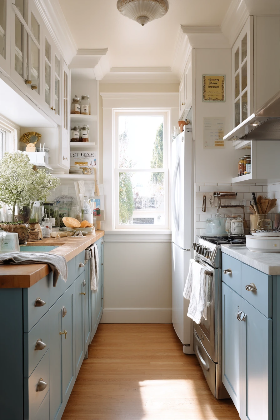
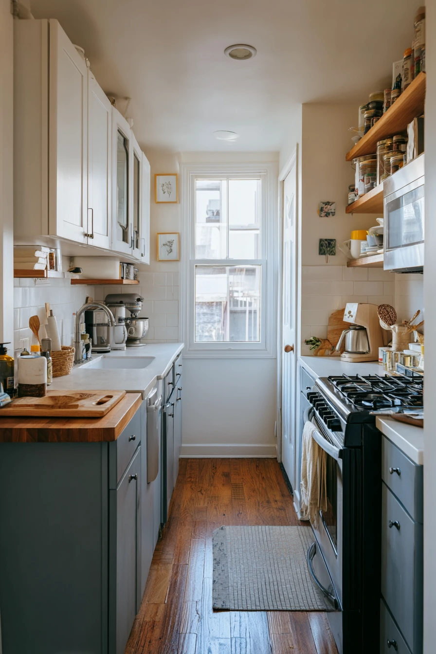
In a narrow galley, dusty blue lower cabinets with white uppers can make the space feel longer and calmer. The white uppers keep the top half light, while the blue base adds color without shouting. Slim pulls are a smart choice because they do not catch on clothes when you walk through a tight aisle.
Use wood to warm it up. A butcher block prep area breaks up the painted surfaces and adds a practical landing spot. A narrow spice shelf above the range is great in a small kitchen, but keep it edited so it does not look crowded. Recipe cards, dish soap, and a drying rack make it feel honest and functional.
To style this look, keep your backsplash and walls simple so the two tone cabinets stand out. In quiet evening light, dusty blue can look more gray, so add one warm item like a wood bowl or a tan towel to keep it from feeling cold.
- Pick dusty blue with a muted tone to suit small spaces.
- Use bright white uppers to reduce the tunnel feeling.
- Install slim pulls so the walkway stays comfortable.
- Add butcher block for warmth and a working surface.
- Edit the spice shelf to a few matching jars and daily staples.
Pro Design Tip: Run the same cabinet color on the end panels and toe kicks to avoid choppy visual breaks in a long, narrow room.
Budget Considerations: Butcher block can be affordable in smaller sizes; you can also use a thick wood countertop offcut as a dedicated prep station.
8 Forest Green Bases for an Everyday Chef
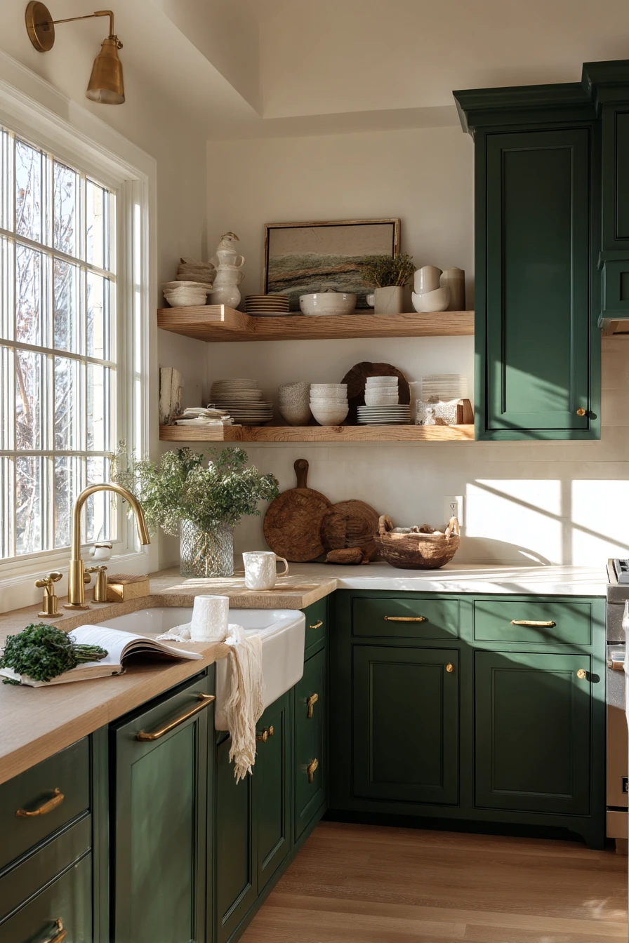
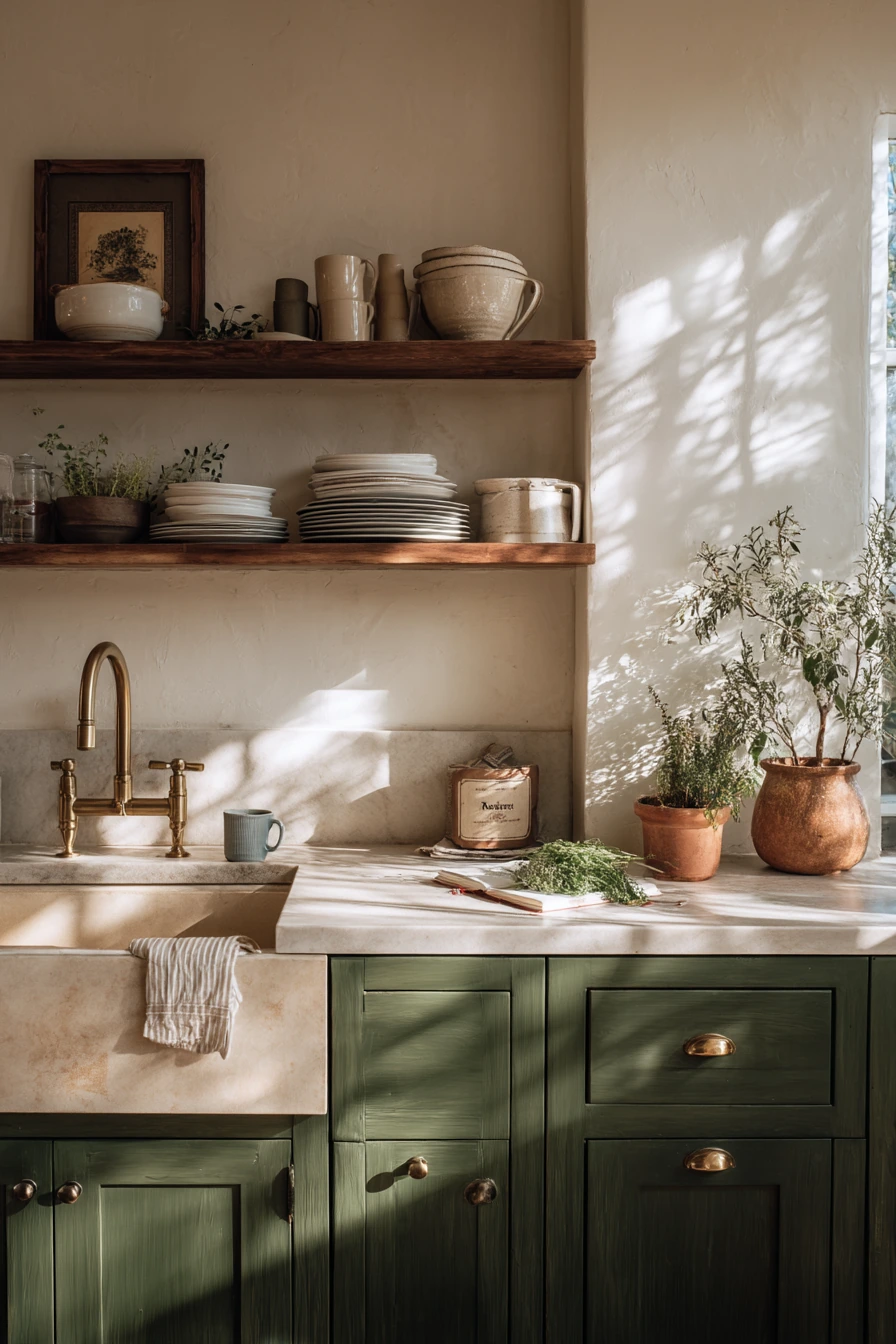
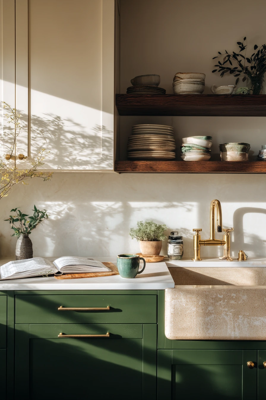
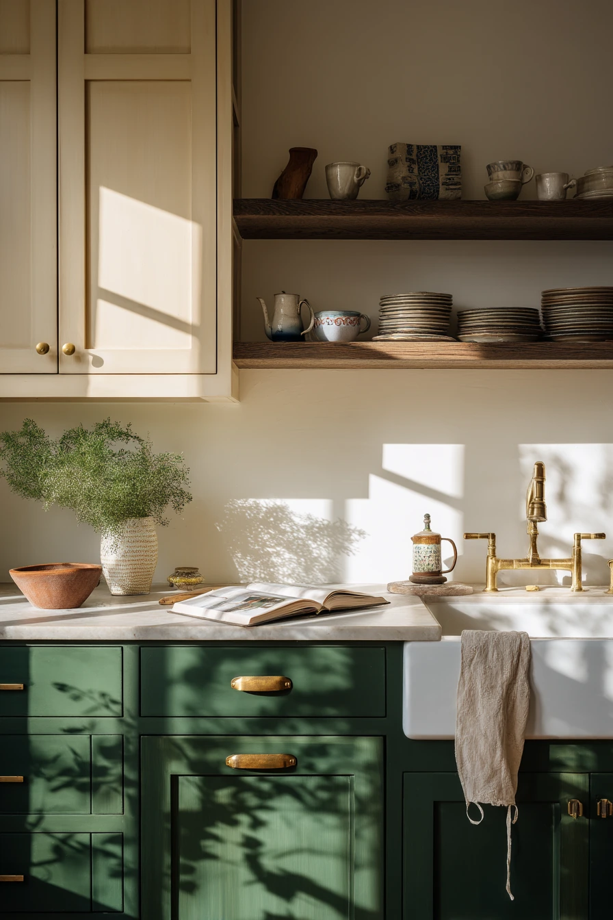
Forest green base cabinets with warm off-white uppers are a rich two tone kitchen cabinet idea for people who cook a lot. The deeper green adds a grounded, classic feel, while the off-white keeps the room bright in crisp morning light. Patinated brass accents work well because they look softer and more lived in over time.
Open shelves with stacked plates can be practical if you use them for daily items. A cookbook left open, chopped herbs, and a flour dusted counter fit this style because it celebrates cooking. A deep farmhouse sink looks right with this palette and helps the kitchen feel sturdy and ready for work.
To style it, add texture instead of more color. Use wood cutting boards, linen towels, and a simple ceramic mug with a tea bag string hanging over the rim. If leaf shadows move across the wall, keep the wall finish simple so the light pattern becomes part of the room’s charm.
- Use forest green on the lowers to hide marks from busy cooking.
- Choose warm off-white uppers to avoid a sharp contrast.
- Use patinated brass for a softer, less shiny hardware look.
- Limit open shelves to plates and bowls you use often.
- Bring in wood and linen for warmth and balance.
Pro Design Tip: Pair forest green with a counter that has warm undertones, so the green looks rich instead of cold.
Budget Considerations: If new brass hardware is costly, mix finishes by keeping existing pulls and adding brass only on the island or main drawers.
9 Greige and Walnut in a Calm Primary Suite Kitchenette
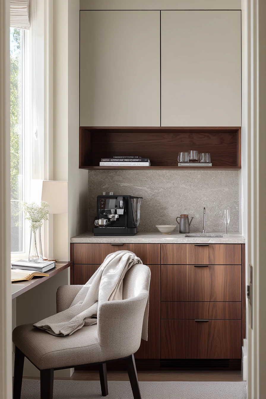
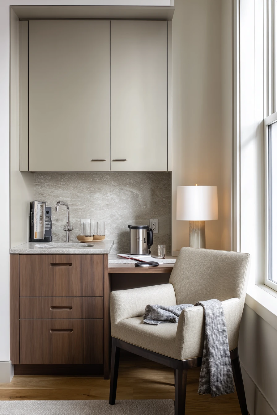
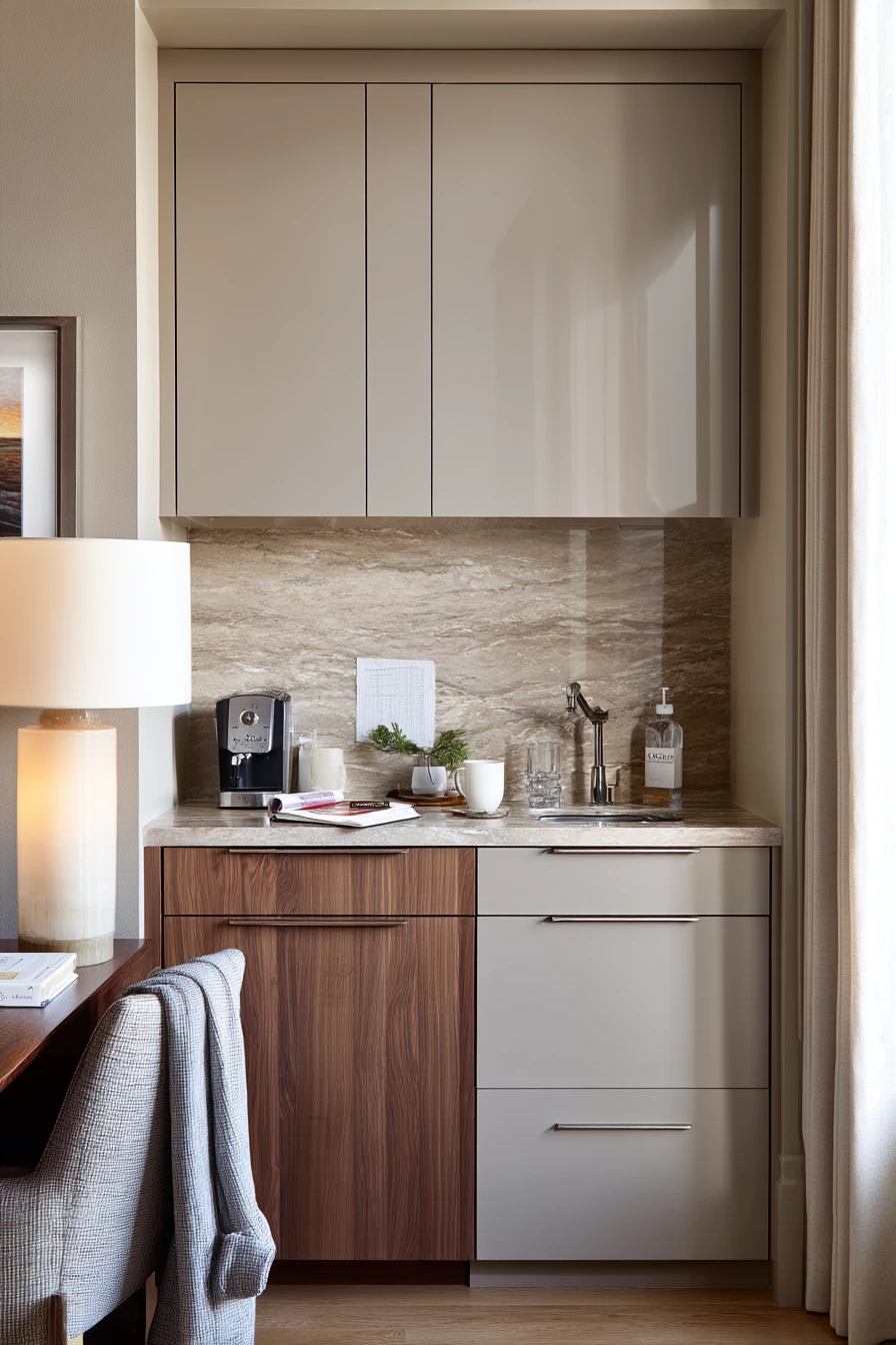
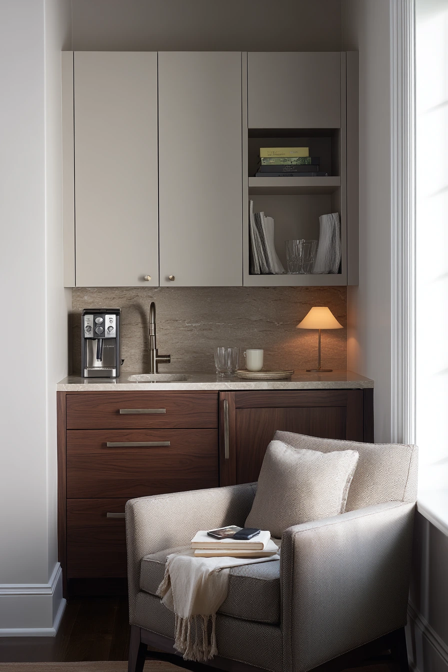
A primary suite kitchenette needs to feel calm, and two tone kitchen cabinets can help. Soft greige uppers with walnut lowers look restful and upscale without feeling formal. A stone slab backsplash keeps the space easy to wipe down and adds a smooth backdrop for a petite espresso setup.
Because this is a small area, styling should be minimal. A robe draped over a chair, two books, a half full water glass, and a phone on charge feel real for a morning routine. Keep the counter to a few items you use every day, like a small tray with pods, a spoon rest, and a cup.
Lighting matters more in a kitchenette. Gentle lamp light mixed with pale window light makes greige look soft, not dull. If you want a bit more contrast, choose darker walnut and keep the greige on the lighter side, so the uppers still lift the space.
- Choose greige uppers to avoid the stark look of bright white.
- Use walnut lowers to bring warmth and a furniture feel.
- Add a stone slab backsplash for a clean, simple surface.
- Keep the espresso setup on a tray to look neat.
- Use one small lamp for soft light in early mornings.
Pro Design Tip: Match your greige to the room’s wall color family so the kitchenette blends into the suite and feels more relaxing.
Budget Considerations: Stone slab backsplashes can be expensive; a budget swap is large format porcelain that looks like stone with fewer seams.
10 Terracotta Accents with Cream Cabinets for a Warm Update
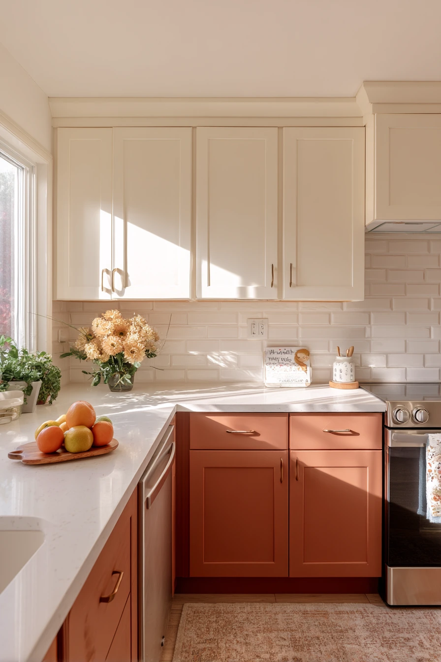
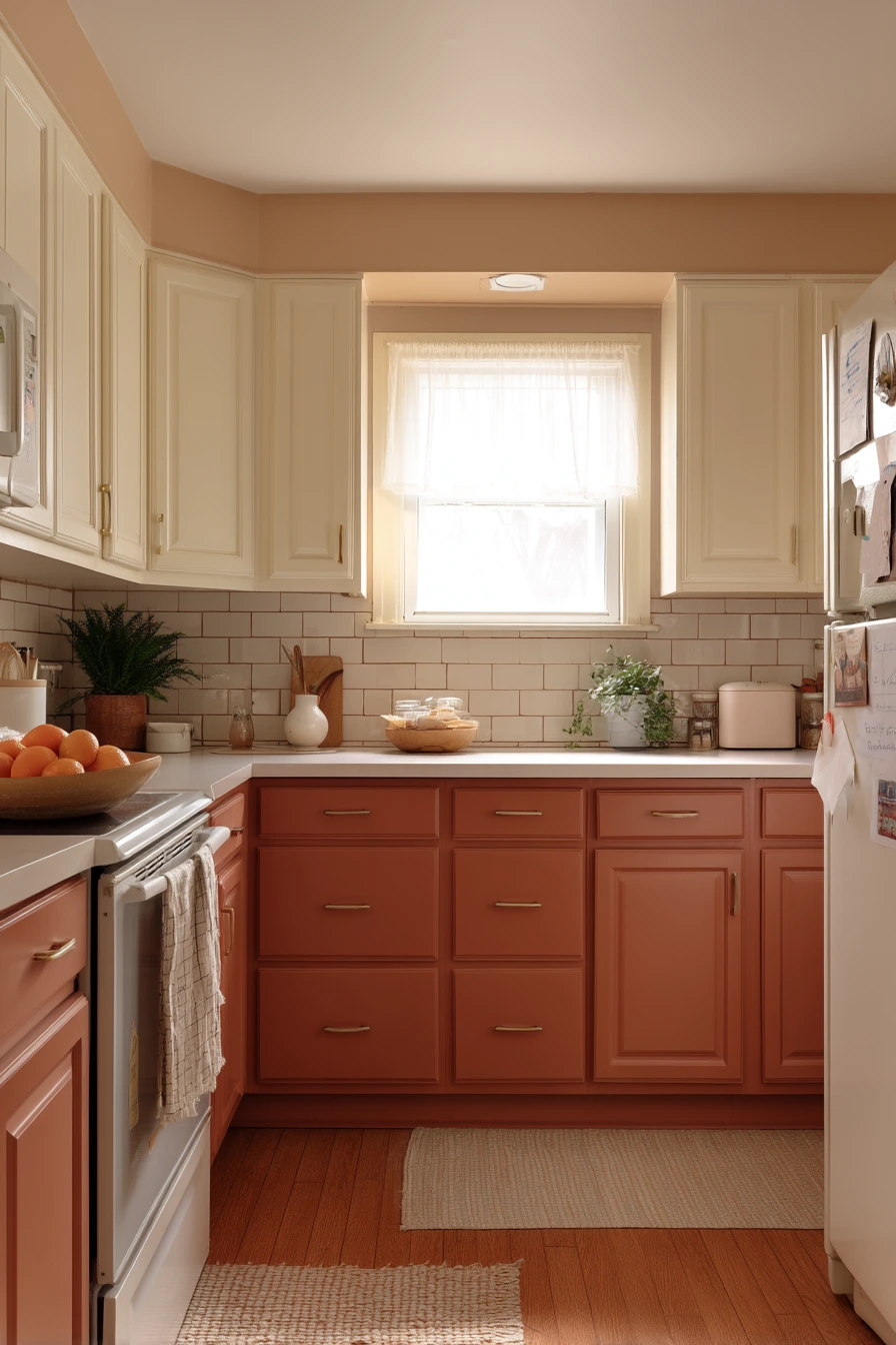
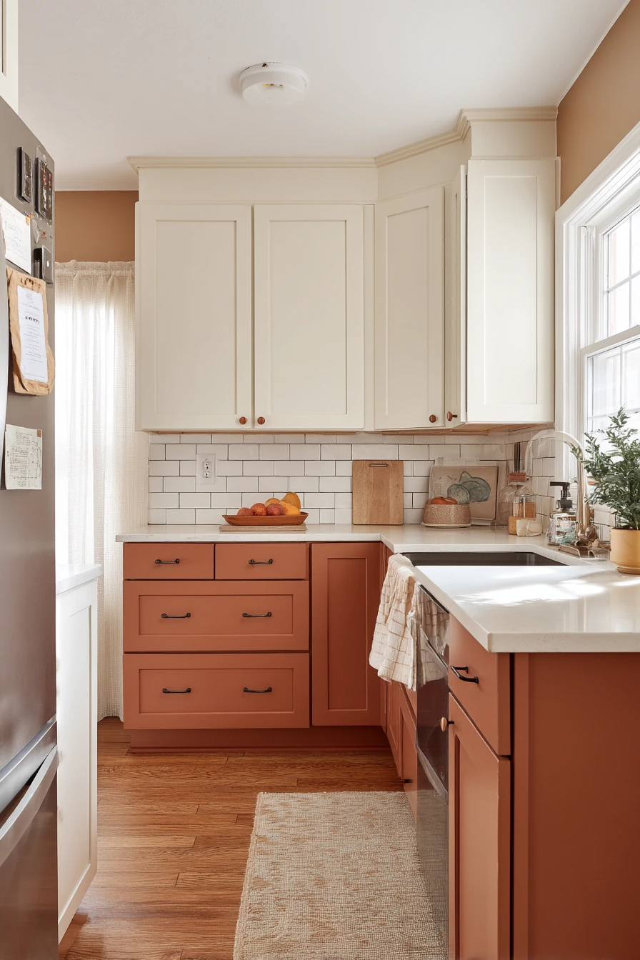
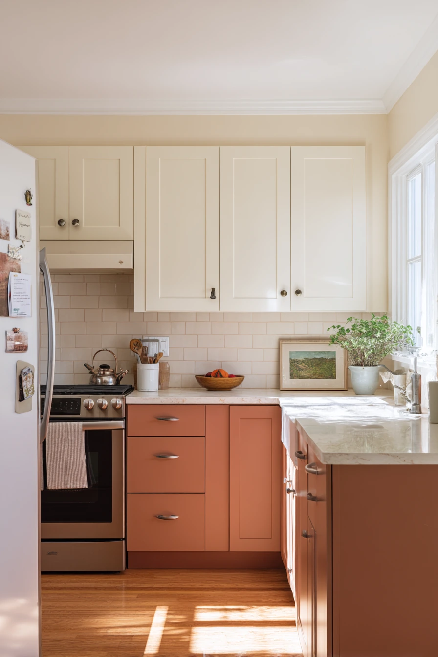
Creamy upper cabinets with muted terracotta lower cabinets create an earthy two tone kitchen cabinet idea that still feels light. Cream keeps the kitchen bright, and terracotta adds warmth and personality without going too bold. Brushed nickel hardware fits well if you want a clean, everyday finish that does not compete with the cabinet colors.
This look is made for real life. A fruit bowl on the counter, school permission slips, a dish towel on the oven handle, and a magnet covered fridge all fit the cozy, layered feel. Quartz counters and a simple tile backsplash keep the background quiet, so the cabinet colors can stand out.
To style it, repeat terracotta in small touches like a utensil crock, a framed print, or a linen towel. Keep the rest of the accents neutral. Soft afternoon light makes terracotta look warmer, so test paint before you commit, especially if your kitchen faces north.
- Pick a creamy upper color that matches your counter undertones.
- Use muted terracotta on lowers to add warmth and hide smudges.
- Choose brushed nickel for a simple, easy to match finish.
- Keep the backsplash plain so the cabinets are the focus.
- Use a wall calendar or tray to corral paper clutter.
Pro Design Tip: Use the same terracotta on the island or a pantry door to create a clear color story, then keep the rest cream.
Budget Considerations: If painting all lowers is too much, start with just the base cabinets on one wall or the island to get the two tone look for less.
Two tone kitchen cabinet ideas work because they balance light and depth, and they can fit many styles, from family friendly oak and cream to modern white and black.
Start by choosing where the darker tone should live, usually on the lowers or the island. Then pick hardware and counters that connect both finishes.
If you want a quick win, swap pulls, paint only the island, or add one open shelf. Small changes can still create a clear two tone look.
FAQ
What is the easiest two tone cabinet layout to get right? White or creamy uppers with a darker color on the lowers is the simplest because it keeps the room bright and grounded.
Should the island match the lowers or be a third color? Matching the island to the lowers looks calm. A third color can work if the rest of the finishes are simple and the island color repeats elsewhere.
What countertop colors work with most two tone kitchens? Warm white quartz, light beige stone, and soft gray surfaces are flexible and help connect two cabinet tones.
Do two tone cabinets make a small kitchen look bigger? Often yes, especially when the uppers are light and the darker tone stays low or on one feature like an island.
What hardware finish is most versatile? Brushed nickel is the easiest to match. Matte brass adds warmth. Black hardware adds sharp contrast but can feel bolder.
Can renters do two tone cabinets without painting? Yes. Try temporary vinyl wraps on lower doors, peel-and-stick backsplash, and new knobs that you can remove later.