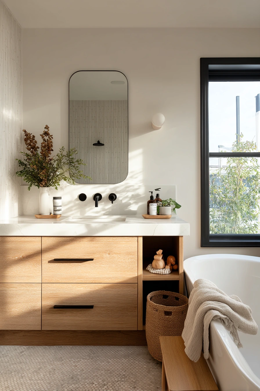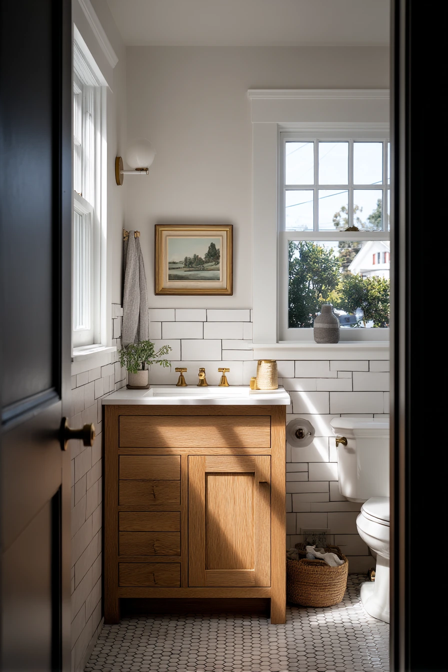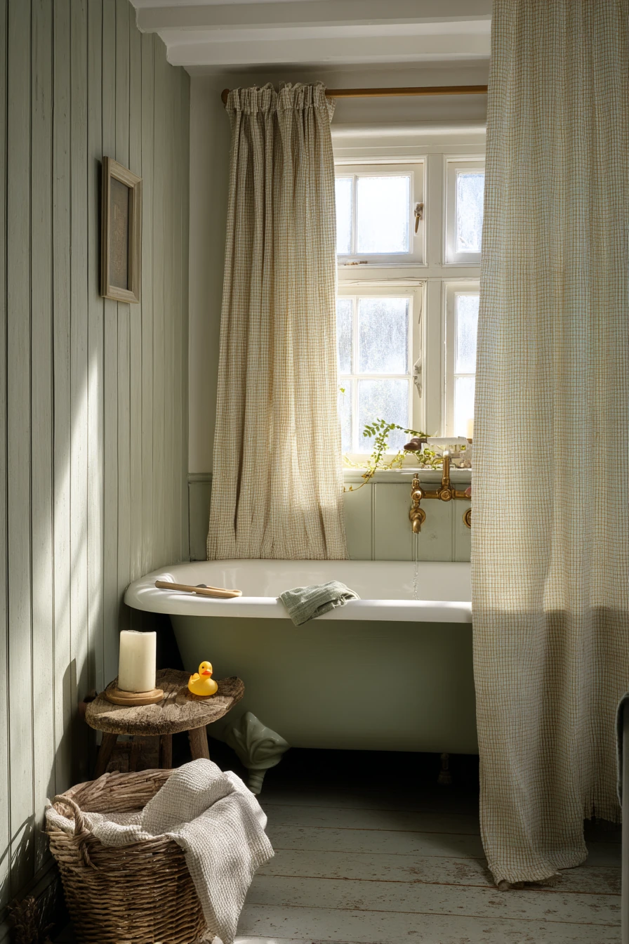

Contrasting grout bathroom ideas are a simple way to make tile look sharper, cleaner, and more custom. By pairing light tile with dark grout, or warm tile with deeper grout, you can highlight the pattern and add depth in a small space.
This post walks through 10 real home looks, from white subway tile with ink-black grout to beige zellige with espresso lines. You will also see practical details like brushed nickel fixtures, oak vanities, and kid friendly floors that still feel pulled together.
For each style, you will get easy ways to copy the look, plus a Pro Design Tip and a Budget Consideration. Use these ideas to choose grout color with confidence and plan a bathroom that photographs well for Pinterest and works well every day.
1 Classic White Tile with Ink-Black Grout
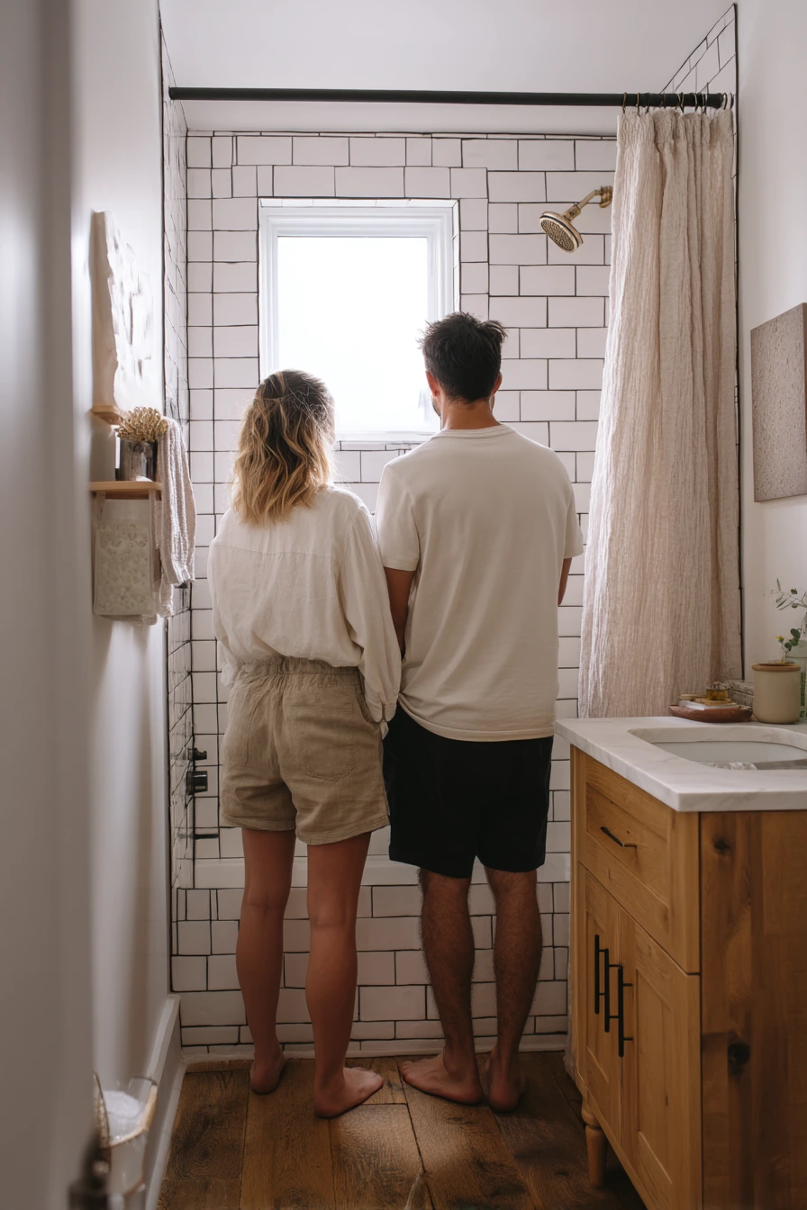

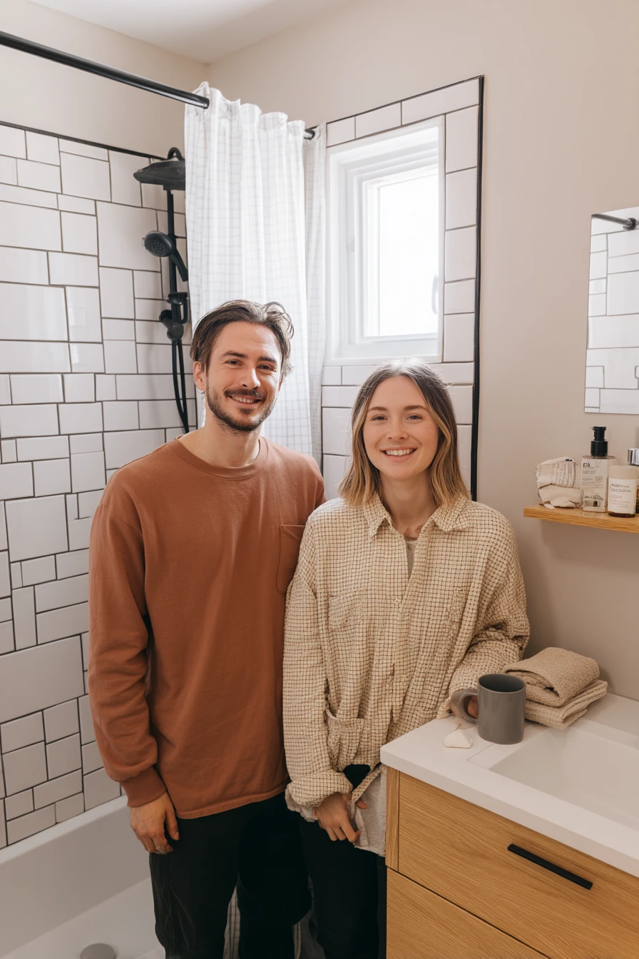
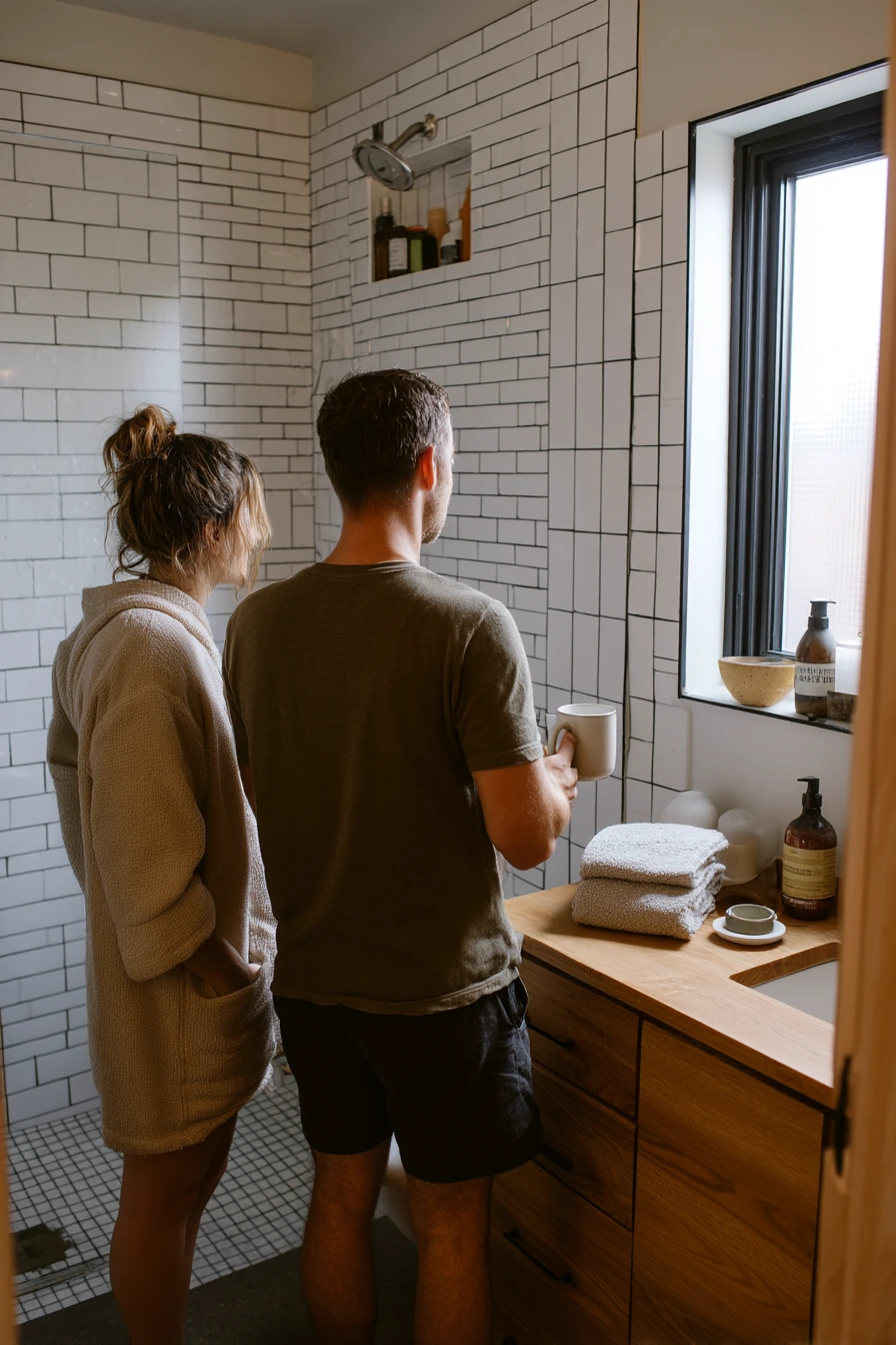
White ceramic subway tile with ink-black grout is one of the clearest contrasting grout bathroom ideas. The white field stays bright, but the dark lines add structure so the shower wall feels crisp. In a compact townhouse, this look also helps the space feel intentional, even with real life items like a half-open medicine cabinet, a mug on the counter, and paint samples on the wall.
Keep the rest of the finishes calm so the grout can do the work. Brushed nickel fixtures are a safe match because they feel clean and not too bold. An oak vanity warms up the black and white combo, and folded cotton towels plus a small ceramic soap dish make the space feel lived in without looking messy.
To style it, repeat the black in small touches, not big blocks. A slim black shower frame, a matte black hook, or a simple black tray keeps the contrast balanced. Use natural morning window light when you can, because it softens the harsh edge that dark grout can create in photos.
- Choose a grout that is labeled stain resistant for a shower wall.
- Use a satin or matte white tile so the grid looks softer.
- Pair with oak or light wood to keep the room from feeling cold.
- Keep countertop items minimal so the lines stay the focus.
- Use a white towel set and add one charcoal hand towel for contrast.
Pro Design Tip: Ask your installer for a grout sample board with your exact tile, then view it in morning and evening light before you commit.
Budget Considerations: If retiling is not possible, get a similar look with a new shower curtain, black hardware, and a grout colorant pen to refresh existing grout lines.
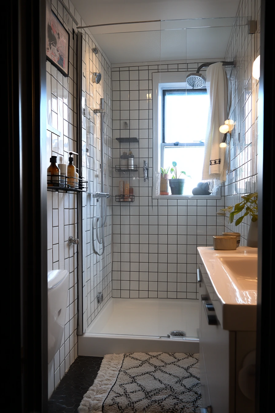
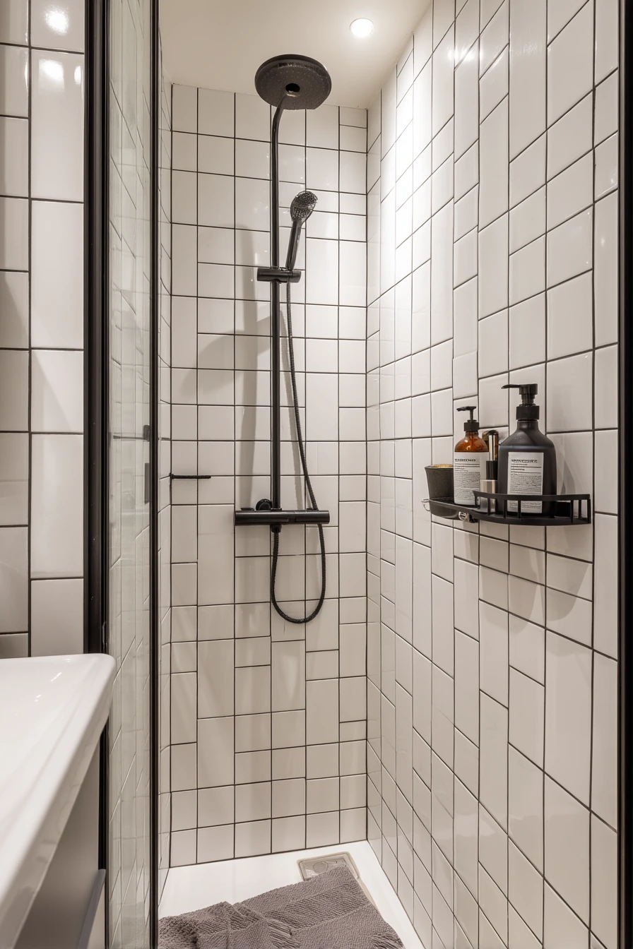
2 Small Apartment Shower with High-Contrast Grout
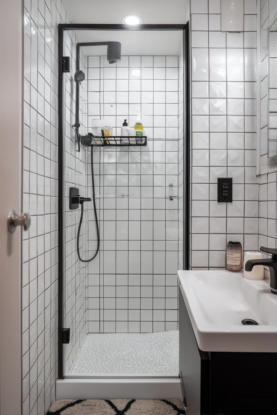
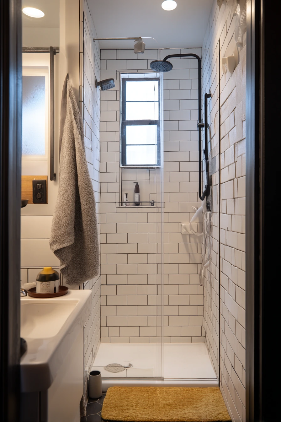
Glossy white square tile with dark charcoal grout works well in a narrow shower alcove because it makes the tile pattern look tidy and even. In a small apartment bathroom, the grid can make the space feel more organized, even when the bath mat is slightly askew and a suction cup caddy is holding shampoo bottles.
Charcoal grout is a little softer than true black, so it hides daily splashes without looking harsh. It pairs well with a slim black shower frame for a modern edge. On the vanity, keep it practical: a toothbrush cup, a phone charging cable, and one small container for hair ties helps the counter look real but not cluttered.
To style this look, add warmth through textiles. A cotton bath mat in oatmeal or sand keeps the room from feeling too stark. If your window light is steamy and soft, lean into it with a simple frosted shade and a light neutral shower curtain, so the tile stays the star.
- Pick charcoal grout if you want contrast with fewer hard lines than black.
- Use one black accent only, like the shower frame or mirror.
- Choose clear or white bottles to reduce visual noise in the shower.
- Hang one framed print with a thin black frame for balance.
- Use a bath mat with a simple border to echo the tile grid.
Pro Design Tip: Ask for a slightly wider grout joint only if your tile edges are imperfect, because wider lines highlight any uneven spacing.
Budget Considerations: Swap to a black shower rod, a darker grout looking caulk line, and matching accessories to mimic the contrast without changing the tile.
3 Warm Neutrals and Espresso Grout
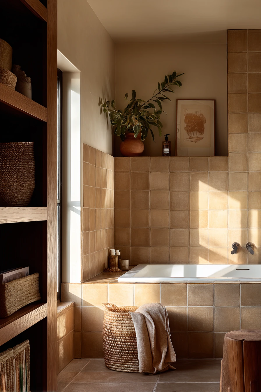
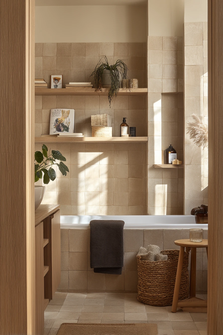
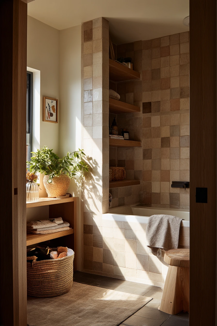
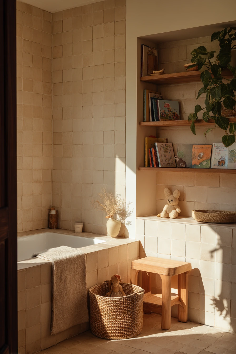
Warm beige zellige-style tile with rich espresso grout gives you contrast without a stark black and white look. It feels calm and earthy, especially around a deep tub surround in a lived in family bathroom. The deeper grout outlines every handmade edge, so the wall looks textured even when it is dry.
This color combo plays well with honey oak shelving and woven storage. A hamper, a kid toy basket peeking from under the sink, and a damp hand towel can still look fine because the palette is warm and forgiving. Late afternoon sunlight brings out the tile variation and makes the grout feel like a soft frame instead of a bold stripe.
To style it, keep your accessories natural. Choose a stone or ceramic tray, a wood stool, and one picture book or small basket that matches the oak tones. If you add plants, let the leaves cast shadows on the wall for a relaxed feel. For contrast that stays clean, use cream towels and one deep brown hand towel to match the grout.
- Pick espresso grout to highlight zellige edges and hide small stains.
- Use warm metals like brass or bronze for a cozy finish.
- Add woven baskets to keep kid items contained and easy to grab.
- Choose towels in cream, sand, or warm white for a soft look.
- Use a wood stool for bath time items so counters stay clear.
Pro Design Tip: Seal the tile and grout properly around the tub so the darker grout does not develop lighter mineral spots over time.
Budget Considerations: If real zellige is too costly, use a zellige-look ceramic tile and spend the savings on a high quality grout and professional sealing.
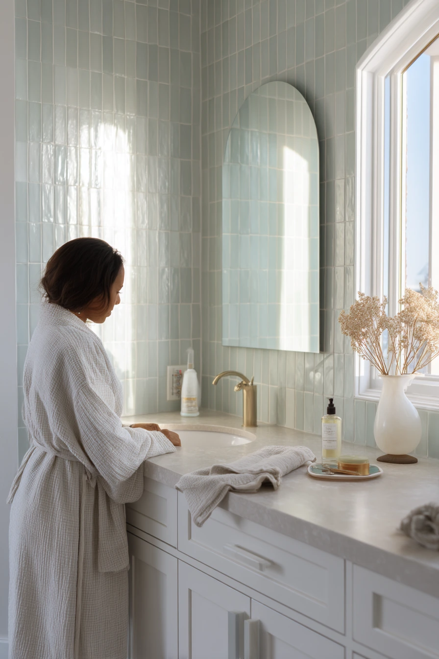
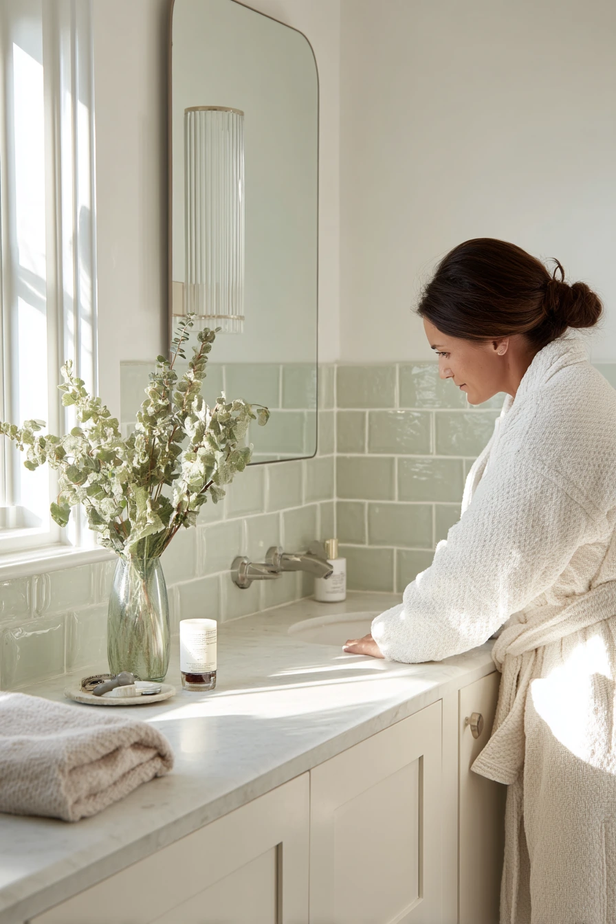
4 Pale Green Tile with Soft Gray Grout
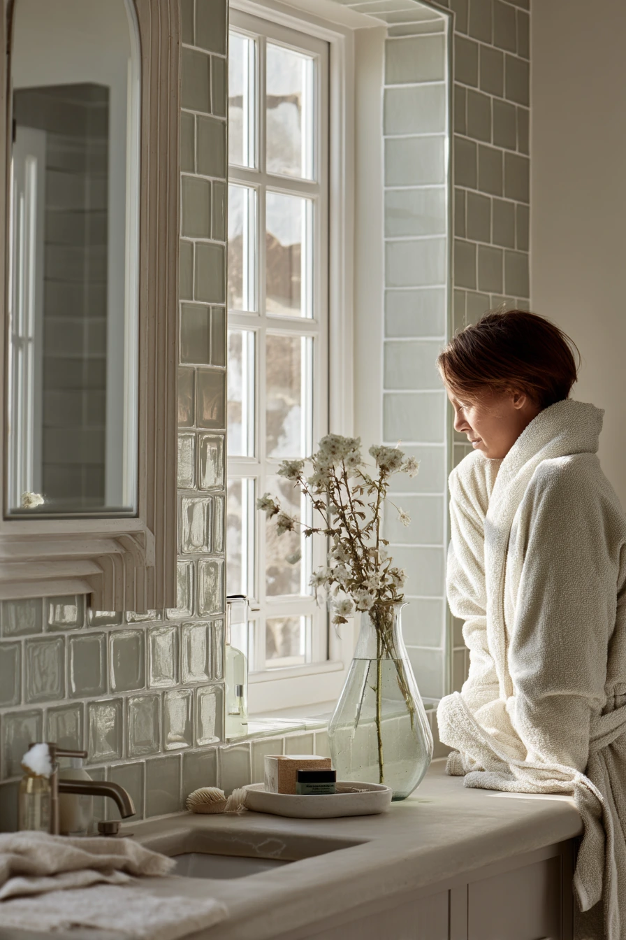
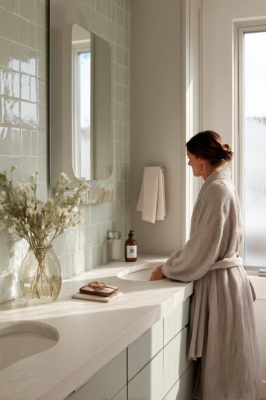
Pale sage tile with soft gray grout is a gentle form of contrast that still adds definition. In a quiet ensuite, the lines help the tile read as a pattern, but the overall feel stays tender and serene. This is a good choice if you like color, but you do not want a busy bathroom.
Soft gray grout also fits well with creamy stone counters and a fluted mirror. Keep the vanity styling simple: a lotion bottle, a glasses case, and a glass vase with one stem is enough. A slightly wrinkled linen towel looks right here, since the mood is relaxed and real, not showroom perfect.
To style the space, keep your metal finishes light and calm. Brushed nickel or soft brass works better than shiny chrome. Add one texture at a time, like a ribbed soap dispenser or a woven tray. Milky window light makes sage look softer, so try a sheer shade instead of a heavy curtain.
- Use gray grout for a low contrast look that still defines tile edges.
- Pair sage tile with cream, warm white, and light wood tones.
- Choose a single stem or simple greenery for an easy focal point.
- Stick to two counter items plus a tray to avoid clutter.
- Use linen towels for soft texture that matches the calm palette.
Pro Design Tip: Match your grout undertone to the tile, so a cool gray does not fight with a warm sage that has yellow in it.
Budget Considerations: You can get this look by painting the vanity and swapping towels and a mirror, even if the existing tile stays the same.
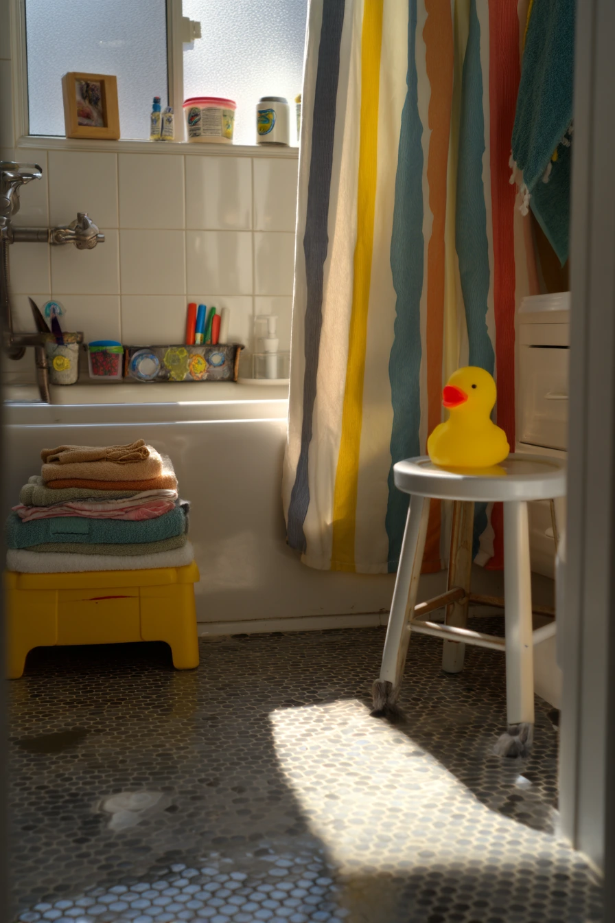
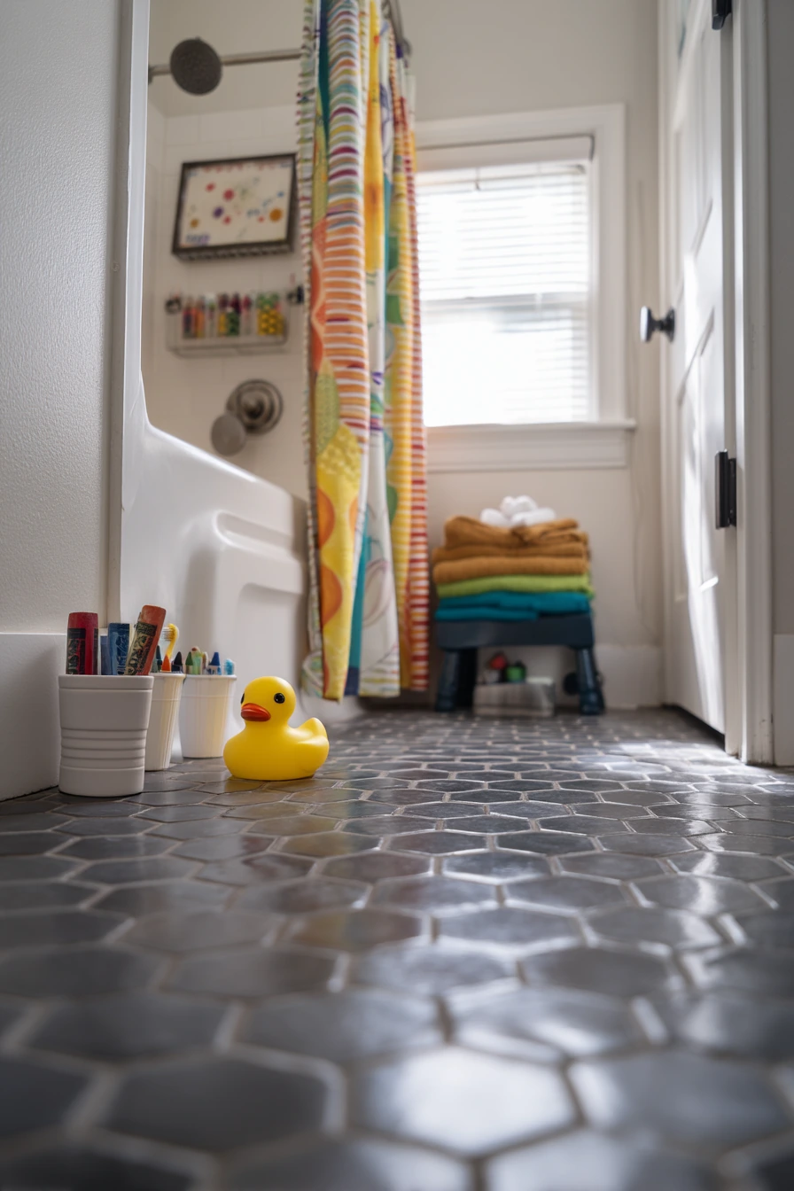
5 Kids’ Bath with Playful Contrast Grout
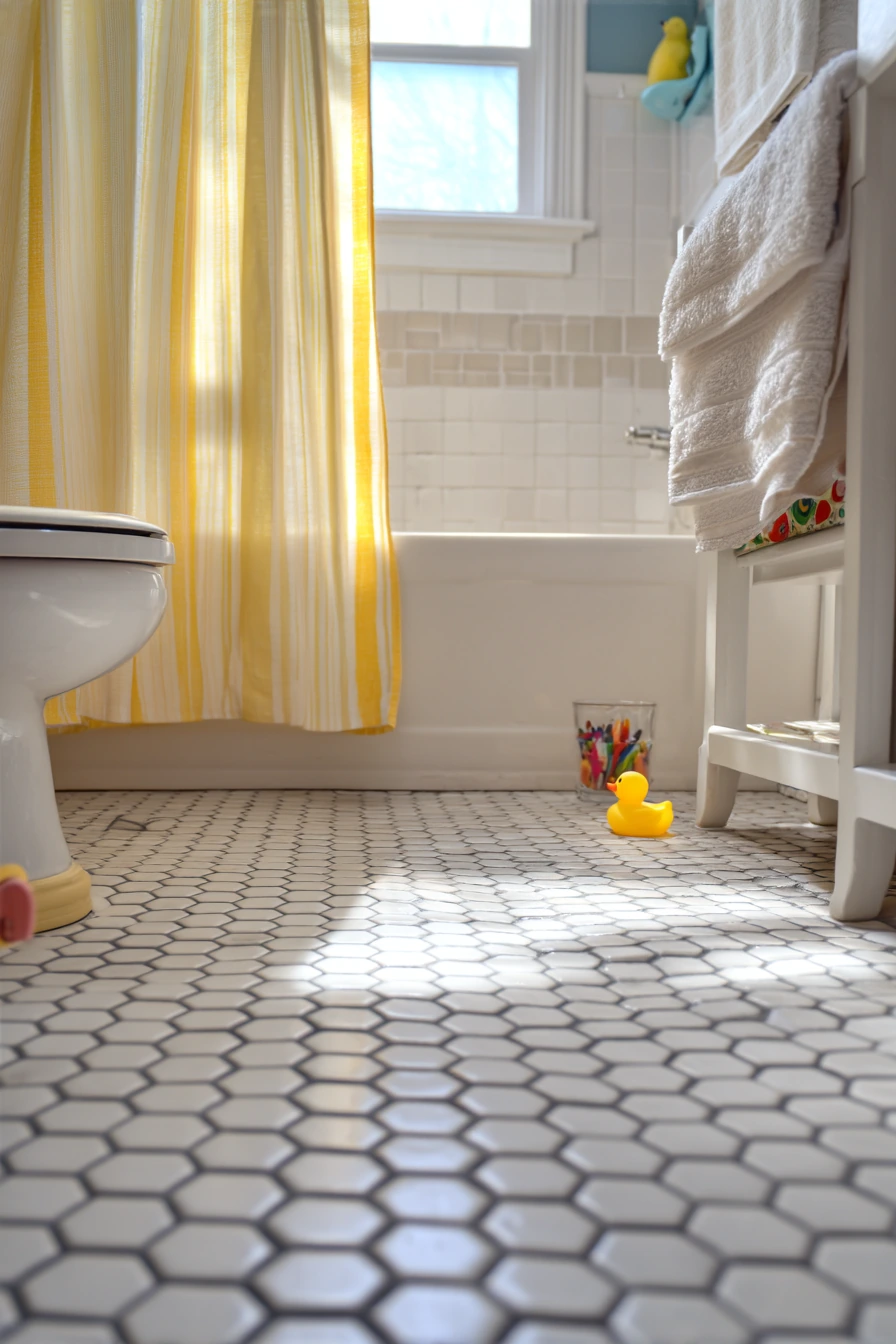
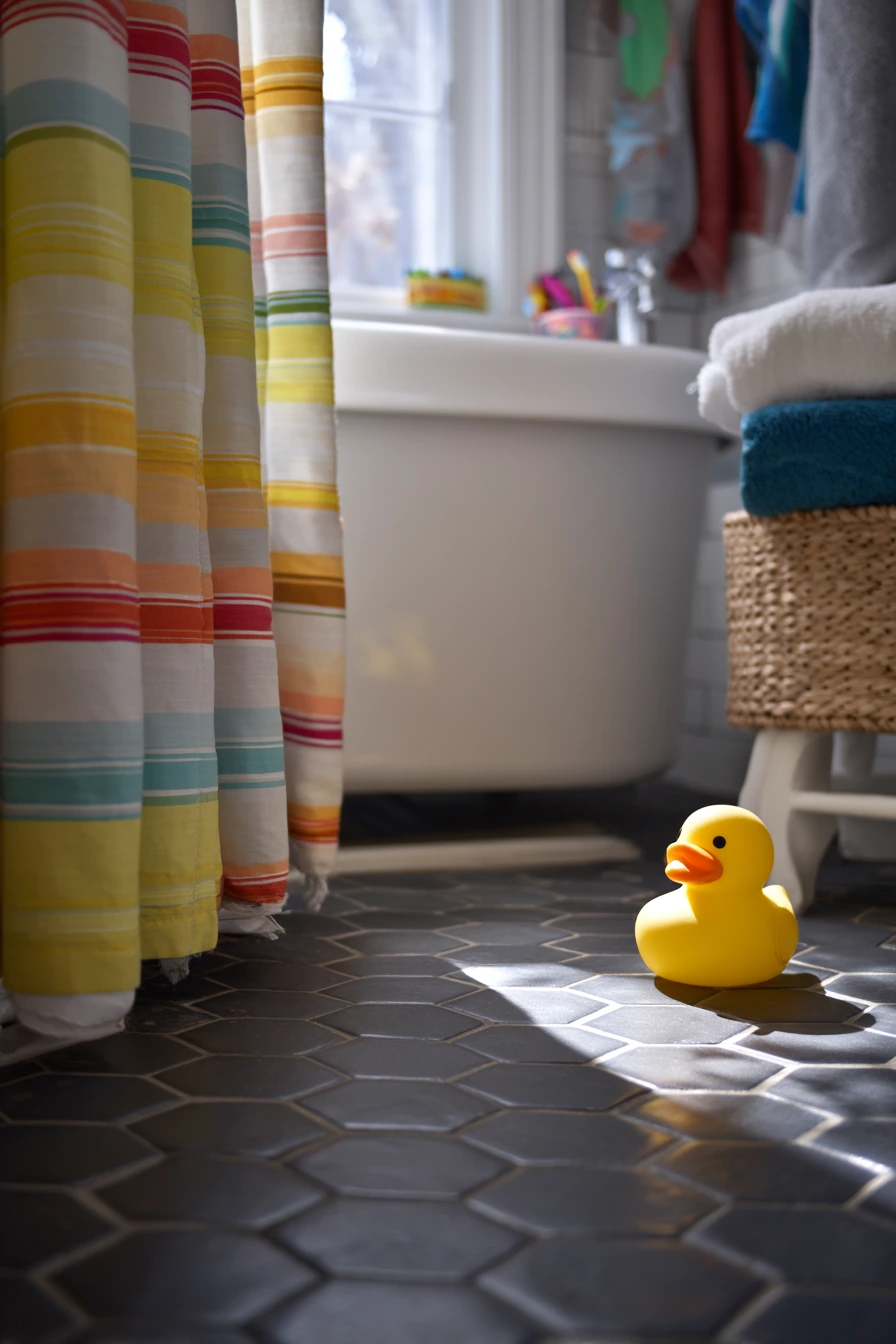
A white hex tile floor with dark slate grout is a smart contrasting grout bathroom idea for a busy family bathroom. The dark lines hide dirt in the joints, which is where kid mess tends to show first. The hex pattern also adds grip and visual interest without needing bold wall tile.
This look works well with easy-clean finishes, like a simple tub panel and a cheerful striped curtain. Real life details like rubber ducks, bath crayons, and a step stool fit in because the floor already has strong pattern. Wet footprints will still happen, but the slate grout helps the floor look better between deep clean days.
To style it, keep color above the floor. Use a stripe or a simple print on the curtain, then repeat one color in towels. Add a small lidded bin for bath toys and a cup for toothbrushes, so the counter feels less chaotic. Sunlight bouncing through a small window makes the white tile glow, so keep the window area clear.
- Choose a darker grout on floors if you want less visible grime.
- Use a bath mat with a non slip backing to protect little feet.
- Add hooks at kid height to keep towels off the floor.
- Store bath crayons in a small draining cup so they dry faster.
- Pick one bright towel color and keep the rest neutral.
Pro Design Tip: Use an epoxy or upgraded stain resistant grout on floors, since kids bathrooms get the most water, soap, and toothpaste.
Budget Considerations: If you cannot replace the floor, refresh the look with grout recoloring and a new striped shower curtain plus matching towels.
6 Rental-Friendly Peel-and-Stick Look with Dark Grout Lines
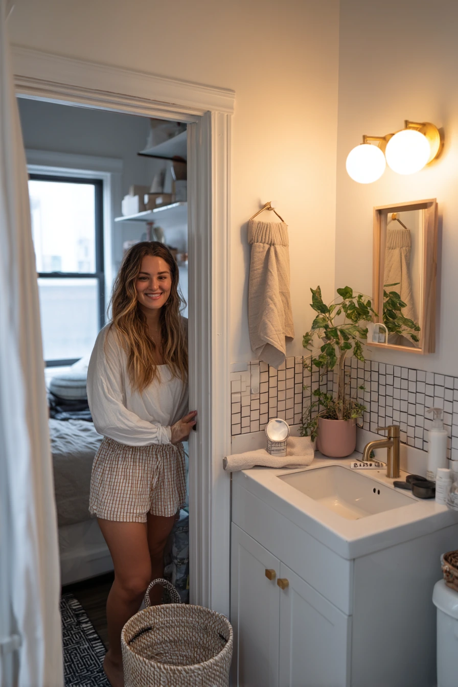
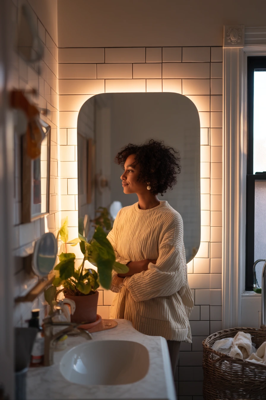
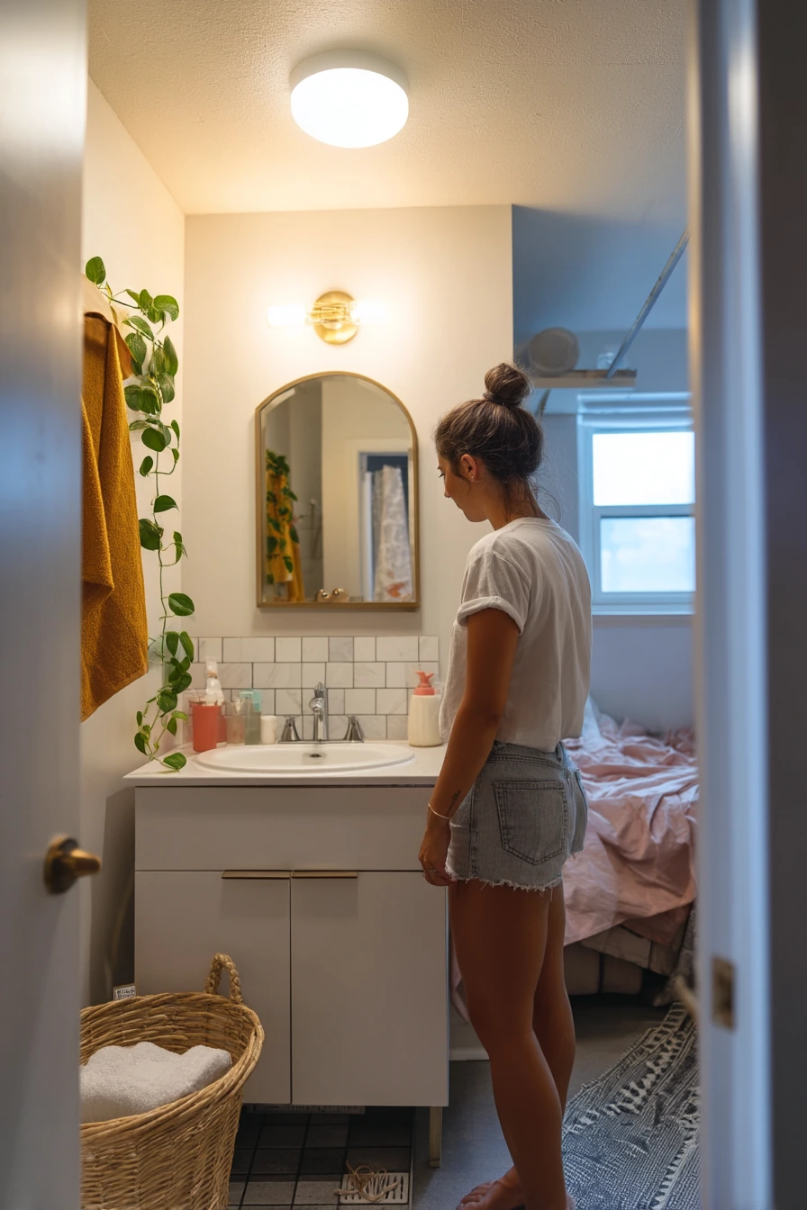
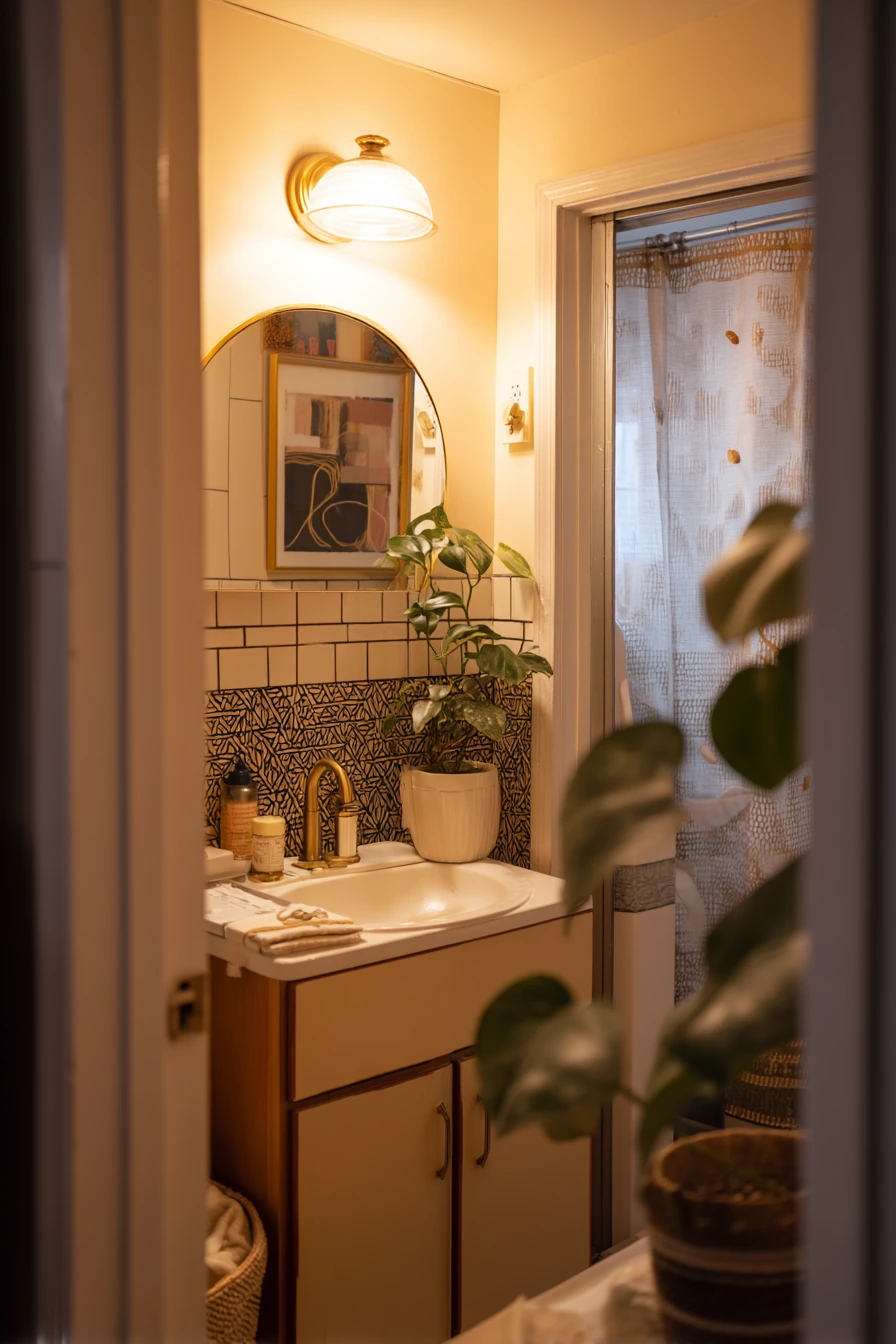
A budget renter bathroom refresh can still use contrasting grout bathroom ideas, even without permanent renovation. Peel-and-stick tile can mimic a backsplash with bold grout lines, giving the vanity area a cleaner frame. In a studio apartment, this is a fast way to make a compact bathroom look more finished.
Keep the styling grounded and practical. A compact vanity looks better when you limit items to what you use daily: a hair clip on the counter, a rolled washcloth, and one small potted pothos. An adhesive mirror frame can help the mirror feel intentional, and warm lamp light plus dusk window glow makes the faux tile look more realistic.
To style it well, choose peel-and-stick designs with a simple pattern, like subway or square. Avoid tiny patterns that can look busy in a small space. Keep your accessories in one tone, like black, white, and warm wood, so the grout lines read as a design choice, not just a shortcut. Hide laundry items in a basket if the doorway view is open.
- Clean and degrease the wall well before applying peel-and-stick tile.
- Start at the center line so cuts look even on both sides.
- Use a small roller or credit card to press out air bubbles.
- Style with one plant and one tray to avoid counter clutter.
- Pick towels that match the grout tone to tie it together.
Pro Design Tip: Choose peel-and-stick tile with a thicker surface and printed grout that is slightly softened, since harsh lines can look fake up close.
Budget Considerations: Most renter friendly tile panels cost far less than real tile, and you can cover a small backsplash area first to keep the project affordable.
7 Moody Black Tile with Soft White Grout
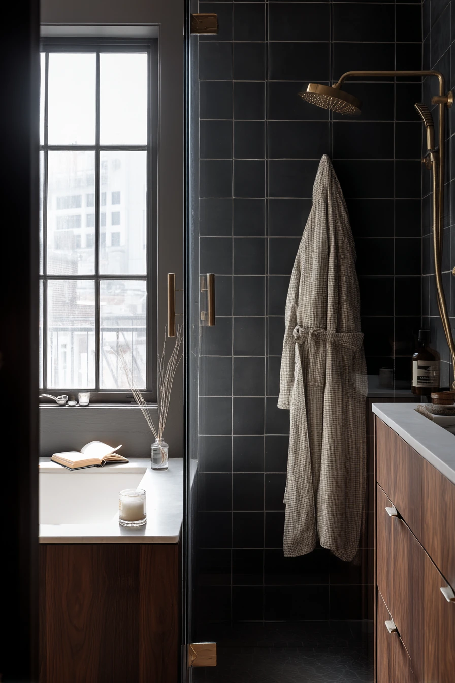
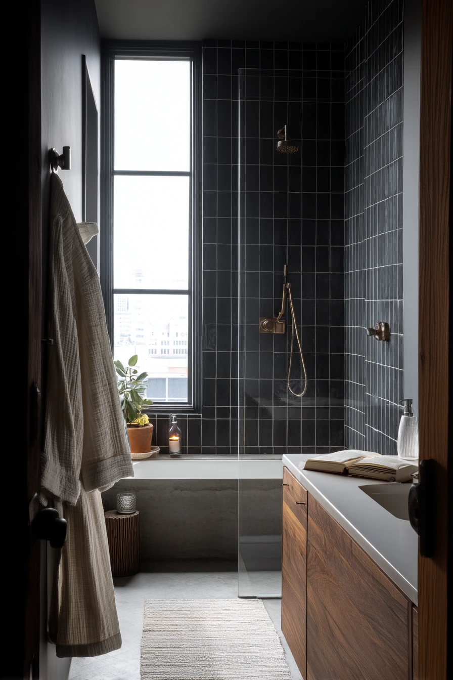
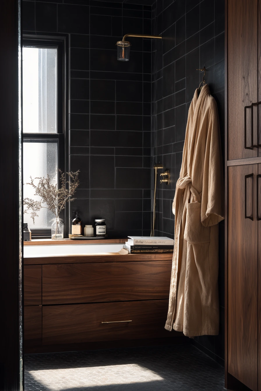
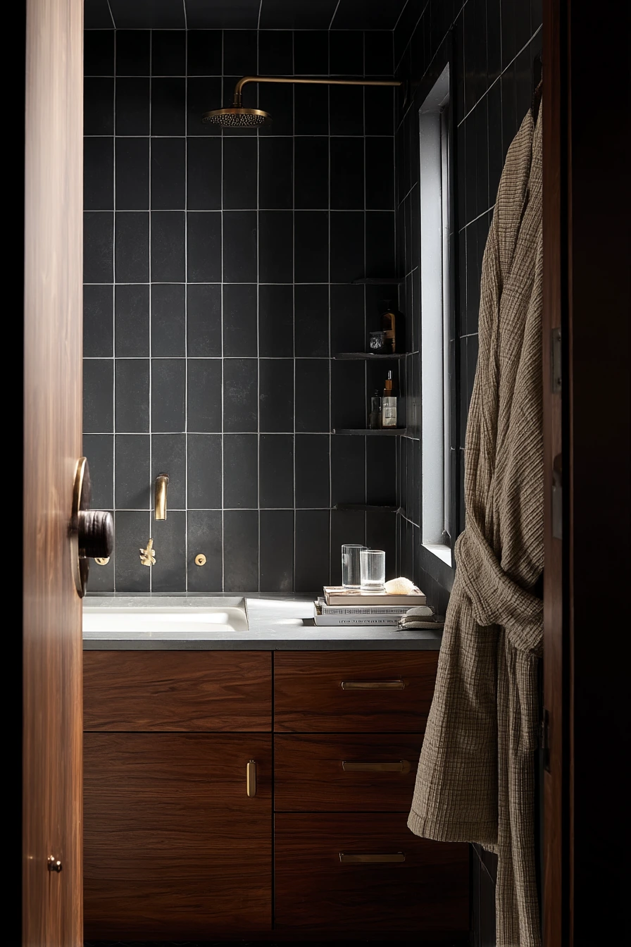
Matte black tile with clean white grout flips the classic look and creates strong contrast. In a lived-in loft primary bathroom, it feels moody but not glossy, especially in cool morning window light. The white grout outlines each tile so the wall reads as a pattern, not a dark blank surface.
This pairing looks best when the rest of the room adds warmth. A walnut vanity and an unlacquered brass faucet keep the black tile from feeling too heavy. Small lived-in details like a folded robe on a hook, a book left open near the tub, a water glass, and a candle stub make the space feel personal and calm.
To style it, use soft textures and warm neutrals. Pick towels in cream or light gray, and add one woven basket for storage. Keep bottles simple and uniform so the shower wall stays the focus. If you want more contrast without adding clutter, add one black framed art print or a dark wood stool.
- Use matte black tile to reduce glare and fingerprints.
- Choose bright white grout to make the tile pattern pop.
- Add walnut or medium wood to warm up the black surfaces.
- Use brass or aged finishes to keep it from feeling too modern.
- Stick to light towels so the room does not get too dark.
Pro Design Tip: Ask for a grout release or proper sealing plan, because white grout on dark tile shows haze if cleanup is rushed.
Budget Considerations: If black tile is out of budget, paint existing cabinetry darker and add white grout refresh plus black accessories to get a similar high contrast mood.
8 Checkerboard Floor with Contrasting Grout Definition
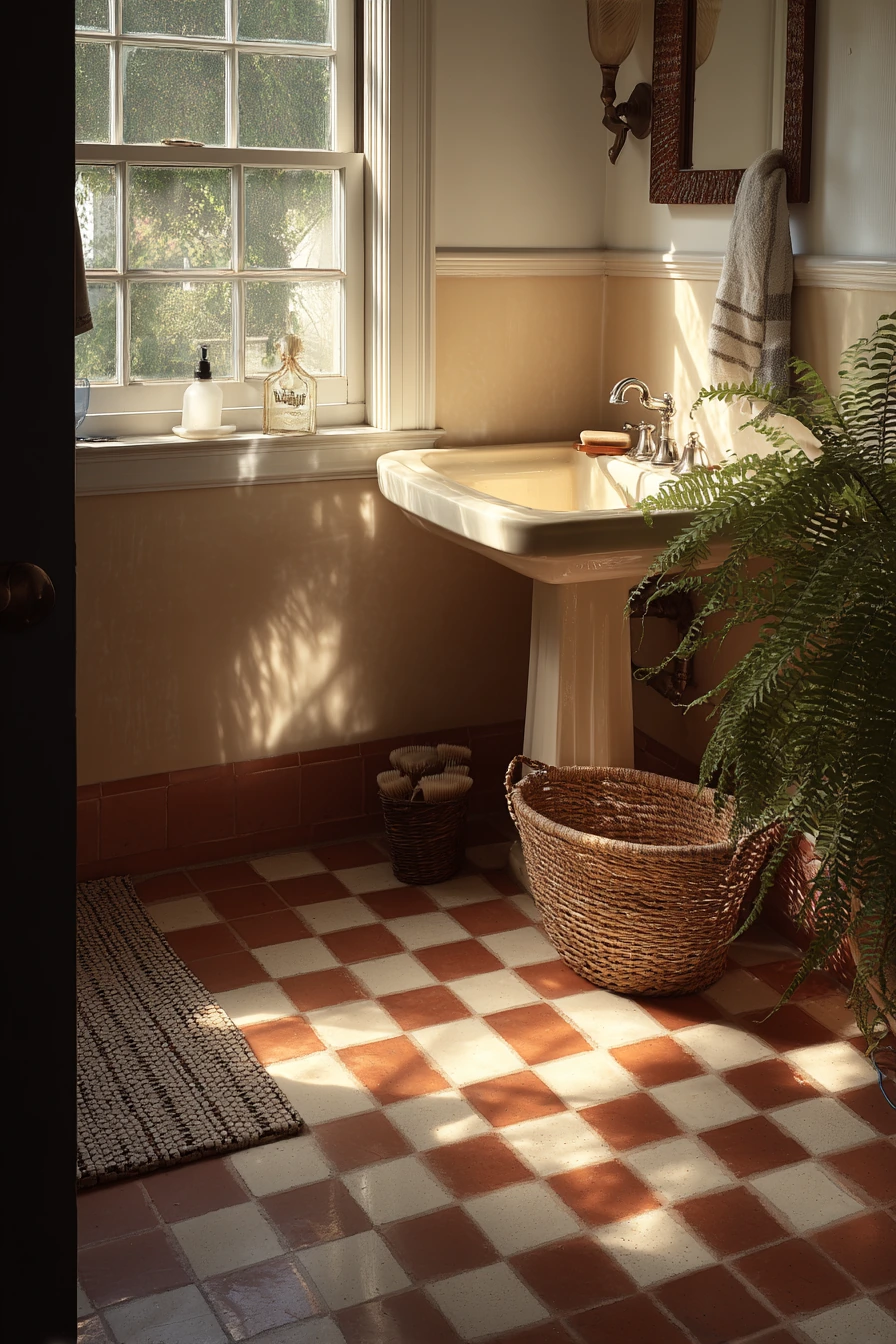
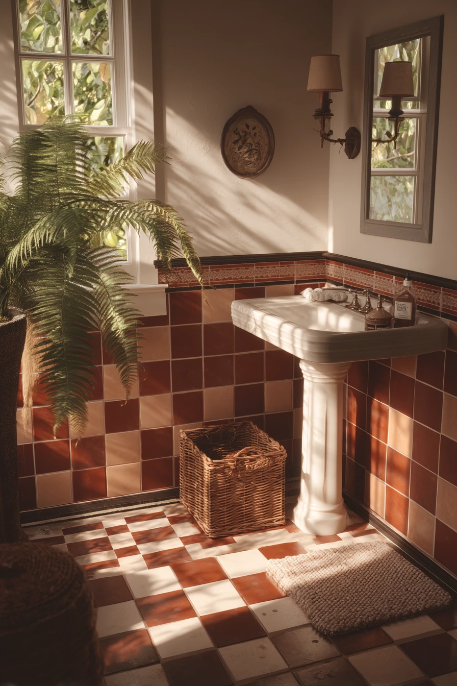
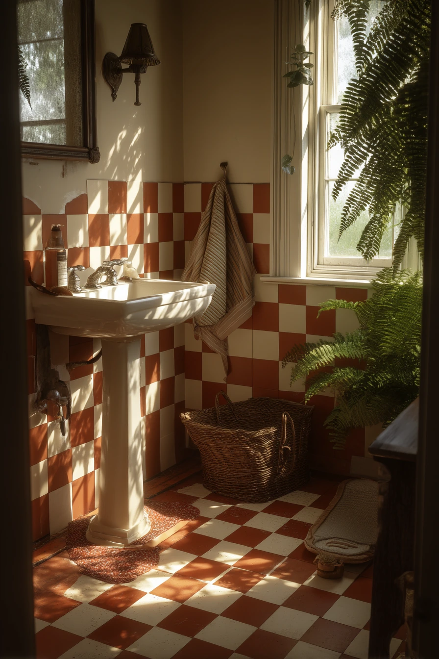
A checkerboard floor of cream and terracotta tile with charcoal grout is a classic cottage look. The charcoal lines emphasize every edge, so the pattern feels sharp even when the colors are soft and sun warmed. This is a great option for older homes where you want character that still looks clean.
With a pedestal sink and a vintage sconce, the floor becomes the main design feature. Keep storage simple with a wicker basket and a small hand soap and comb on the sink. A slightly rumpled bath rug fits the nostalgic vibe, and a fern near the window adds a natural shadow that makes the room feel cozy.
To style it, repeat the terracotta tone in small ways, like a clay soap dish or a warm toned towel. Keep the rest of the palette cream, tan, and soft black so the floor does not fight with the walls. If your bathroom is small, use a rug that shows the checkerboard border instead of covering the whole pattern.
- Use charcoal grout to outline checkerboard squares clearly.
- Pick cream paint or warm white walls to keep it light.
- Add one vintage element like a sconce or mirror for charm.
- Choose a small rug that leaves most of the pattern visible.
- Use wicker or wood storage to match the cottage feel.
Pro Design Tip: Keep your grout lines consistent in width across the checkerboard so the squares look even and the pattern feels calm.
Budget Considerations: If replacing the floor is too expensive, use checkerboard vinyl tile and choose a grout look version to keep the same contrast at a lower cost.

9 Spa Bath with Quiet Grout Contrast
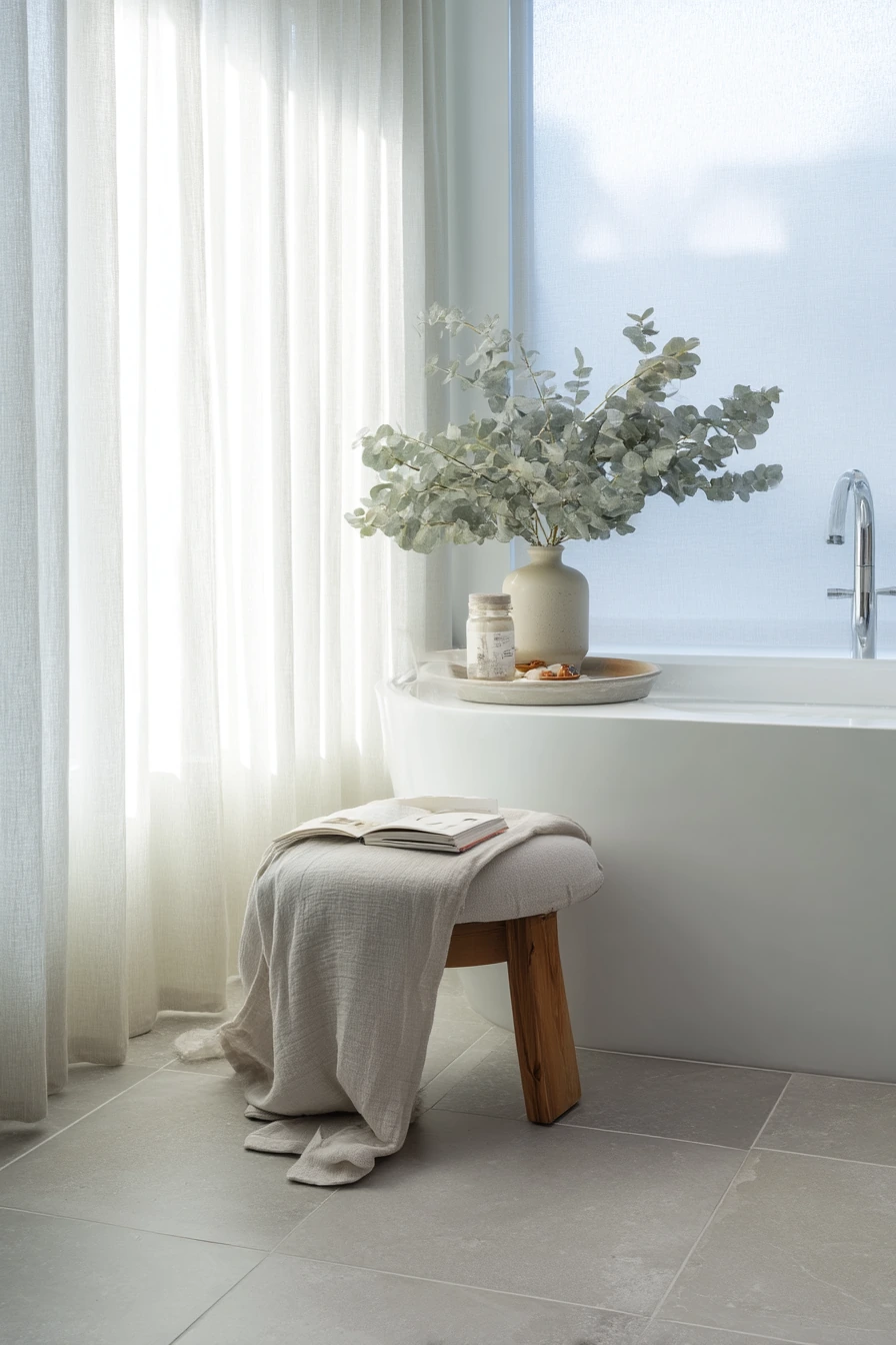
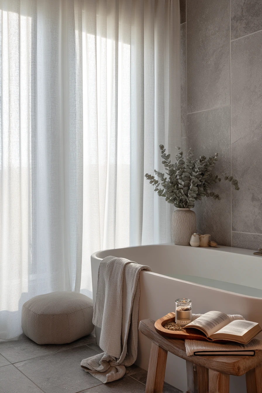
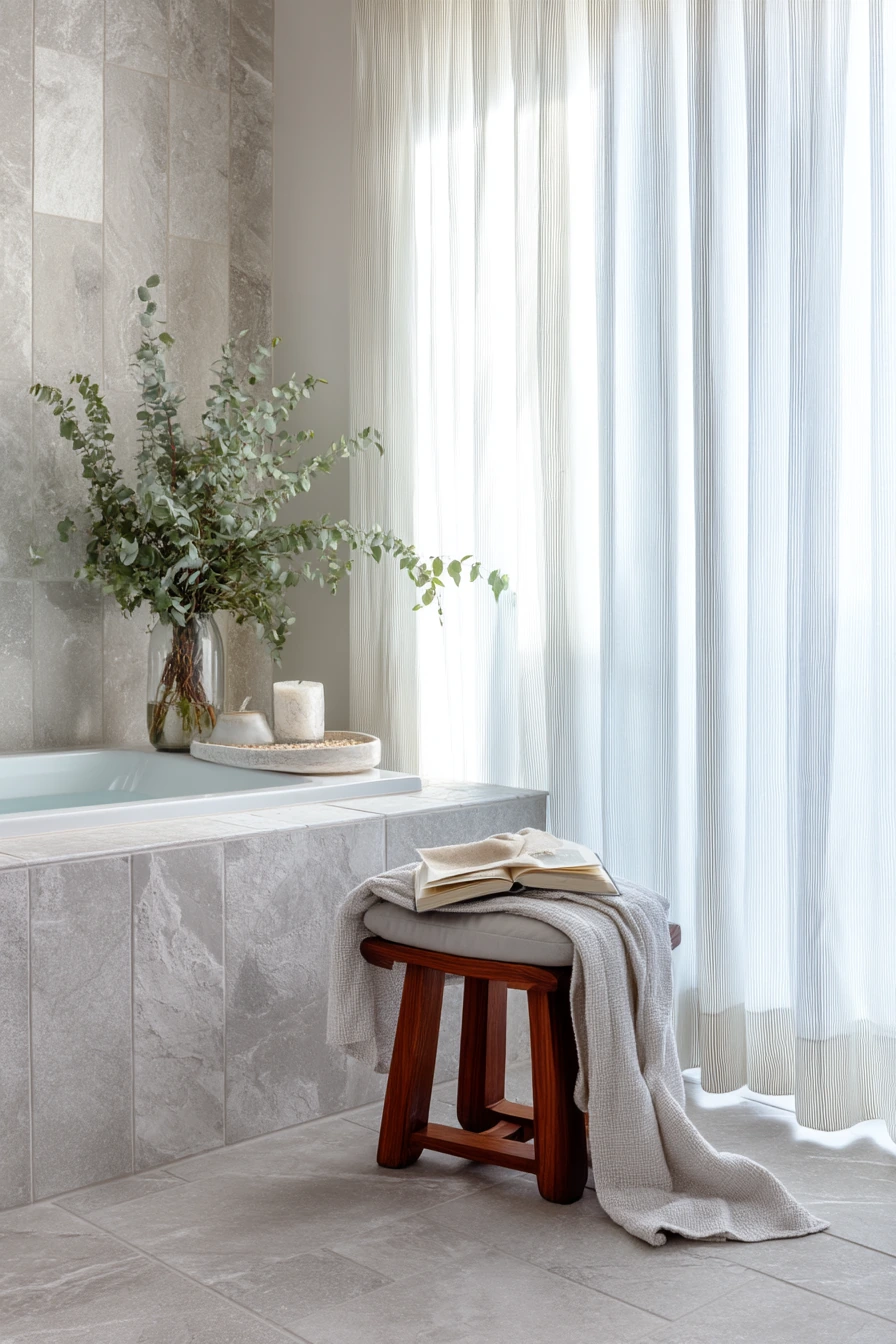
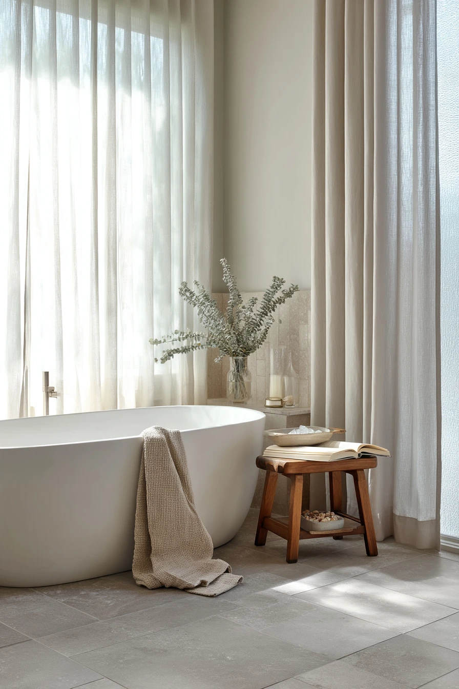
Not all contrasting grout bathroom ideas need dark lines. Large format stone-look tile with subtle dove-gray grout creates a quiet contrast that still defines the layout. In a serene master bath, this helps the room feel breathable and modern, without drawing attention to every joint.
This look pairs well with a soaking tub and soft materials like linen curtains and a robe draped on a stool. Style the tub area like a small routine: a ceramic tray, a paperback novel, bath salts, and a eucalyptus bundle. With frosted glass and soft morning light, the tile reads as smooth and spa like, but still family friendly.
To style it, keep the color range tight. Think warm whites, light grays, and soft beige. Use natural items to add life, like eucalyptus or a small plant, and keep bottles in matching containers. If you want a bit more contrast, add a black or dark bronze faucet, but keep it to one main feature.
- Use dove-gray grout to hide stains while staying soft on the eyes.
- Choose large tiles to reduce grout lines and ease cleaning.
- Style the tub with one tray to keep items neat and contained.
- Add linen curtains for gentle texture and a calm look.
- Pick matching dispensers so the counter feels less busy.
Pro Design Tip: Match the grout color to the mid tone in your stone-look tile, so the floor and walls look seamless but still defined.
Budget Considerations: Large format tile can cost more to install; save money by using it on one main wall and choosing a simpler tile elsewhere.
10 Renovation After-Update: Grout Makes the Tile Pop
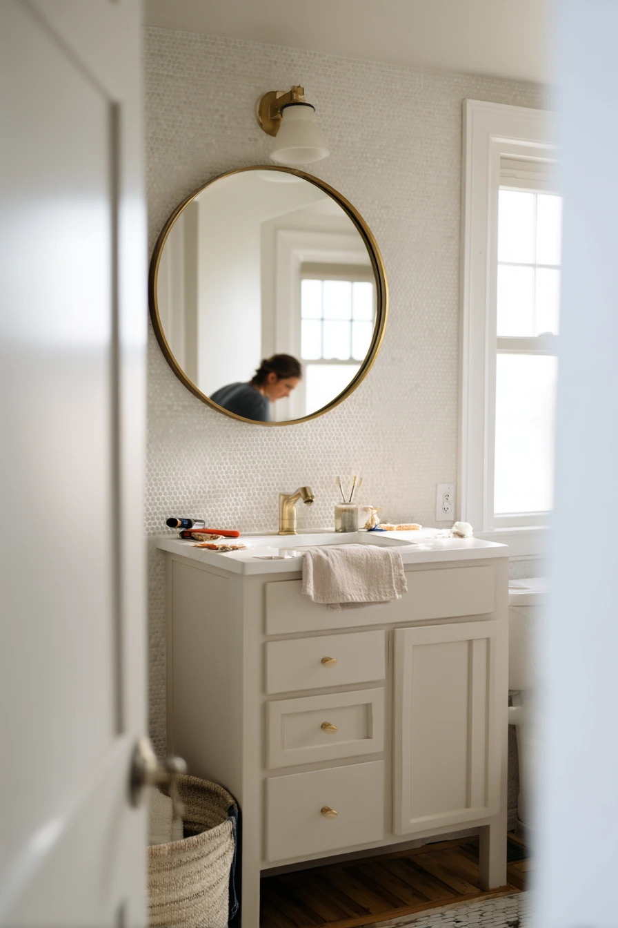
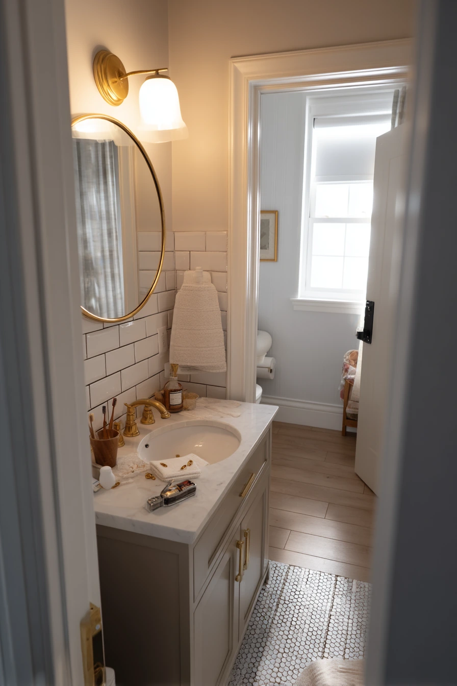
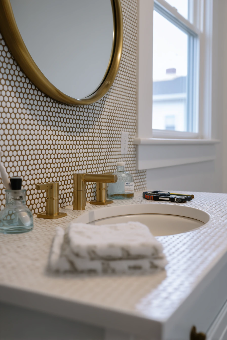
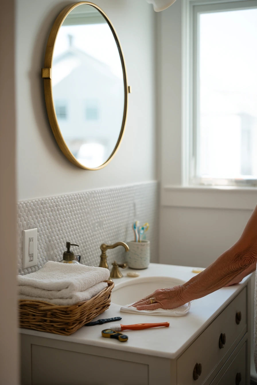
White penny tile with espresso grout is bold, graphic, and very practical. The small circles create lots of grout lines, so the darker color helps hide wear. In a freshly updated hallway bathroom, it also adds instant character, even if the rest of the room is simple and functional.
This style looks good with a brass mirror and a painted vanity. It fits a real work in progress scene too, like a homeowner wiping down tile while a drill and tape measure sit nearby. Keep everyday items like toothbrushes and folded hand towels in one spot so the pattern does not compete with clutter.
To style it, use warm accents that match the espresso grout. A wood tray, amber soap bottle, or tan hand towel can make the room feel less black and white. If you are choosing paint, soft white or pale greige keeps the room bright. Side window daylight helps penny tile look clean, so avoid heavy window treatments.
- Use espresso grout to ground penny tile and hide dirt in joints.
- Choose a brass mirror or warm metal to complement the brown tone.
- Keep counter items on a tray for a cleaner look.
- Pick paint sample chips in warm neutrals to match the grout.
- Seal the grout well since penny tile has many joints.
Pro Design Tip: Use sheet penny tile with careful layout, and ask for extra time on alignment so the rows do not drift over the wall or floor.
Budget Considerations: Penny tile installation can be labor heavy; lower costs by using it as an accent band and choosing a larger, cheaper tile for the rest.
Contrasting grout can change the whole feel of a bathroom, from sharp black lines on white subway tile to soft gray joints on stone-look slabs. Pick the grout strength based on how much pattern you want to see and how much daily mess you need to hide.
Before you commit, test samples in your real lighting and plan a few supporting finishes like towels, wood tones, and metal hardware. A small set of choices that work together will make your tile look intentional and easy to live with.
FAQ
1. Does dark grout stay cleaner than white grout?
Dark grout can hide stains and discoloration better, especially on floors and in kids bathrooms. It still needs sealing and regular cleaning.
2. Will black grout make my bathroom feel smaller?
It can, because strong lines add visual grid. Balance it with light walls, bright lighting, and warm wood like an oak vanity.
3. What is the best grout color for white tile?
For contrast, try charcoal or black. For a softer look, try light gray. Choose based on how bold you want the pattern to look.
4. Is epoxy grout worth it for a shower or floor?
Often yes, especially in high use bathrooms. It resists stains and water better, but it costs more and is harder to install.
5. Can I change grout color without retiling?
Sometimes. Grout recoloring products can refresh old grout, and grout pens can help small areas. Results depend on the grout condition and cleaning prep.
6. How do I keep contrasting grout from looking too busy?
Use larger tiles, limit other patterns, and keep accessories simple. Repeat the grout color in one or two small details like frames or towels.